“As an Amazon Associate, I earn from qualifying purchases. If you click a link and make a purchase, I may receive a small commission at no extra cost to you. This helps keep my design guides free and honest—thank you for the support!”
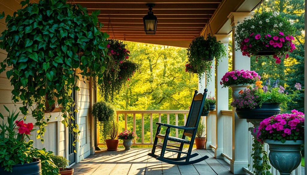
Renter-friendly upgrades, zero drilling, maximum “who lives here?” energy
Renting can feel like living inside someone else’s design choices. Beige walls, sad lighting, and “no holes” rules that basically scream “please do not enjoy yourself.” Ever looked around and thought, “How do people make rentals look expensive without risking the security deposit?” Same.
This list keeps things renter friendly, no drill, and realistically doable. Think peel-and-stick wallpaper, removable tiles, plug-in lighting, tension rod tricks, and damage-free styling moves that look custom without becoming permanent. The goal stays simple: make the space feel high-end and intentional, then undo it cleanly when it’s time to move. Nobody needs a wall patching marathon the night before the final walkthrough.
Before anything goes up, a quick rule saves a lot of pain: clean the surface, test a small hidden area, and remove slowly. Adhesives act cute until they meet dusty walls and cheap paint. Ready to upgrade without a single drill bit? Let’s do it.
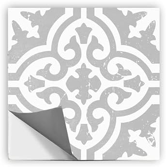
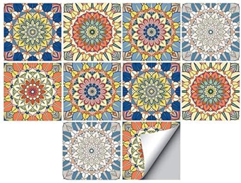
1) Peel-and-stick wallpaper accent wall (instant custom, zero commitment issues)
A peel-and-stick accent wall gives a rental the fastest glow-up with the least drama. One wall changes the whole room’s energy, and it makes everything else look more intentional. Ever notice how a couch suddenly looks “designer” when it sits in front of a bold pattern or a soft textured neutral? That’s the magic.
Pick a wall that naturally grabs attention, like the wall behind the sofa or the headboard wall in a bedroom. Go for subtle patterns, warm neutrals, or soft texture looks if the goal leans luxury. Loud prints can work, but they can also start to feel like a temporary pop-up shop if the rest of the room stays calm. Keep it balanced.
Prep matters here. Wipe the wall down, let it dry, and test a small piece behind a door or in a corner first. Matte paint and older paint jobs can act unpredictable. When it’s time to remove, pull it down slowly and steadily, not like ripping off a Band-Aid in a panic.

- Wallpaper
- Wallpaper
- Black Wallpaper–Self Adhesive- Just peel and stick. The size of this wallpaper is 35.4inch × 118inch, covering an area …
Quick tips that make it look expensive:
- Choose large-scale patterns or textural neutrals for a high-end vibe
- Align the pattern carefully before committing to full panels
- Use a smoothing tool and work from the center outward to avoid bubbles
- Stop the wallpaper cleanly at trim edges for a crisp finish
2) Go “quiet luxury” with peel-and-stick grasscloth texture (the richest-looking wall upgrade)
If a room needs instant depth, peel-and-stick grasscloth-style wallpaper does the job. Texture makes a space feel layered and intentional, even when the color stays neutral. Ever walk into a high-end home and notice how the walls feel soft and dimensional instead of flat? That’s the effect this mimics.
This works especially well in bedrooms, dining corners, and office spaces where the vibe should feel calm but elevated. Stick with warm oat, sand, greige, or creamy taupe tones for that expensive look. Then pair it with natural wood, brass accents, and soft textiles so the whole room looks curated instead of “random stuff got placed here.” Keep the wall styling simple so the texture stays the star.
- Gives the look of a wood wall with this faux grassloth look
- Peel and stick to apply, pull up to remove
- NuWallpaper is safe for walls and leaves no sticky residue behind
Quick tips that make it look designer:
- Choose a matte or linen-finish grasscloth look for realism
- Install on the most visible wall to maximize impact
- Match decor to the texture: boucle, linen, wool, wood tones
- Keep wall art minimal so the texture reads clearly

- 𝐏𝐞𝐞𝐥 𝐚𝐧𝐝 𝐒𝐭𝐢𝐜𝐤 𝐖𝐚𝐥𝐥𝐩𝐚𝐩𝐞𝐫: Grasscloth Wallpaper features a simple, grooved design that creates a bright, breezy backdrop …
- New Upgrade – Cover any smooth wall kitchen cabinet, furniture, stair riser, for craft projects and to line dresser draw…
- 1 Roll Wallpaper – 17.7 inches wide by 118 inches long, covers 14 square feet. There have grid and measurement on the ba…
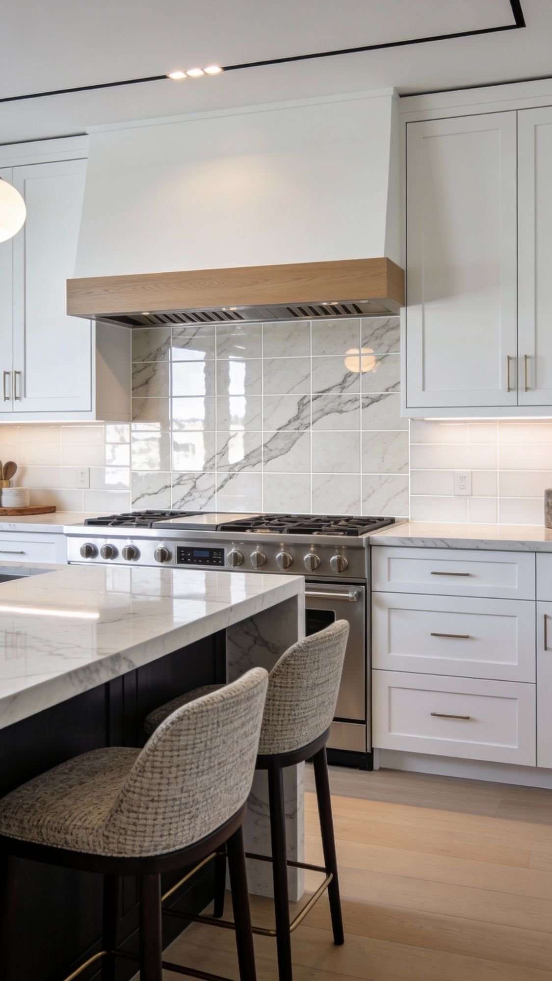
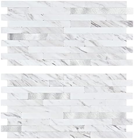
3) Peel-and-stick backsplash tile that looks like real stone (the kitchen glow-up that shocks people)
Peel-and-stick backsplash tile upgrades a rental kitchen fast, and it makes the whole space feel more “finished.” A good tile look adds shine, texture, and structure behind the counters, which instantly reads as expensive. Ever notice how a plain counter looks kind of naked without a backsplash? This fixes that in one afternoon.
Pick styles that mimic high-end materials, like zellige-look tile, marble-look panels, or slim glossy subway. Keep the color story tight so the kitchen looks curated instead of chaotic. Clean the surface like it owes money, because grease and dust ruin adhesion quickly. Then press firmly, line up edges carefully, and trim cleanly around outlets for that “built-in” vibe.

- Easy DIY, Just Peel & stick, cut with tin snip, utility knives or hand saws, saving large amount on labor
- 3″x6″ individual subway tile, plans the layout freely to your imagination
- Waterproof, heat resistant, stain resistant, anti-scratch, high impact, color fadeless, easy to clean, durable
Make it look high-end:
- Choose matte zellige or soft marble veining for a luxury feel
- Keep grout lines straight and consistent
- Add a warm under-cabinet light to highlight the texture
- Avoid super busy patterns if the counters already have movement
- Effortless Installation – Our Peel and Stick Backsplash requires no tools or messy grout. Simply peel off the backing an…
- Durable & Waterproof – Made from high-quality PVC material, this backsplash resists moisture, heat, and stains, making i…
- Friendly – Easily removable without damaging walls, ideal for apartments, dorms, or temporary decor.
4) Tile decals over ugly existing tile (cover the chaos, keep the deposit)
Tile decals turn dated tile into something that actually looks intentional. They cover loud patterns, soften weird colors, and make bathrooms and kitchens feel upgraded without touching grout or mortar. Ever walked into a rental bathroom and thought, “Why does this tile look like it came free with a 1998 flip phone?” Tile decals fix that vibe fast.
Pick matte finishes and subtle patterns for a luxury look. Decals look best on smooth tile, because the adhesive needs a clean, flat surface to grip. Clean the tile thoroughly, dry it completely, then apply each decal slowly so edges line up cleanly. Keep the pattern consistent, because crooked decals scream “DIY panic,” and nobody wants that.
- Premium Quality Self-Adhesive Laminated Vinyl with UV Protective HD Print with 7+ Years Life
- Realistic Tile Look When Installed on Existing Tiles ; High Performance Adhesive for Long Durability
- 100% Opaque Decals Hence Tiles are Covered Completely ( These Decals are not Transparent )
Best places to use tile decals:
- Bathroom floors (especially small ones that need a quick refresh)
- Kitchen backsplash bands with dated designs
- Laundry room floors where function matters more than perfection
- Entry tile that feels too busy or too dark
Pro tips for a seamless finish:
- Measure first and plan the layout before sticking anything down
- Start from the center and work outward for symmetry
- Press edges firmly so corners do not lift over time
- Keep extra decals on hand for quick replacements
- Not a TILE product, it’s a PVC sticker – applied on floor/walls for home DIY decoration or renovation
- Peel and Stick, Self-adhesive – Simple and easy to apply or remove
- Perfect for Bathroom Kitchen backsplash – Water-proof, oil-proof, easy to clean, brightly colored and non-fading
5) Contact paper on counters (the “wow” upgrade that costs way less than it looks)
Contact paper on counters can turn a sad rental surface into something that looks like stone, concrete, or a sleek modern finish. It works best when the counter looks dated but still feels structurally fine. Ever looked at a rental counter and thought, “This laminate has lived through too much”? This gives it a fresh identity without a full remodel.
Choose thick, high-quality vinyl with a realistic finish. Marble-look, soapstone-look, and warm concrete tones tend to look the most luxe. A cheap, shiny roll can look plasticky fast, so a matte or satin finish usually wins IMO. Measure carefully, cut with extra overhang, and smooth as you go so bubbles don’t set up camp.

- Peel and stick wallpaper
- Wallpaper
- Size: 17.71 inches x 196.8 inches, (45cm×5m)covering an area of 24 square feet. Please measure it in advance before buyi…
Make it look expensive (and last longer):
- Pick heat-resistant and water-resistant options labeled for counters
- Use a squeegee or smoothing tool to flatten it cleanly
- Seal seams carefully and trim edges sharply for a crisp finish
- Add a large cutting board in your prep zone so you don’t scratch the wrap
Where this works best:
- Coffee bars and beverage stations
- Bathroom counters
- Kitchen counters with lighter use (or a lot of cutting boards, honestly)
6) Cabinet glow-up with removable vinyl (custom color without paint drama)
Removable vinyl on cabinets delivers that “new kitchen” feeling without paint, sanding, or the emotional breakdown that comes with getting primer on your socks. It works best on flat cabinet fronts, and it makes even a basic rental kitchen look intentional. Ever notice how a kitchen feels instantly more expensive when the cabinets look modern and cohesive? This is the shortcut.
Choose a vinyl with a satin or matte finish so it reads like real cabinetry. Deep espresso, soft taupe, warm greige, or even a muted olive can look designer when the rest of the space stays calm. Clean every cabinet surface thoroughly, especially near handles, because hands leave oils that mess with adhesion. Apply slowly, smooth as you go, and trim edges sharply so it looks crisp instead of “temporary project.”

- CONTACT PAPER WOOD GRAIN
- 🚪Wood Contact Paper ——「Size」1 roll of contact paper wood -12 x 200 inches (0.3 x 5M), cover 16.15 sq.ft.
- 🚪Wood Contact Paper ——「Features」Contact paper wood is made of high-quality vinyl material, which is peel and stick, self…
Luxury-level styling tips:
- Use one consistent color on lowers, then keep uppers lighter for contrast
- Pair the wrap with hardware swaps using existing holes for a full upgrade effect
- Keep seams hidden on cabinet edges whenever possible
- Choose vinyl labeled removable and surface-safe to avoid residue
Best places to start if the kitchen feels intimidating:
- Just the lower cabinets
- A single bank of cabinets (like near a coffee station)
- Bathroom vanity doors for a smaller test run
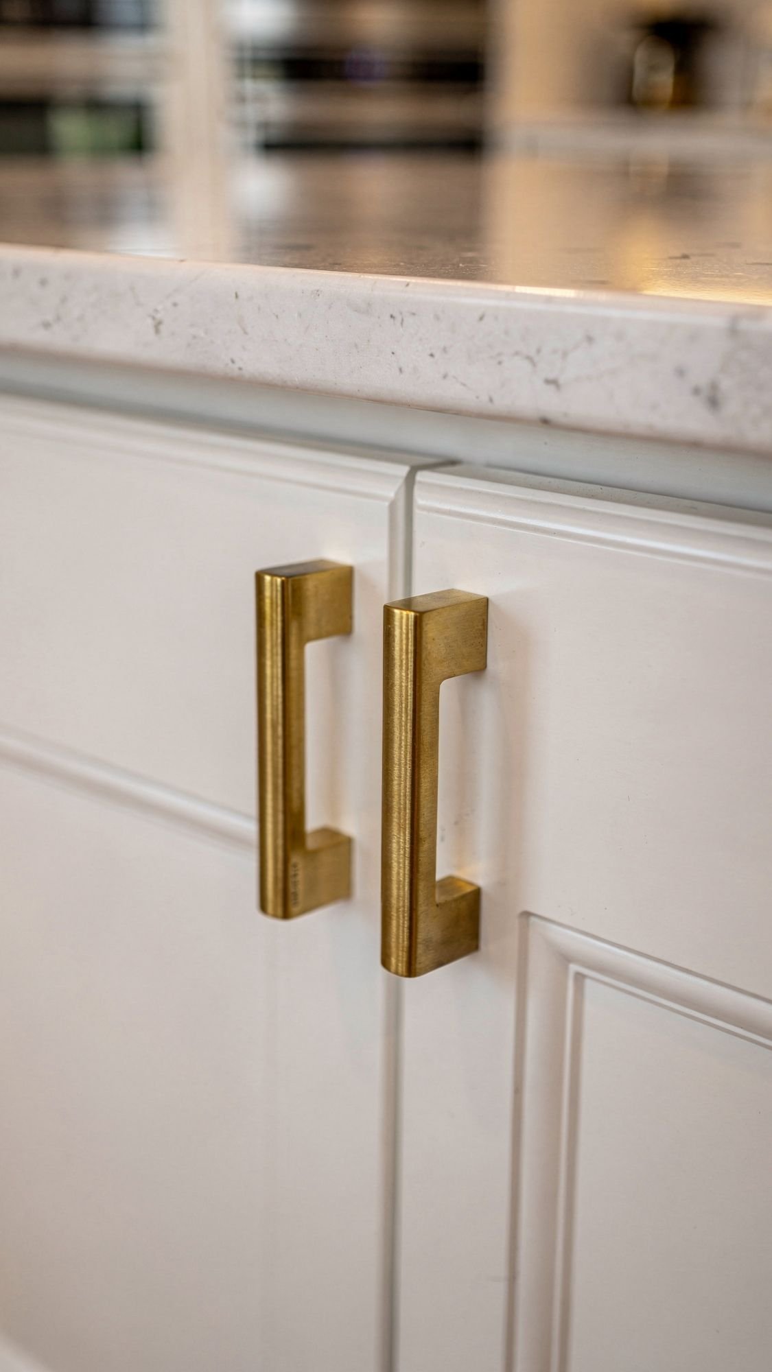
7) Swap hardware using existing holes (tiny change, huge payoff)
A hardware swap feels almost too easy, which is exactly why it works. New knobs and pulls instantly update cabinets, dressers, and even built-in closets, and they make a rental look like someone actually cared. Ever opened a cabinet and thought, “These handles look like they came from the clearance bin in 2006”? Replace them and the whole room levels up.
The key is using the existing holes so you avoid drilling. Match the current pull spacing, keep the old hardware in a labeled bag, and reinstall it when you move. Choose brushed brass, polished nickel, or matte black depending on the vibe. Stick to one finish across the space so it looks cohesive and not like a hardware sampling platter.

- Specifications: Overall Length: 6.4″ (163mm), Hole Centers: 5″ (128mm). Projection: 1.1″ (297mm) Measure the distance be…
- Solidly & Long-lasting Crafted: Our handles are Crafted from Solid Material, our kitchen drawer pulls ensure corrosion r…
- Long-Lasting Color: Elevate your furniture aesthetics with our cabinet handles. The high-quality finish and multi-layer …
How to make it look designer:
- Match hole spacing exactly so everything fits cleanly
- Choose heavier, substantial-feeling hardware for a luxury look
- Keep one finish consistent across the room
- Upgrade the “boring” spots too: linen closets, bathroom vanity, built-in drawers
Quick comparison (what looks most high-end):
- Brushed brass: warm, upscale, modern-luxe
- Polished nickel: classic, bright, hotel vibe
- Matte black: clean, modern, strong contrast

- 365-Day Trial Period: We are confident you will love these cabinet knobs, so we offer a 365-day trial. If they do not me…
- Size of Round Knobs: Diameter 1-1/6″(30MM); Base Diameter: 3/5″(16MM) ; Height: 1-1/8″(30MM). Please verify knobs dimens…
- Package Includes:The box you receive includes 5 round knobs with 10 screws . The longer screws can be cut to different l…
8) Peel-and-stick wall molding (instant architecture, zero drill, major flex)
Peel-and-stick molding gives plain rental walls that custom, tailored look people usually pay contractors for. It adds structure and shadow, which automatically makes a space feel more expensive. Ever walked into a high-end home and noticed how the walls look “designed” even without art? That’s molding doing the heavy lifting.
Keep the layout simple and symmetrical. A clean picture-frame grid behind a sofa, a console, or a bed looks intentional and high-end. Use a level, measure carefully, and map the design with painter’s tape before sticking anything down. Crooked trim ruins the illusion fast, and nobody wants to stare at a slightly slanted rectangle for the next year :/

- 【201 Stainless Steel】Experience the perfect blend of practicality and elegance. Our trim is crafted from premium stainle…
- 【8K Mirror Coating】Indulge in the radiance of our trim’s 8K mirror plating coating. This cutting-edge finish not only cr…
- 【Effortless Peel & Stick】Transform your home with ease using our DIY-friendly metal trim. Simply peel the backing and st…
Best spots for peel-and-stick molding:
- Behind the sofa as a feature wall
- The dining wall for a “formal” feel without the formality
- The bedroom headboard wall to make the bed look anchored
- Entryways that need instant polish
Make it look like real millwork:
- Pick molding with a clean profile, not overly ornate
- Keep spacing consistent between frames
- Paint the molding the same color as the wall for a subtle luxury look
- Style the wall with one oversized art piece or a mirror, not a clutter collage

- Transformative – Art3d pre-cut molding trim adds depth and character to walls, gives traditional elegance with a hint of…
- Premium Polystyrene Material – Unlike flexible PVC molding trim, it’s stiff and sturdy that can align straightly. It’s p…
- Easy & Quick Installation – Our pre-cut wall molding kit is designed for easy application with the use of adhesive or gl…
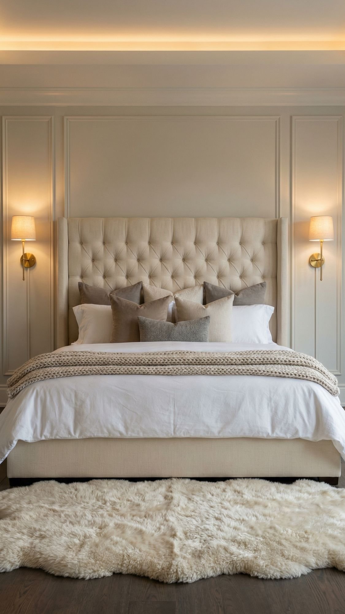
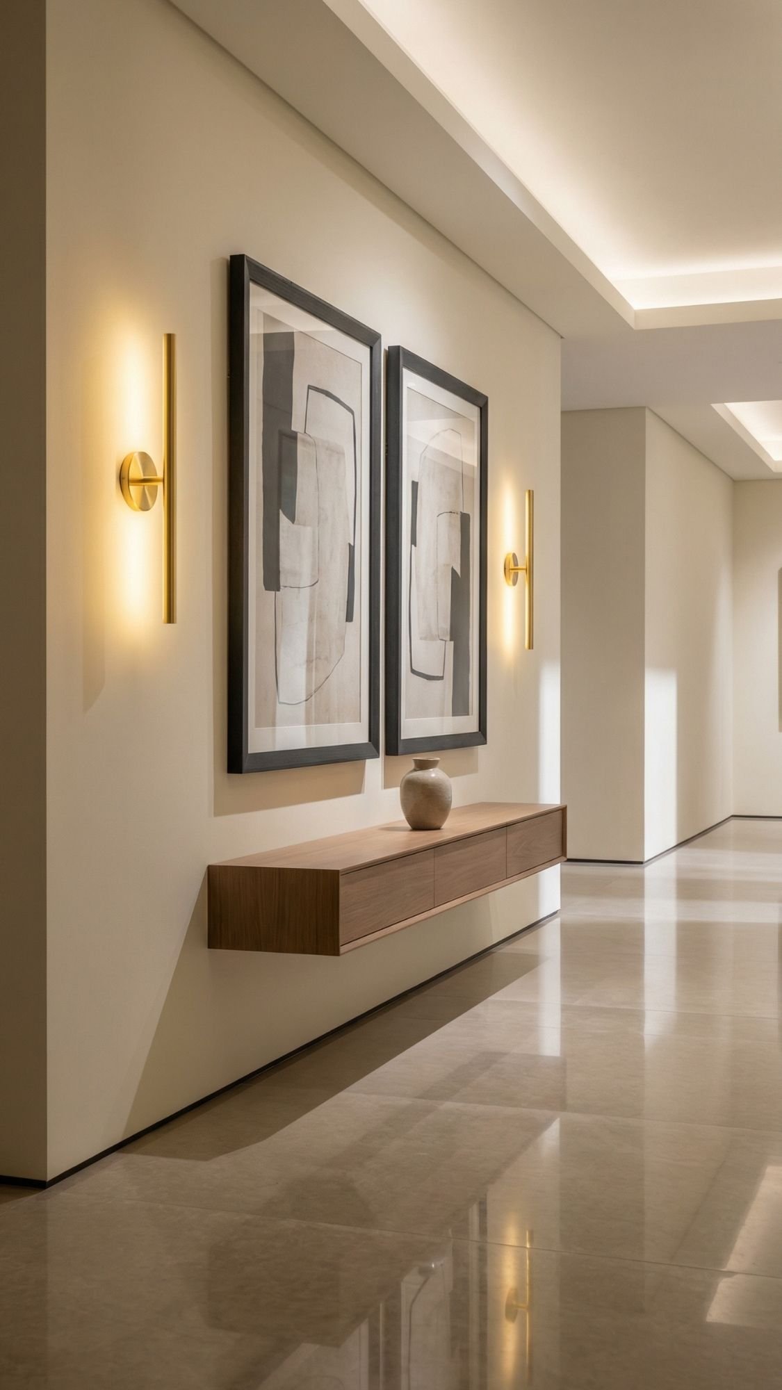
9) Plug-in wall sconces (because overhead lighting never wins)
Plug-in sconces instantly make a rental feel finished, like the space came with a designer instead of a landlord who shops in bulk. They add height, symmetry, and that boutique-hotel glow that makes everything look better. Ever notice how a room feels calmer when light comes from multiple places instead of one harsh ceiling fixture? That’s the whole point.
Place plug-in sconces where the room needs structure: next to the bed, beside a reading chair, or flanking a console in the entry. Use cord covers to hide the wire and match them to the wall color so the sconce looks built-in. Mount the fixture with heavy-duty damage-free strips if the weight allows, or use removable hooks plus a stable backplate approach depending on the design. Keep it secure and rated for the load, because nobody wants a midnight sconce crash.
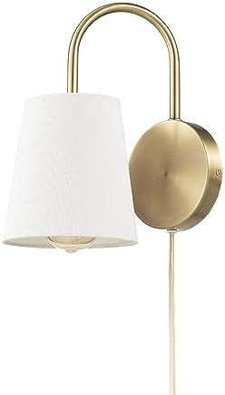
- MINIMALIST SOFT GLAM DESIGN: a matte brass palette pairs perfectly with a white textured shade to create a glamorous yet…
- PLUG-IN OR HARDWIRE CAPABILITY: the 2-in-1 design allows you to install your light as a plug-in so you can place it anyw…
- BULB REQUIREMENTS: this 2-in-1 matte brass wall sconce requires 1x E26/Medium Base 60W Max Bulb (sold separately) – Comp…
How to make plug-in sconces look custom:
- Choose hardwired-look styles with clean backplates
- Add paintable cord covers and run them straight down
- Use matching pairs for symmetry whenever possible
- Pick warm light bulbs so the glow feels luxe, not clinical
Best places to install them:
- Bedside lighting in bedrooms
- Over a reading nook chair
- In a hallway to add depth
- Above a sideboard or entry console

- Classic Excellent Quality PVC Wall Cable Hider: The wire management TV wire covers for wall are made of PVC material, at…
- Complete Cord Cover Kit for Flexible Installation:With an external size of W 1.2 x H 0.6 in, this cord cover wall kit is…
- Smooth Arched Design for a Clean Look:Featuring a subtle arched profile with fine surface lines, the cable cover and fit…
10) Rechargeable stick-on sconces (no outlet nearby, still looks intentional)
Rechargeable stick-on sconces solve the “no outlet, no problem” situation without turning the wall into a DIY crime scene. These lights bring a soft glow to dead zones like hallways, corners, and awkward blank walls. Ever walk past a dark hallway and think it feels a little… unfinished? A warm sconce fixes that instantly.
Choose styles that mimic real fixtures, like slim brass, matte black, or polished nickel silhouettes with a clean backplate. Keep the light temperature warm so the space feels expensive instead of like a dentist office. Place them in pairs when possible, because symmetry always looks more custom. Plan the recharge routine upfront so the lights stay usable and don’t turn into decorative props after week two.

- [Renter-Friendly & No Hardwired] Transform Your Space in Minutes Forget expensive electricians and messy wires. Whether …
- [Exclusive Removable Battery] Hassle-Free Charging Innovation Stop taking down the entire fixture! Unlike competitors, O…
- [Modern Aesthetic & 350° Precise Rotation] Style Meets Function Crafted from premium matte metal, these 27.75″ slim tube…
Make rechargeable sconces look high-end:
- Pick warm LED tones and avoid harsh cool whites
- Mount at eye level and keep spacing consistent
- Use matching pairs to create symmetry
- Style nearby with a mirror, art, or a console so it reads like a designed moment
Best places for them:
- Hallways and long corridors
- Over a gallery wall or framed art
- Beside a vanity mirror when wiring feels impossible
- Inside closets or near storage zones for functional glow

- Rechargeable LED wall mounted lights: It delivers up to 7 hours at maximum brightness or 16 hours on the medium setting….
- Wall lights with remote: Wall lights with remote: Take control of your surroundings from the comfort of your seat. With …
- Strong magnet & 360° rotation: Illuminate every corner of your space with unmatched flexibility and convenience. With 36…
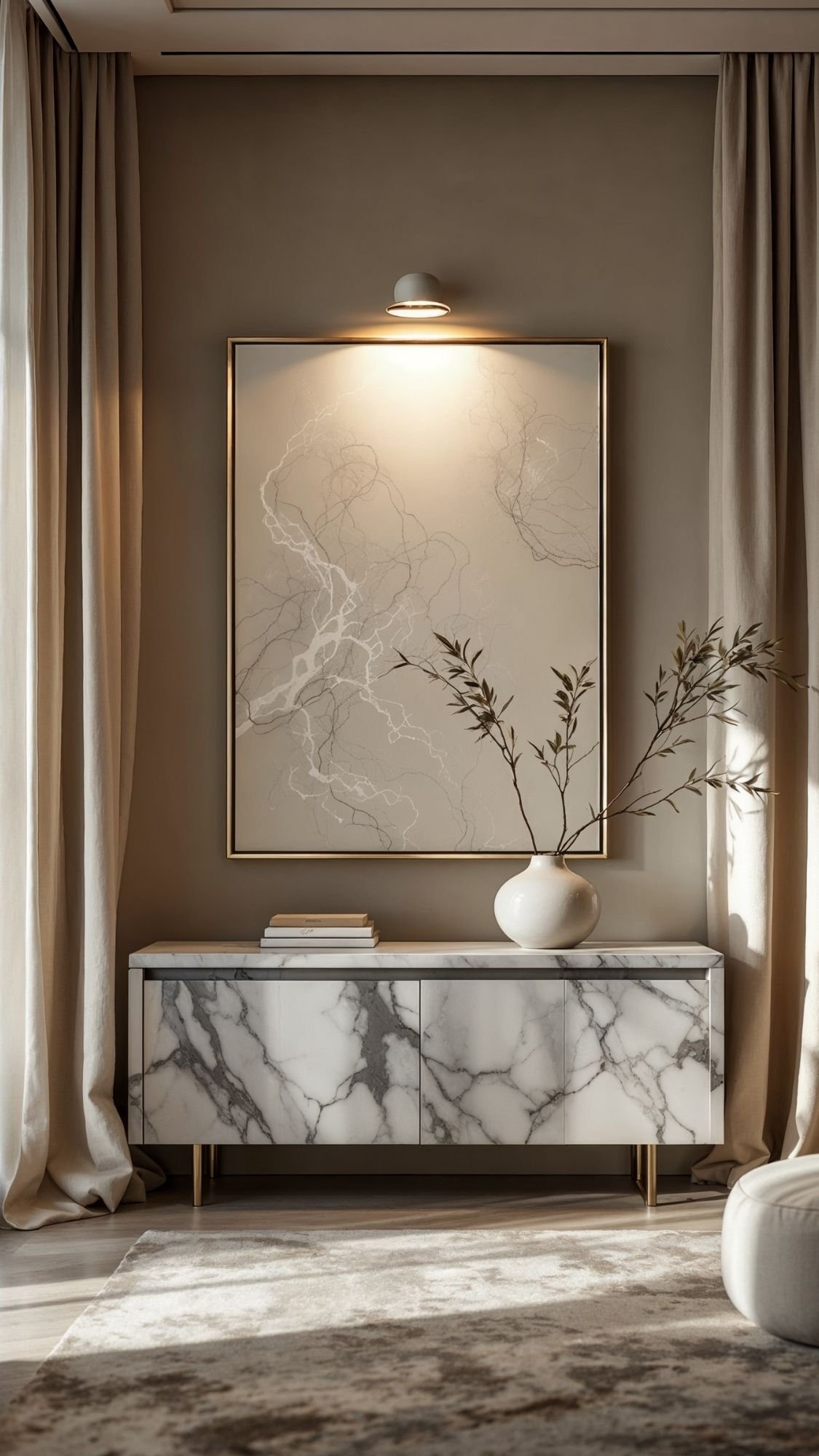
11) Cordless picture lights (turn any art into a “gallery moment”)
Cordless picture lights make even basic wall art look elevated. They add drama, highlight texture, and give the room that curated, collected feel. Ever noticed how hotels make simple art look expensive? They light it like it matters.
Pick a slim picture light in brass, matte black, or polished nickel, then mount it with damage-free strips rated for the weight. Keep the placement centered over the frame and consistent if you install more than one. Warm light always wins here, because it flatters everything, including the art you bought at 2 a.m. during an “I need to redecorate” spiral.

- 16 Color Modes & 4 RGB Dynamic Modes: Warm light 3000K, natural light 4500K, cold light 6000K, 13RGB colors and 4 RGB dy…
- 2 Control Methods & Memory Function: Manual Control- short press the picture light’s button to adjust 7 colors, long pre…
- 3-Pack Rechargeable Dartboard Light: The wireless picture light has a built-in 2000aAh rechargeable battery to make your…
How to make it look designer:
- Use one oversized piece of art instead of a cluttery wall
- Center the light and keep it proportional to the frame
- Choose warm LED so the glow feels luxe
- Keep nearby styling minimal so the lit art stays the focus
Best spots for picture lights:
- Over a statement print in the living room
- Above framed photography in a hallway
- Over a console vignette in the entry
- Over a dramatic headboard wall piece in the bedroom
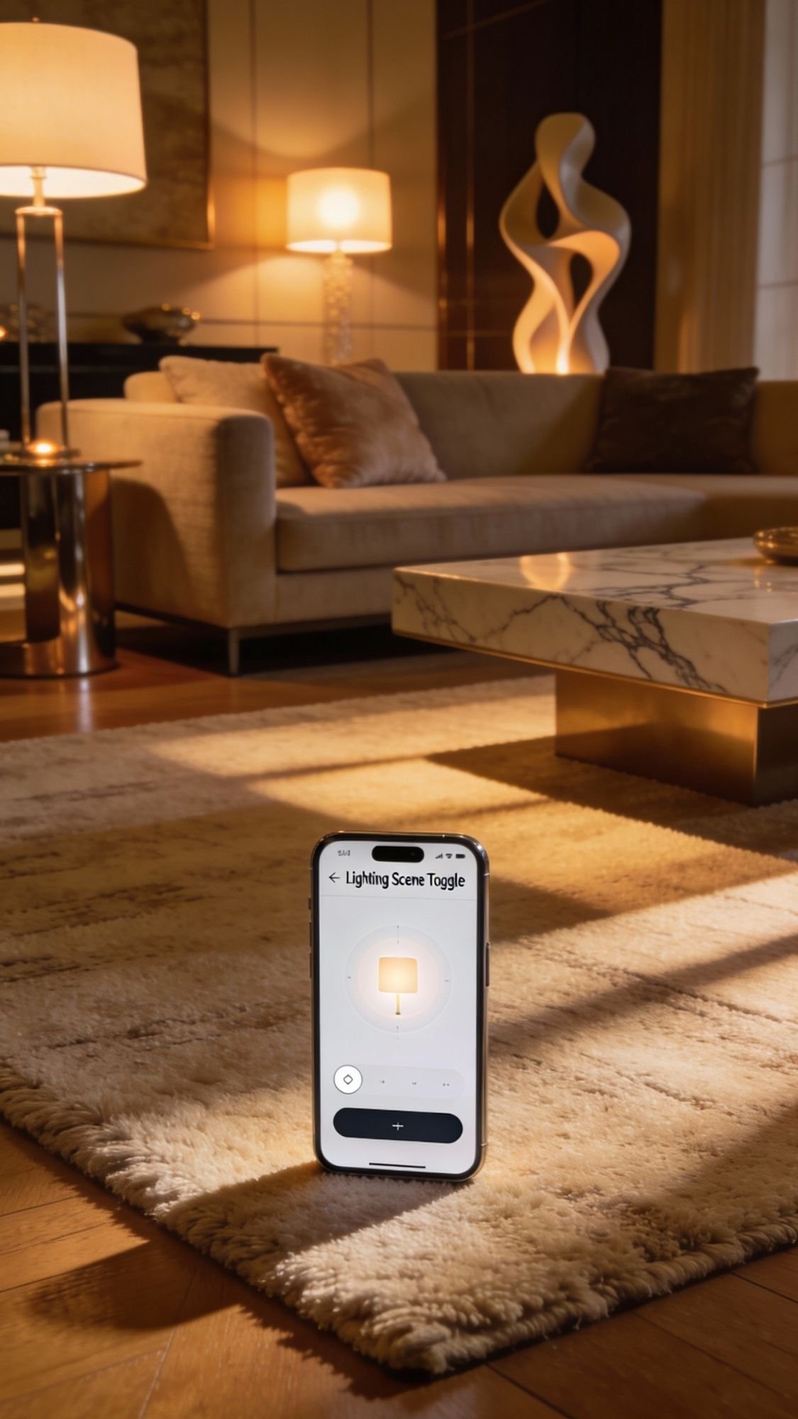
12) Smart bulbs + smart plugs (the mood lighting upgrade that feels weirdly luxurious)
Smart bulbs and smart plugs upgrade a rental without changing a single fixture. They let you control brightness, warmth, and timing, which makes the space feel modern and intentional. Ever walked into a room and felt instantly relaxed because the lighting looked soft and layered? Smart lighting lets you build that vibe on purpose instead of relying on one blinding overhead light.
Use smart bulbs in lamps and existing fixtures, then add smart plugs to anything that turns on with a switch, like a floor lamp. Set simple routines, like warm dim lighting in the evening and brighter light in the morning. Keep it subtle and consistent across the space so it feels like a design choice, not a tech demo. Nobody needs rainbow lighting unless the goal involves a gaming setup.

- Multicolor & Auto White: Dimmable 16 million colors and warm to cool whites(2500K-6500K). Set your bulb to automatically…
- Voice Control: Get hands-free control of your lights with your voice via Amazon Alexa or Google Assistant. Perfect for t…
- Remote Control: Control your smart light bulb from anywhere with your smartphone using the free Kasa smart app (iOS, And…
Luxury lighting moves that work every time:
- Set an evening scene with warm, dim light for a cozy upscale glow
- Use multiple lamps instead of one ceiling light
- Put floor lamps and table lamps on smart plugs for one-tap control
- Keep color temperatures consistent across rooms for a cohesive look
Best places to use smart lighting:
- Living room lamps for movie-night ambience
- Bedroom lamps for a softer wind-down routine
- Entry lighting so it turns on automatically after dark
- Reading nooks where you want adjustable brightness
- Voice control: Kasa smart plugs that work with Alexa and Google Home Assistant. Enjoy the hands free convenience of cont…
- Smart Outlet Control from anywhere: Turn electronics on and off your smart home devices from anywhere with your smartpho…
- Scheduling: Use timer or countdown schedules to set your wifi smart plug to automatically turn on and off any home elect…
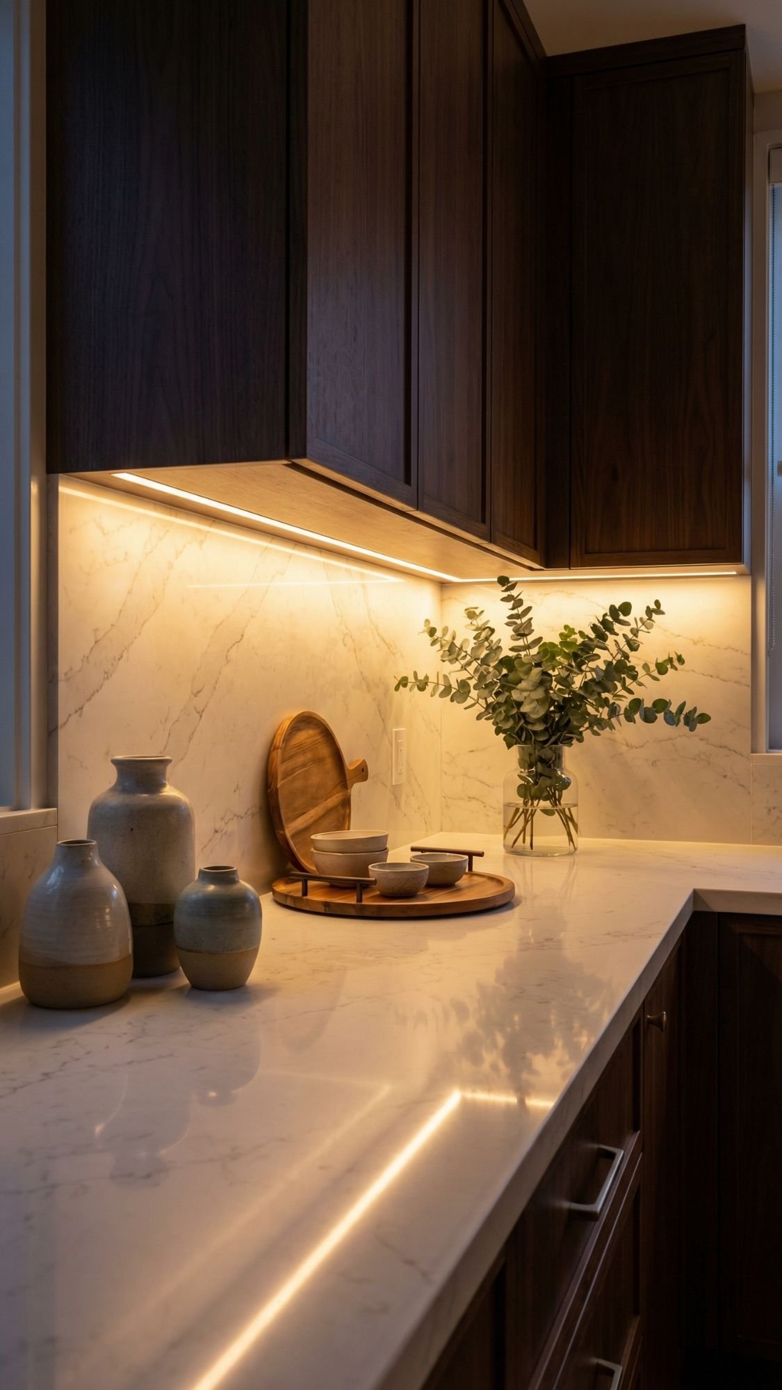
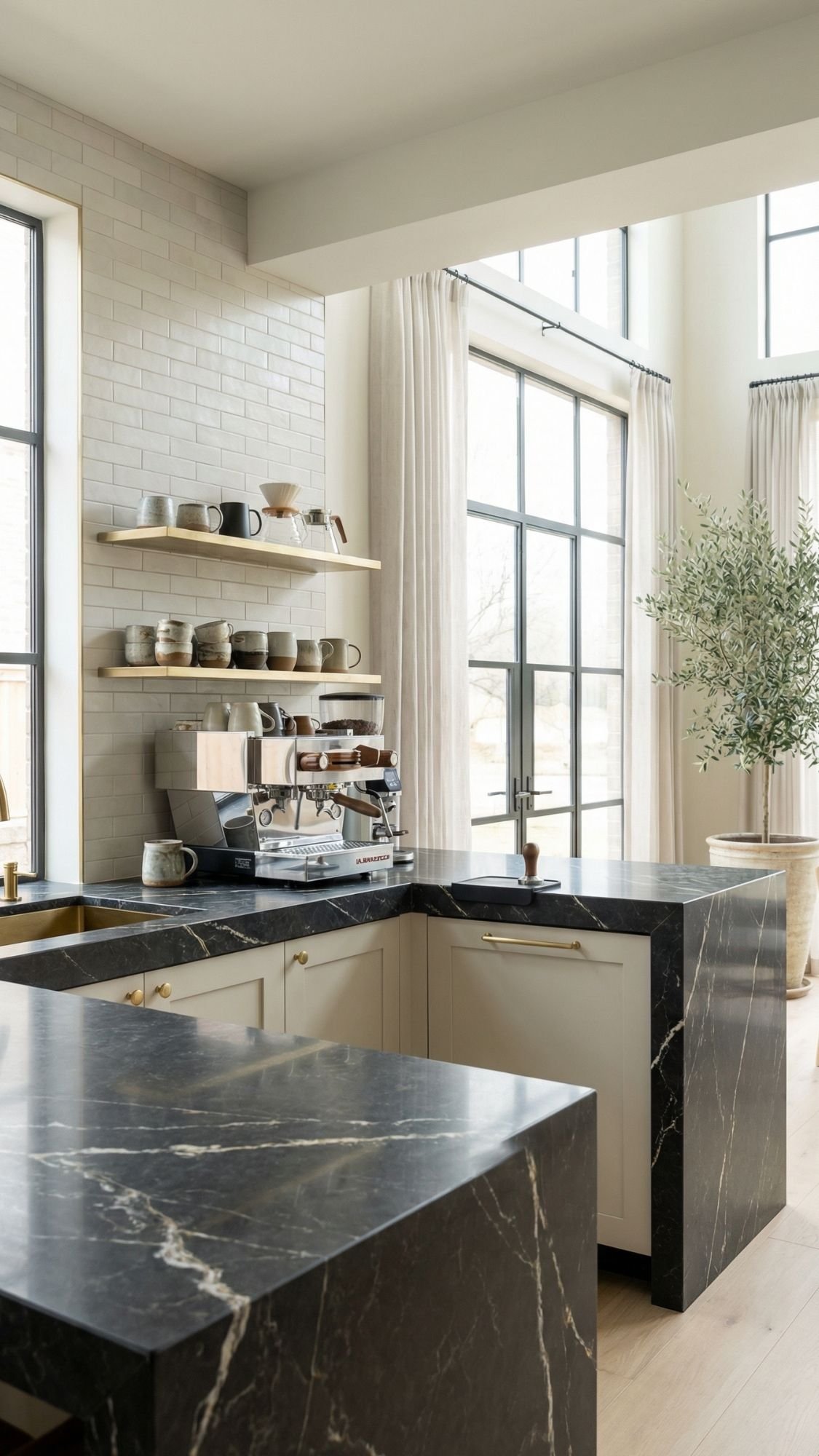
13) Under-cabinet rechargeable lighting (the “designer kitchen” trick with zero wiring)
Under-cabinet lighting makes a kitchen look instantly upgraded because it adds depth and glow where it matters. It also makes the space feel more expensive at night, when overhead lights can look harsh and flat. Ever noticed how luxury kitchens always have that soft countertop glow? This is how renters fake it.
Choose rechargeable light bars that stick on with adhesive backing or magnetic mounts. Go for warm light and a clean, slim profile so it disappears visually and lets the glow do the work. Motion-sensor versions feel especially high-end in pantries and coffee stations because the lights turn on automatically like the kitchen knows what it’s doing. Place them evenly, keep spacing consistent, and hide charging cables inside a drawer or cabinet so the setup stays sleek.

- Upgraded Motion Sensor Under Cabinet Lights: Setting the under cabinet lights on motion sensor mode, they auto-on when h…
- Always-on Mode: The under counter lights for kitchen can be also be set to be always-on, or off. The always-on feature a…
- Upgraded Dimmable Closet Lights: The cabinet lights are bright and eye-protection, thanks to 40pcs energy-saving LEDs an…
Make it look custom:
- Use warm white lighting, not cool blue
- Space bars evenly so the glow looks intentional
- Pick slim fixtures so they hide under the cabinet edge
- Add one styled zone (like a coffee station) so the lighting feels curated
Best places for under-cabinet lighting:
- Main counter run for everyday glow
- Coffee bar or beverage station for a luxury moment
- Pantry shelves for function and drama
- Bathroom vanity area for a soft, flattering light
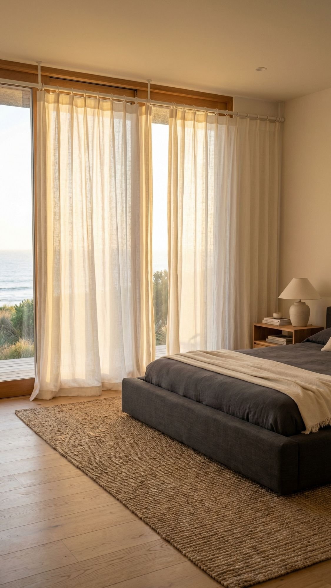
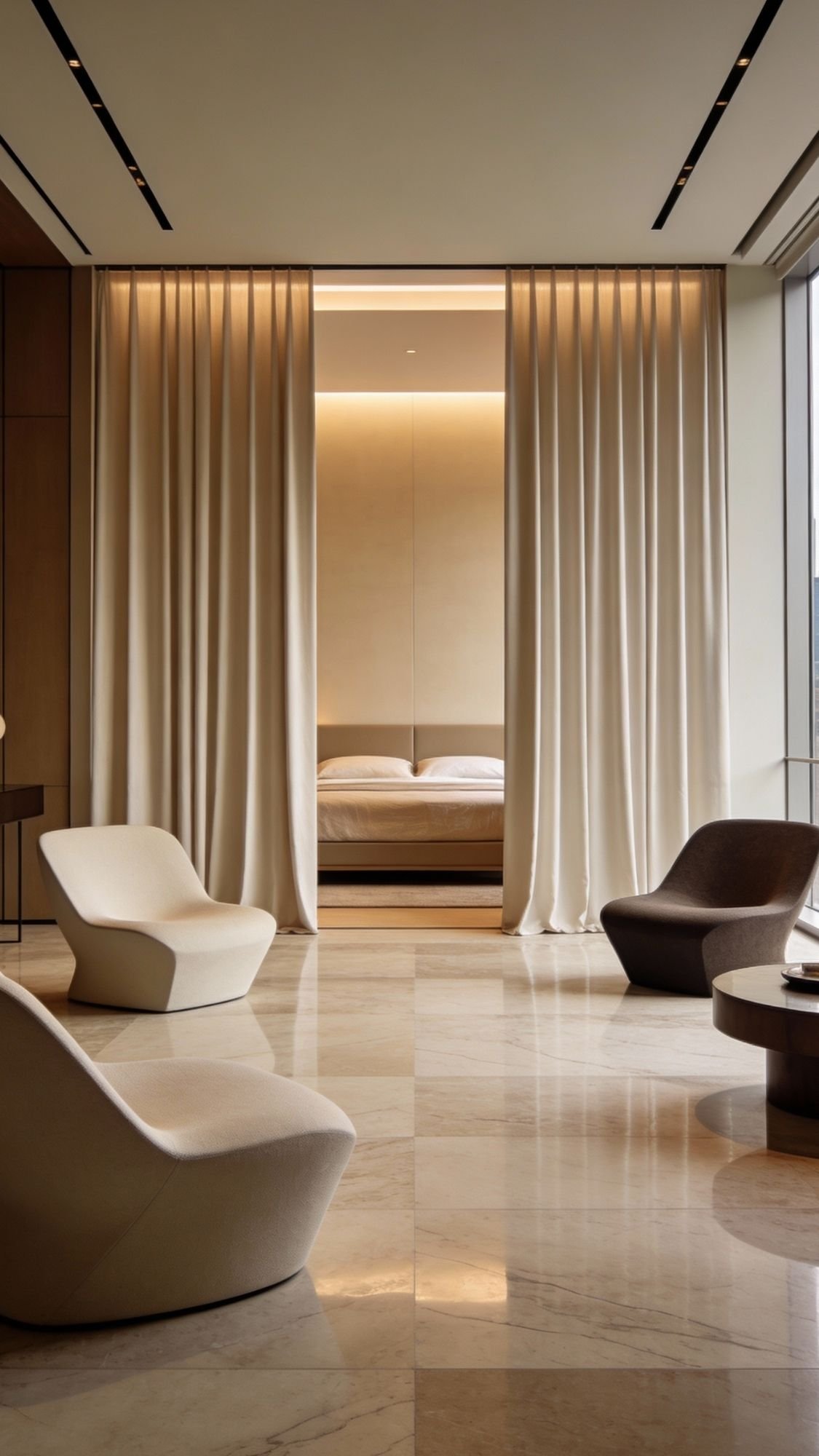
14) No-drill curtains with tension rods (softens everything fast)
Curtains instantly make a rental feel more finished. They add height, softness, and that “somebody styled this room” energy, even if the walls stay boring. Ever notice how a space looks more expensive when the windows look dressed instead of exposed? Curtains do that in five minutes.
Use tension rods inside the window frame for a true no-drill setup. Pick panels that look luxe, like linen-look or heavier woven textures, and keep them in a neutral tone that matches the room’s palette. If the goal leans high-end, choose longer panels so the window looks taller and the room feels larger. Flimsy sheer panels can look fine, but thicker fabric usually reads richer.

- Advanced Lock in System – Unlike traditional twist-and-tight designs, this large size shower curtain rods spring tension…
- Built for Strength and Stability – Upgrade your home decor with our long no drill curtain rods, featuring a sturdy 1.25-…
- Stay Secure with Anti-Slip – The tension rods for windows 83 to 123 inches ensure maximum stability after installation. …
Make no-drill curtains look designer:
- Choose linen-look or textured panels for a luxury finish
- Keep colors soft and cohesive with the room
- Use a sturdy tension rod rated for the curtain weight
- Steam the panels so they hang clean and crisp
Where this works best:
- Bedrooms for softness and privacy
- Living rooms to add warmth and scale
- Kitchens with awkward windows that need polish
- Any rental with harsh blinds that feel outdated

- Room darkening: Our curtains use precise lining technology to block out most of the light, giving you sufficient privacy…
- Luxurious linen look: These farmhouse-style imitation linen curtains don’t just look modern , they add a touch of countr…
- Versatile hanging options: Each pack comes with two blackout curtains and offers three different hanging methods. 1:You …
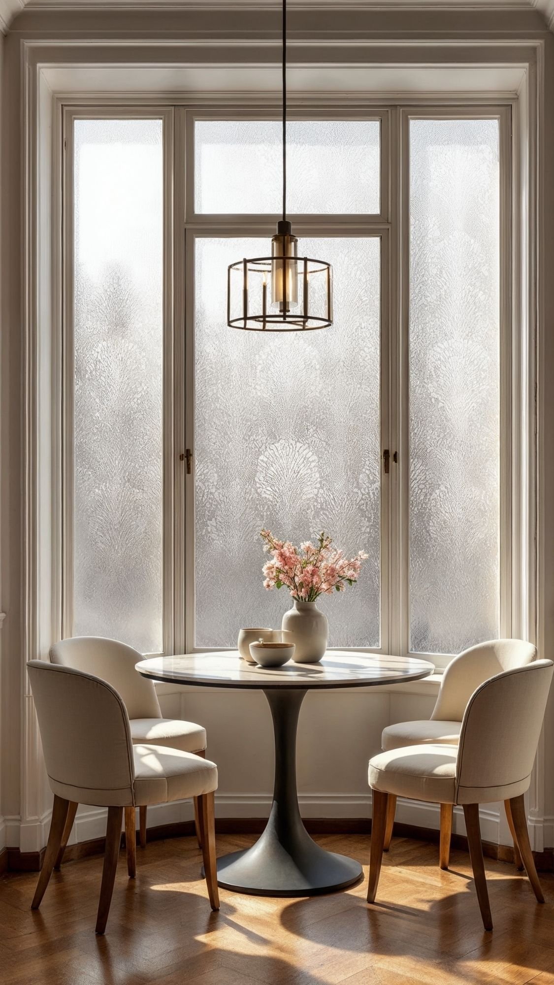
15) Window film for privacy that still lets light in (bright, private, and pretty)
Window film solves two annoying rental problems at once: privacy and ugly views. It lets natural light pour in while keeping nosy neighbors from getting a front-row seat to your life. Ever wanted to open the blinds without feeling like you just stepped onto a stage? Window film fixes that.
Choose frosted, reeded-glass, or subtle patterned films for a luxury look. Repositionable cling styles usually make removal easier later, and they help avoid sticky residue. For a smooth application, spray the glass with soapy water, position the film, then squeegee out bubbles slowly. Clean edges matter here, because crisp lines make the whole thing look custom.

- Frosted Elegance, A Touch of Art: This glass film features frost etching and staggered textures, adding soft, refined to…
- Goodbye Peeping Eyes, Hello Bright Spaces: Block unwanted views and 98% UV rays while letting natural light shine throug…
- Zero Messy Glues, Glass-Friendly Design: Forget messy adhesives—this static cling privacy film for glass windows is rent…
High-end window film styles that look expensive:
- Frosted glass look: clean, modern, spa vibe
- Reeded glass look: upscale, architectural, very “designer”
- Soft geometric pattern: elegant without feeling loud
Best places to use it:
- Street-facing living room windows
- Bathroom windows for privacy
- Entry sidelights
- Rentals with close neighbors and lots of windows
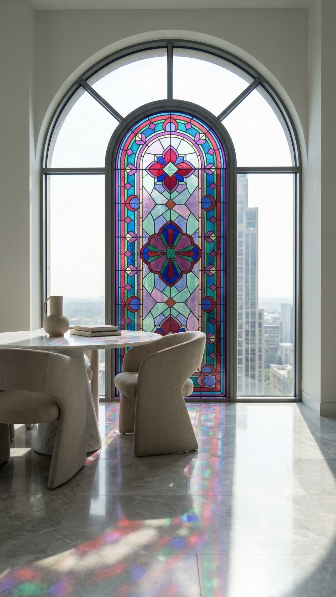
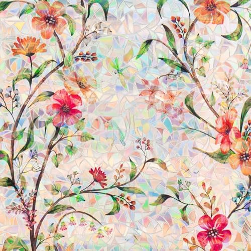
16) Temporary “stained glass” window moment (because plain glass feels boring)
A temporary stained-glass look adds color and personality without committing to anything permanent. It turns basic windows into a design feature, and it makes sunlight look dramatic in a very “expensive home editorial” way. Ever seen colored light hit the floor and thought, “Okay… that’s actually stunning”? That’s the whole vibe.
Keep it classy. Choose jewel tones, soft geometric shapes, or subtle vintage-inspired patterns instead of anything cartoon-bright. One pane can make a statement, especially in an entry, breakfast nook, or a hallway window. Style the room around it with calm neutrals so the glass effect reads intentional and not like a craft experiment.
- Privacy Protection–Offer privacy without sacrificing light,no need to worry about being peeped by passersby and neighbo…
- Static Cling Design–Super easy to apply and remove without damaging windows surface.Also,it can be reused if not be dam…
- Control Heat Anti UV–Solar control properties helps to reduce heat,soften strong and glare sunshine,save energy during …
How to make it look luxury instead of loud:
- Pick muted jewel tones or elegant geometric patterns
- Apply it to one window or one section, not every window in the home
- Keep surrounding decor minimal so the colored light stays the focus
- Clean glass perfectly first so the decal sits smooth and flawless
Best places for this upgrade:
- Entry windows for instant wow factor
- A breakfast nook window for morning light drama
- A hallway window that needs interest
- A bathroom window if you want privacy plus style

- Enjoy Natural Light and Privacy: This privacy window film is the perfect alternative to heavy curtains or blinds during …
- Beautiful Patterns, Stunning Effect: Want to add some personality to your home decor? Look no further than your windows!…
- Environmentally Friendly Design: Say goodbye to messy glue and adhesives. This static cling window film is easy to apply…
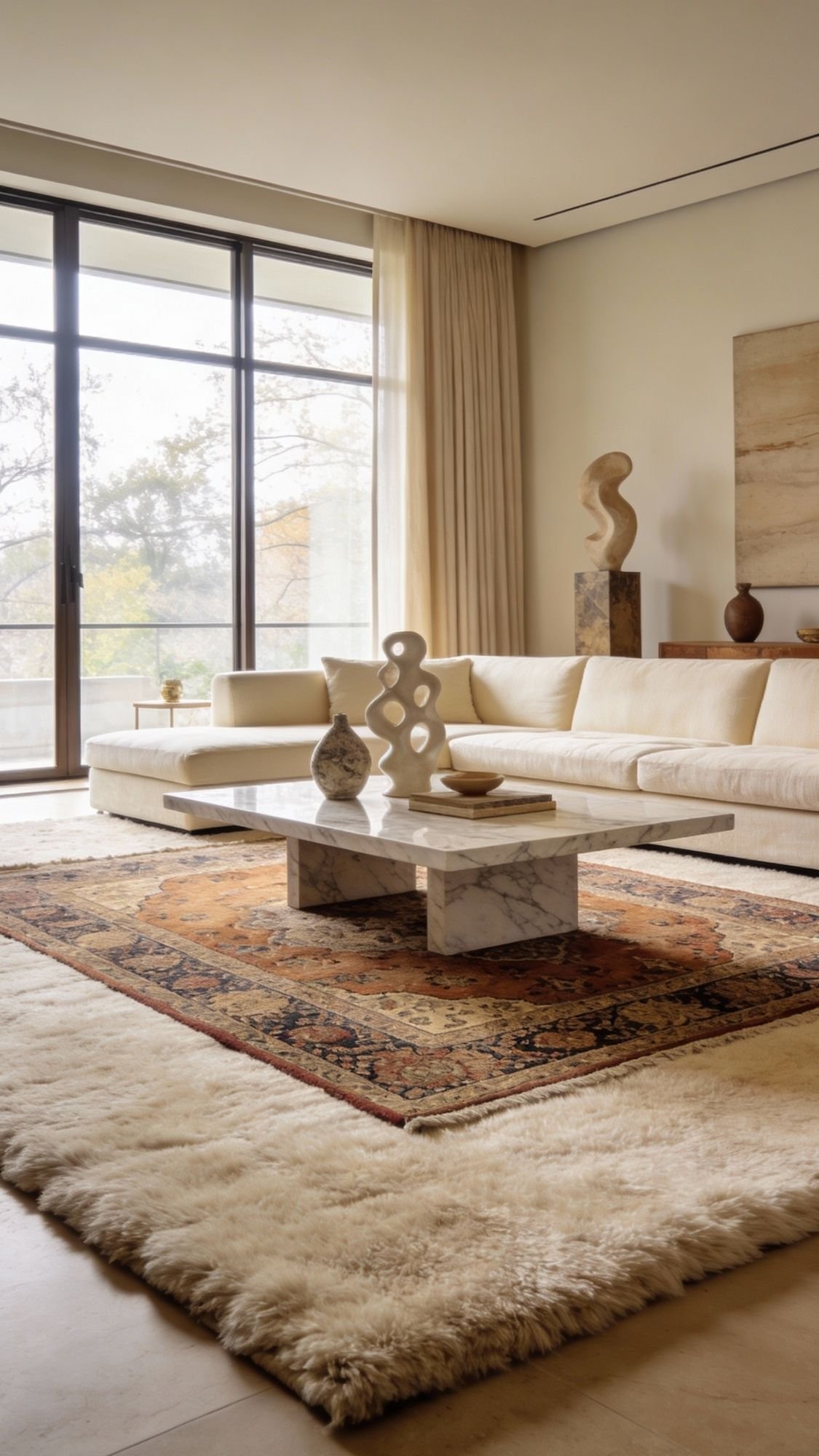
17) Rug layering to hide sad floors and add “collected” style (instant richness, zero risk)
Rug layering makes a rental feel finished fast. It covers worn floors, warms up echoey rooms, and adds that “this space has a point of view” look. Ever walked into a room and felt like something was missing, even though the furniture looked fine? The floor usually needs more love.
Start with a large base rug in a neutral texture, then add a smaller patterned rug on top. The base rug sets the tone and size, while the top rug adds personality. Keep colors in the same family so it reads intentional and luxe. If the rugs slide around, use removable rug tape or a non-slip pad that comes up clean.
- 100% POLYPROPYLENE PILE
- USABLE EVERYWHERE: This woven rug is perfect for both indoor and outdoor use, making every room more stylish and comfort…
- EASY TO MAINTAIN: Our stain-resistant and non-shedding rugs for living room can be easily cleaned with a hose or a vacuu…
Luxury rug layering formula:
- Base rug: large, neutral, textured (wool, jute-look, or low-pile)
- Top rug: smaller, patterned, vintage-inspired for character
- Keep a 2–6 inch border of the base rug visible around the top rug
- Add a coffee table or ottoman to anchor the layered look
Best rooms for rug layering:
- Living rooms with open layouts
- Bedrooms where you want softness underfoot
- Home offices to make them feel less “temporary”
- Rentals with tile or laminate that feels cold
- ❤️[VINTAGE STYLE DESIGN] – These rugs are designed with intricate vintage-inspired patterns to add a touch of sophistica…
- ❤️[KIDS & PETS FRIENDLY] – Our carpets cozy and soft, comfort and safety with plush materials and non-slip backing. Love…
- ❤️[WASHABLE & EASY TO CLEAN] – Enjoy hassle-free cleaning with our ultra-thin rugs. Stain-resistant and machine washable…
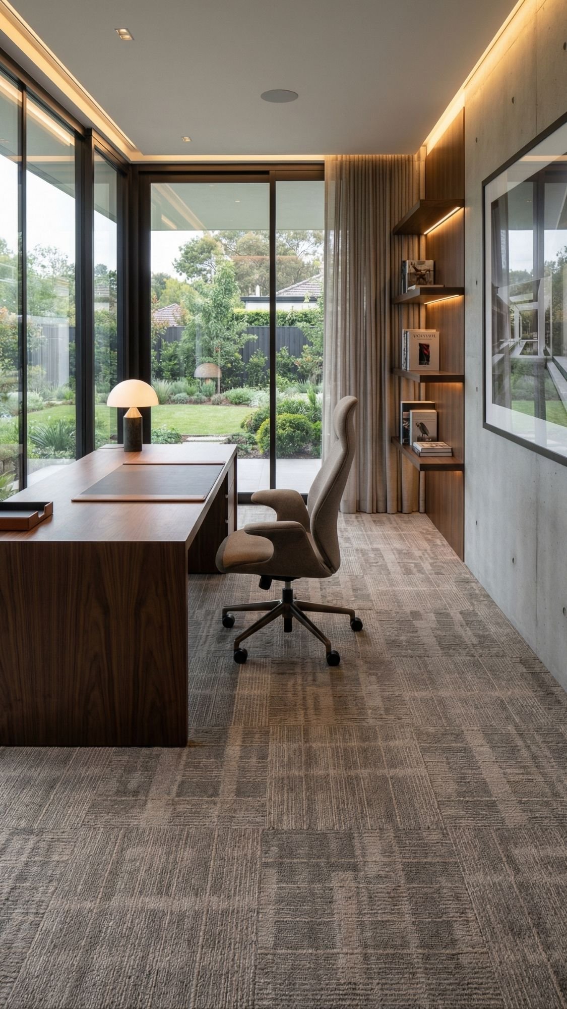
18) Carpet tiles for rental-friendly floor fixes in awkward rooms (replace one tile, not your sanity)
Carpet tiles fix rental flooring problems without a full rug takeover. They work especially well in rooms where a big rug feels impractical, like a small office, a play area, or a weird corner that never looks finished. Ever tried to make an awkward room feel cozy and it still looked… unfinished? Carpet tiles can give it structure fast.
Choose tiles with a tight, low-pile finish so they look sleek and modern, not like office carpet from the early 2000s. Stick to neutrals or subtle patterns for a luxury vibe, and lay them in a clean grid so the room feels tailored. The best part: if one tile gets stained, you swap that one tile instead of panicking over the whole floor.

- Easy Peel & Stick Installation: Self-adhesive carpet tiles feature a strong self-adhesive backing. Simply peel off the f…
- High quality: Carpet tiles are meticulously crafted from 100% heavy-duty polyester, an adhesive layer, and precision-pri…
- Easy to cut: Each tile measures 24“ x 24” and can be trimmed with scissors or a utility knife to fit edges, corners, or …
Make carpet tiles look high-end:
- Pick low-pile textures for a clean, modern finish
- Choose subtle patterns like tonal grids or soft heathered neutrals
- Keep alignment perfect so seams look intentional
- Save a few extra tiles for future replacements
Best places to use carpet tiles:
- Home offices where you want comfort and polish
- Kid zones where spills happen regularly
- Basement rentals that feel cold underfoot
- Small bedrooms with odd layouts
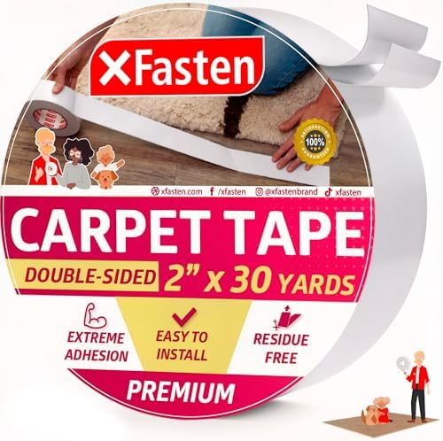
- Secure area rugs and carpets in place with our double sided carpet tape heavy duty. Our double sided tape for rugs to st…
- Unlike other double sided rug tape for carpet floor, our area rug tape for tile uses a RESIDUE-FREE adhesive that DOESN’…
- Our carpet tape for hardwood floors is vacuum-friendly and repositionable while maintaining MAX ADHESIVE STRENGTH; it’s …
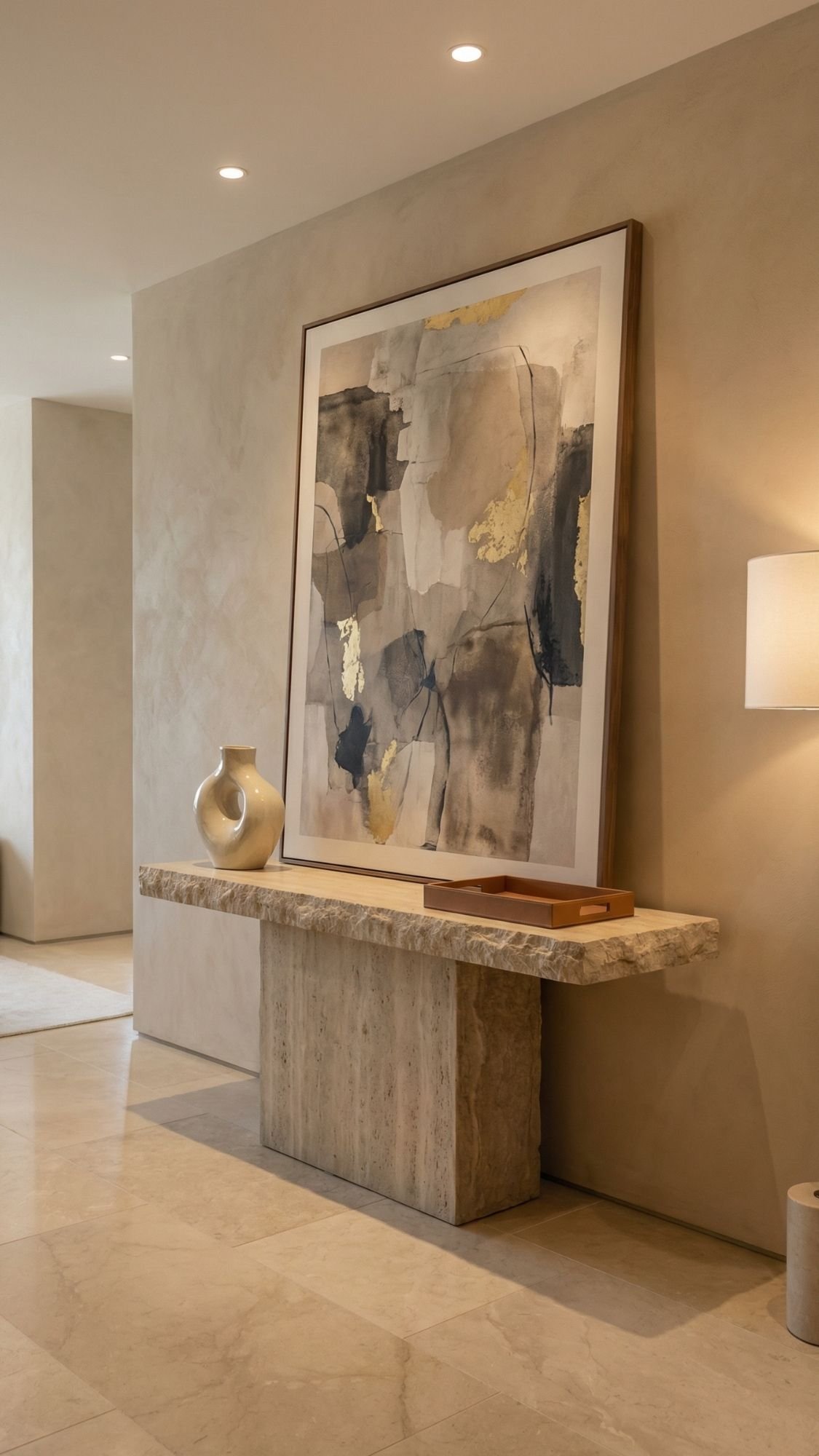
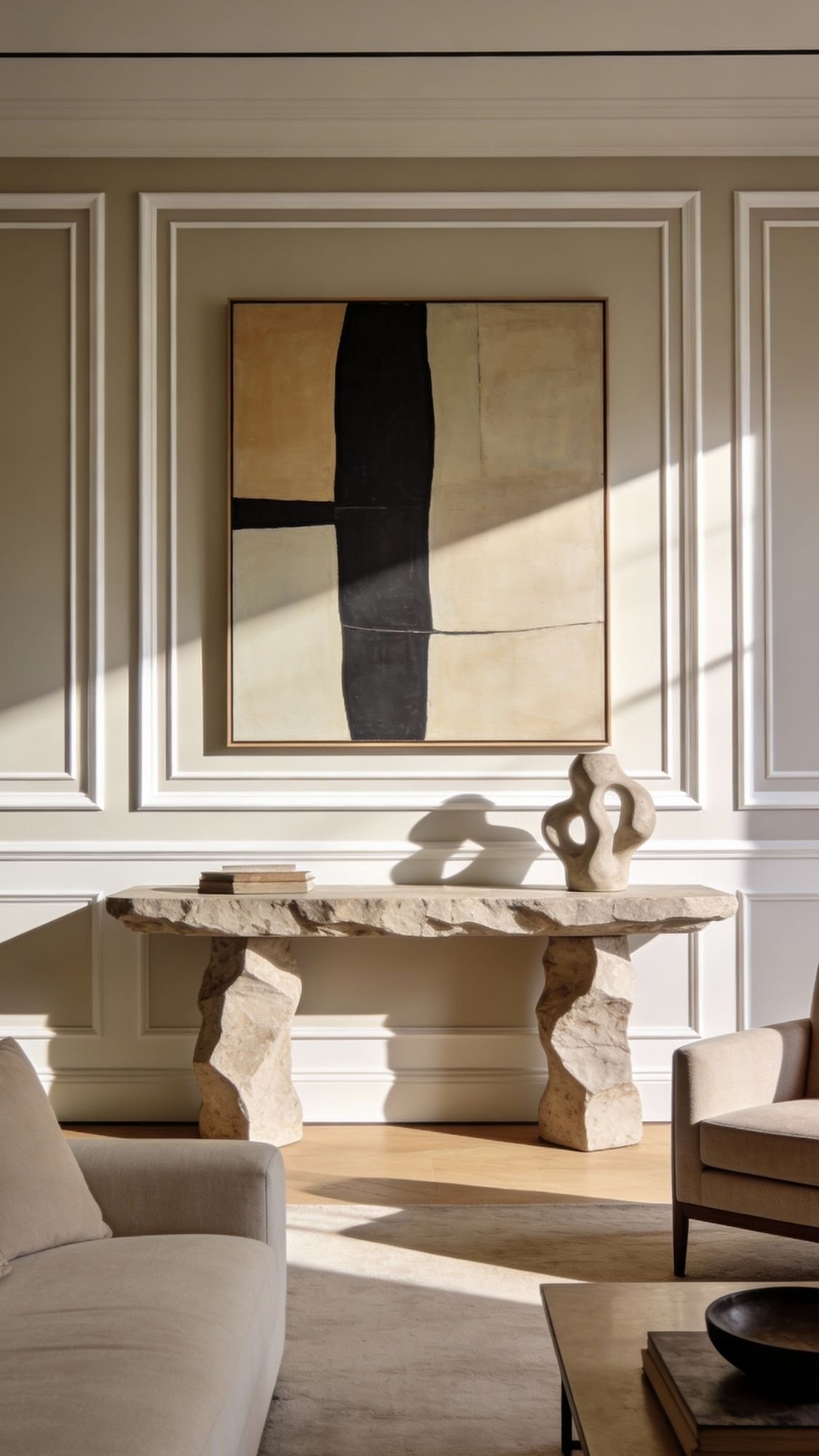
19) Lean oversized art instead of hanging it (lazy, but make it editorial)
Leaning oversized art gives a room instant “designer styling” without putting a single hole in the wall. It looks intentional, it feels collected, and it makes a space feel more high-end because scale always reads expensive. Ever notice how luxury homes use fewer pieces, but they go bigger? This is that move.
Place a large framed piece on the floor and lean it against the wall behind a console, a low dresser, or even a bench. Keep the frame simple and elevated, like black, walnut, or thin brass. If you worry about slipping, use museum putty under the frame corners so it stays stable without damaging surfaces. Skip cluttery groupings nearby so the art stays the star.

- Self-assembly required: This product needs to be assembled by you. The instruction manual is included, just follow the s…
- Diverse Sizes: The measured size is 72 IN x 48 IN. Choose from a variety of sizes to meet different spatial requirements
- Premium Canvas: Crafted from high-quality canvas, this artwork is sturdy, showcasing both quality and taste
How to make leaned art look truly luxe:
- Choose one oversized piece instead of multiple small frames
- Keep the frame finish consistent with the room’s metals or woods
- Add one styling element nearby, like a sculptural vase or a stack of books
- Avoid leaning art in tight walkways where it can get bumped
Best spots for leaned art:
- Entry consoles for an instant statement
- Living rooms behind a low media console
- Bedrooms behind a dresser for a soft gallery feel
- Dining rooms on a sideboard wall

- Ideal for securing antiques, collectibles, and other breakable items from falling
- Works on almost any surface
- Easy to apply with its pliable texture
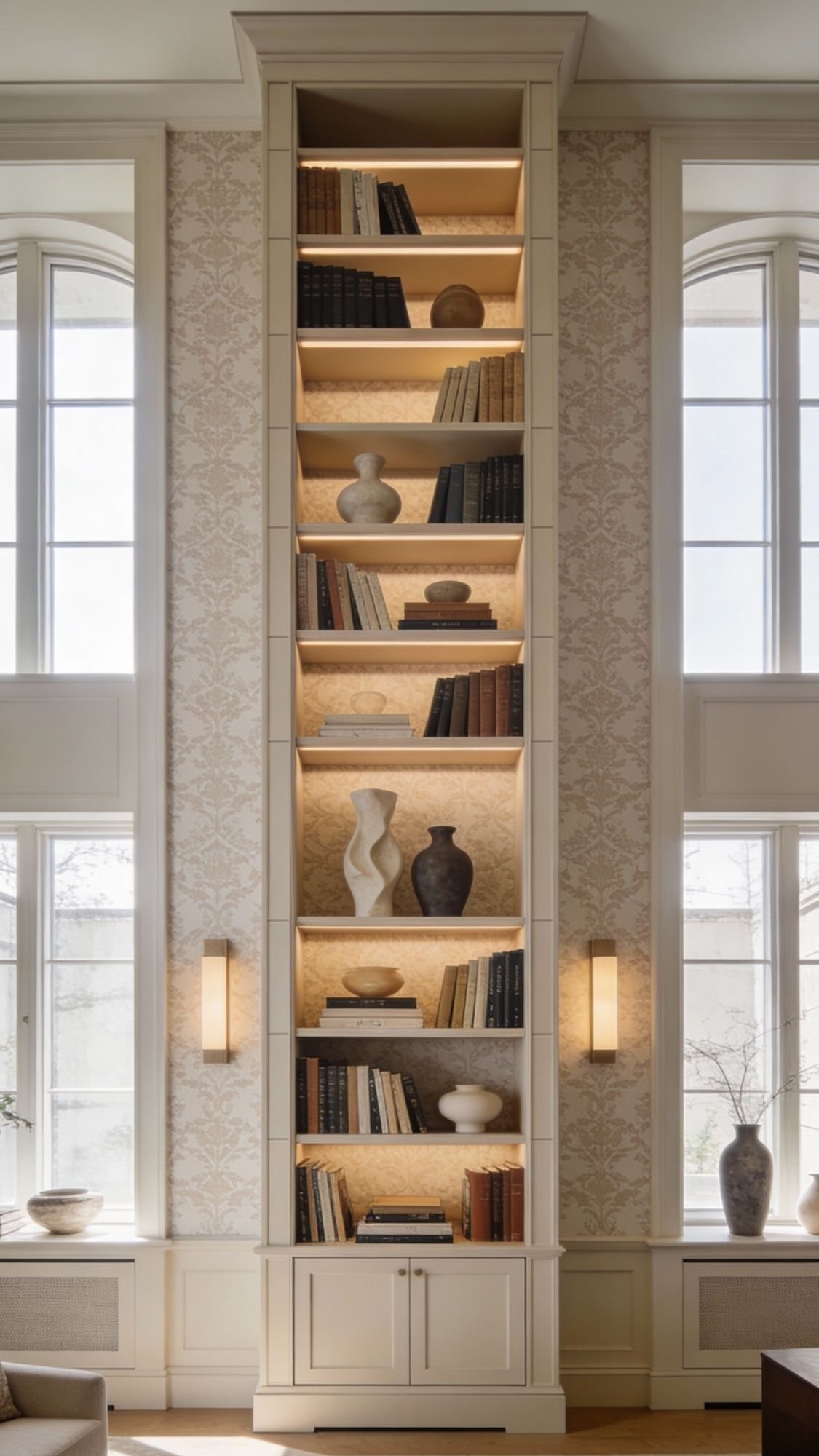
20) Create a “built-in” look with a tall bookcase + peel-and-stick backing (custom vibes, no construction)
A tall bookcase can look like a built-in when it fills vertical space and looks styled on purpose. Add peel-and-stick wallpaper to the back panel and suddenly it feels custom, like the shelf came with the home and not from a flat-pack box. Ever seen a shelf that looks expensive even when it clearly isn’t? The backing and styling do that.
Choose a bookcase with clean lines and a solid color, then add a subtle removable wallpaper backing in a tonal pattern or texture look. Keep the shelf styling curated with a mix of books, objects, and negative space. Too much stuff makes it look like storage. A luxury shelf always looks like it has room to breathe.

- 【Unique Design】Delicated wallpaper design, the perfect combination of pink and white can create a Whole new look to live…
- 【SIZE&MATERIAL】17.71In X 118.1In=14.5sq.ft.Exclusive Designed wallpaper is made of vinyl. We have upgraded the wallpaper…
- 【FEATURE】Quick and easy to install – Just peel and stick! Removable vinyl floral wallpaper thick enough which will conce…
How to make it look built-in and expensive:
- Use a tall bookcase that feels close to ceiling height
- Add peel-and-stick wallpaper backing in a soft neutral or tone-on-tone pattern
- Style with the “rule of threes” so objects look intentional
- Mix textures: ceramics, wood, stone, glass, and a little greenery
- Leave empty space so it looks curated, not crowded
Best places for this trick:
- Living rooms that need a focal point
- Home offices that feel bare
- Dining rooms with unused wall space
- Bedroom corners that need purpose

- Upgraded Premium Functionality: Built-in 84 super bright LEDs, the Gritin under cabinet light is crafted with aluminum a…
- Adjustable 3-Color Temperature & 5-Brightness: Equipped with 3 color temperatures: warm (3000K) for cozy spaces, cool (6…
- 4 Lighting Modes: The motion sensor lights support four modes to meet the needs of different occasions: OFF Mode, Night …
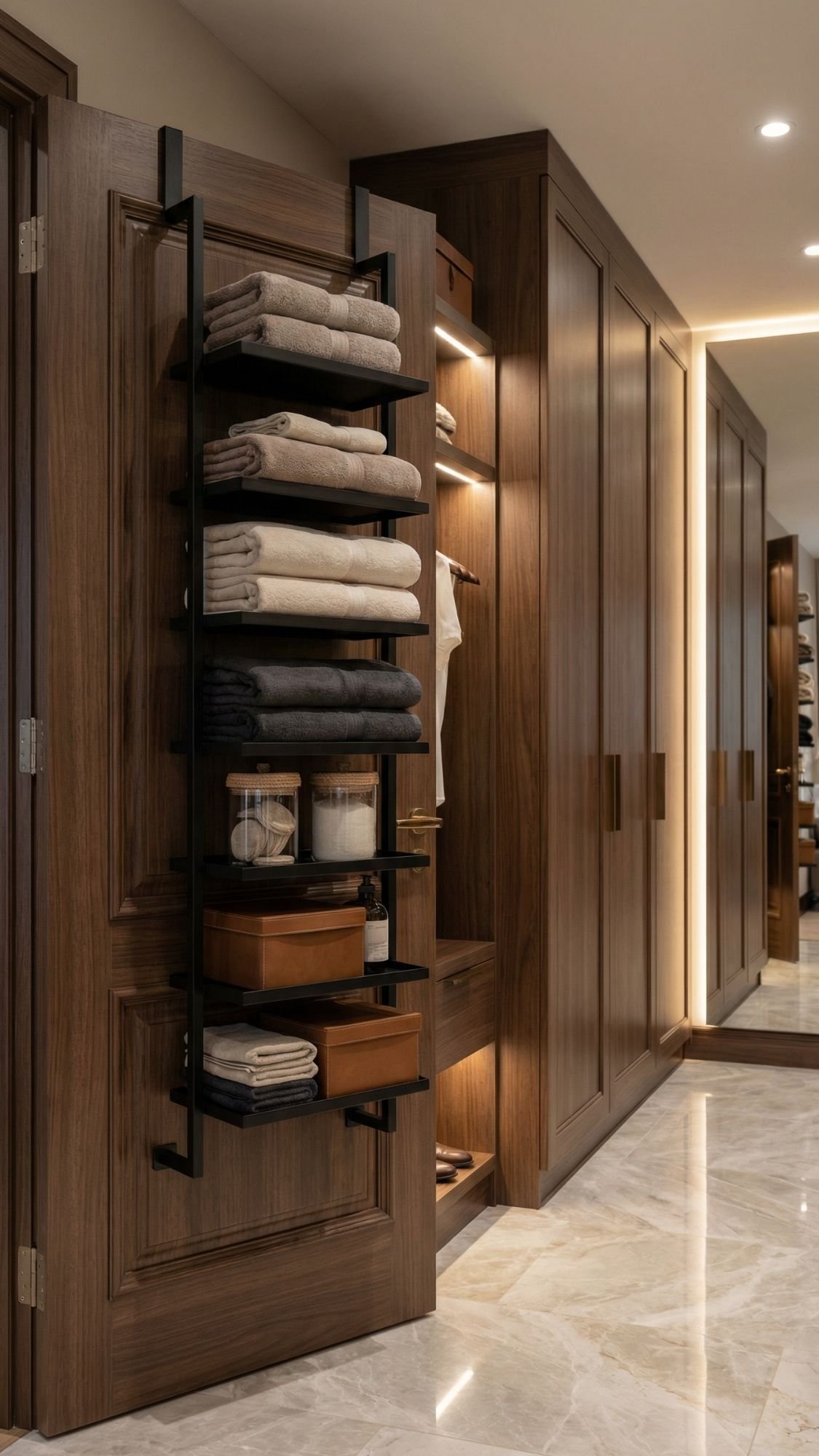
21) Over-the-door organizers that look intentional, not like a dorm (storage, but make it chic)
Over-the-door organizers save rentals from clutter without adding holes to walls. The trick is choosing versions that look clean and elevated, because the wrong one can scream “college apartment energy” in the worst way. Ever tried to get organized and somehow the organizer made the room look messier? This avoids that.
Look for matte metal, woven textures, or neutral fabric organizers with structured pockets. Keep the contents neat and consistent, like rolled towels, matching bottles, or pantry items decanted into uniform containers. When everything looks cohesive, the organizer reads like a design choice instead of a desperate storage situation.

- Adjustable Door Fastener: No need to worry about door thickness! Our adjustable door fastener ensures a customized, secu…
- Adjustable Basket Height: Designed to hold bottles of varying heights, the adjustable baskets provide greater flexibilit…
- Dense Mesh Baskets with Guardrails: The dense mesh design features a flat, supportive base that securely holds small ite…
How to make it look luxe:
- Choose neutral colors and structured materials
- Stick to matching containers inside the pockets or shelves
- Keep heavier items low so it stays stable
- Avoid overfilling so the door still closes smoothly
Best places to use it:
- Pantry doors for snacks, spices, or wraps
- Bathroom doors for towels and skincare backups
- Bedroom closet doors for accessories
- Laundry room doors for supplies and too
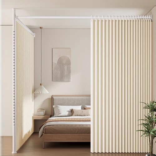
22) A tension-rod “room divider” that doubles as a vibe upgrade (studio life, upgraded)
A tension-rod room divider creates zones without building walls or drilling anything. It makes a studio or open layout feel more intentional, and it gives “separate spaces” energy even when the floor plan says otherwise. Ever wished the bed didn’t feel like it lived inside the living room? This fixes that.
Use a ceiling-to-floor tension pole system or a heavy-duty tension rod setup, then hang drapery panels that look luxe. Choose heavy linen, textured blackout panels, or soft woven neutrals so the divider reads expensive and not like a temporary curtain hack. Keep the divider line straight, keep panels long, and keep the hardware minimal so it feels architectural.
- Heavy Duty Metal Curtain Rod: Crafted from high-quality stainless steel, this room divider rod combines durability with …
- Adjustable: This versatile room divider tension rod offers adjustable length from 82″ to 102″ and height from 6 ft to 10…
- Room Divider Rod No Drilling: This floor to ceiling room divider rod requires no drilling or wall damage, making it a pe…
How to make it look custom and high-end:
- Use floor-length panels for height and drama
- Choose heavier fabric so it hangs smoothly
- Keep the color neutral so it blends into the room
- Add one styled zone on each side so it looks intentional
Best ways to use a tension divider:
- Create a sleeping zone in a studio
- Separate an office corner from the living room
- Hide storage or a clothing rack cleanly
- Build a dressing area without rearranging the whole space
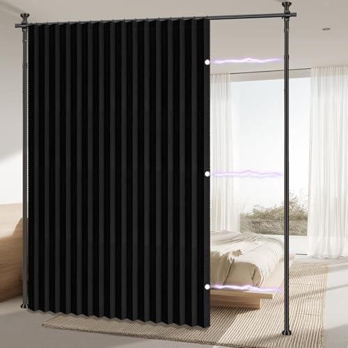
- Privacy & Blackout: AJAZZ room divider curtain 100 % blackout curtains, studio or office into an instant private zone wi…
- No-Drill Tension Rod Included: Adjustable height & width, curtain rods no drilling, zero damage, perfect for renters or …
- Built-in Sound-Dampening weave: Dense triple-weave fabric absorbs echo & room noise, ideal for dorm, apartment, podcast …
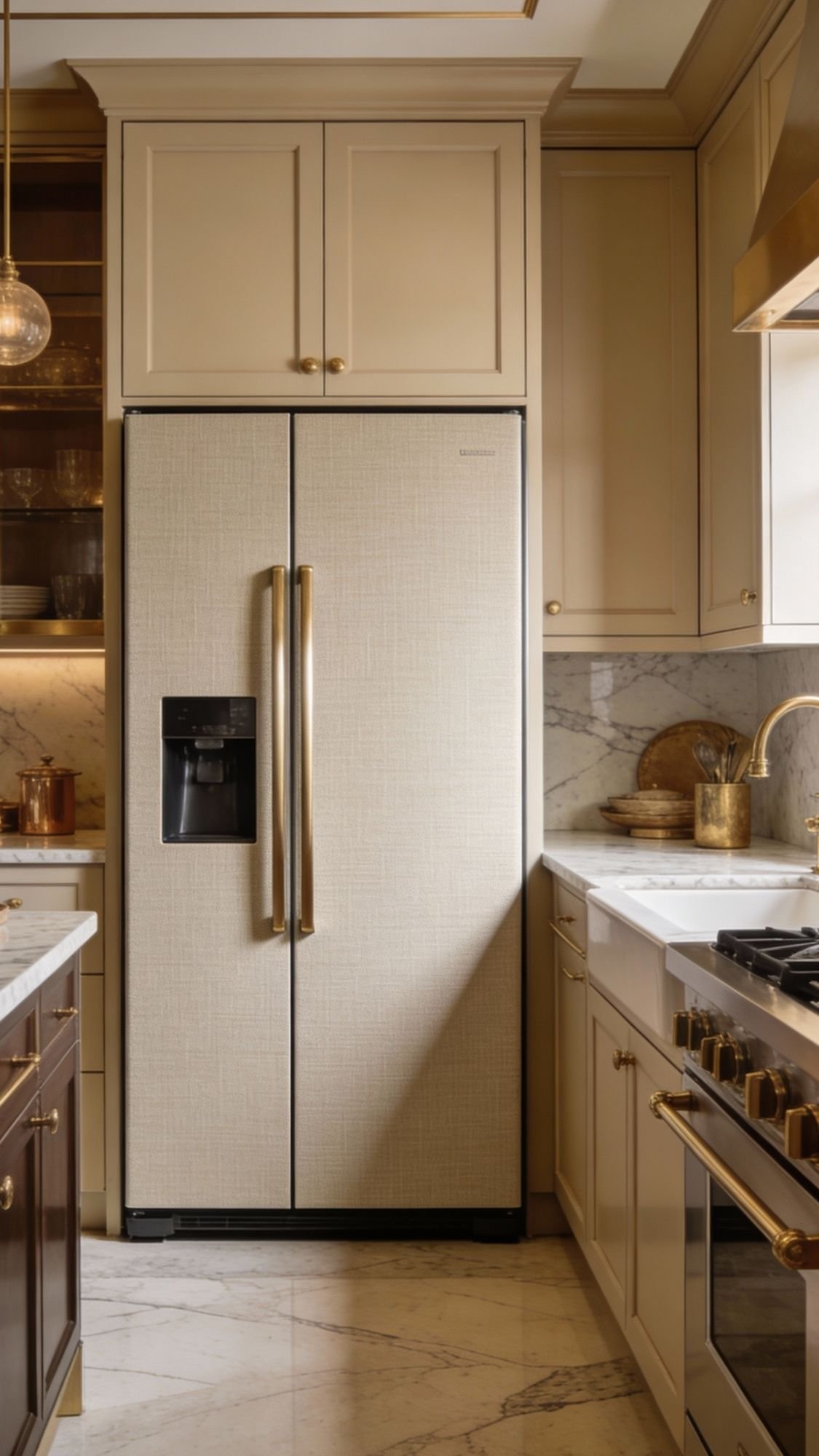
23) “Swap the vibe” with removable decor on appliances (yes, even the fridge)
If the appliances look dated, scratched, or mismatched, the whole kitchen can feel older than it actually is. Removable vinyl or peel-and-stick wallpaper lets you give the fridge or dishwasher a clean new look without committing to anything permanent. Ever seen a kitchen that looks fine except for the one sad appliance that ruins the vibe? This handles that.
Choose a wrap that looks elevated, like a subtle linen texture, matte neutral tone, or a sleek modern finish that matches the cabinet palette. Apply it carefully, trim edges cleanly, and keep seams hidden. Avoid covering vents, control panels, or anything that needs airflow. When it looks smooth and intentional, it reads like a designer finish instead of a DIY shortcut.
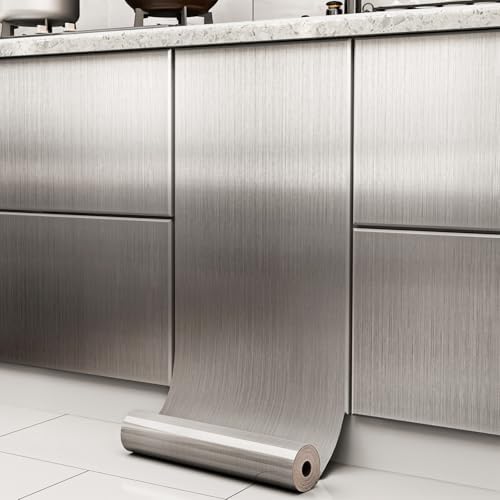
- 【DETAILS】:17.7 inches×78.7 inches(1.48 ft×6.56 ft), covers 9.71 sq.ft. Strong coverage, upgrade and thicken stainless st…
- 【EASY TO INSTALL】:Stainless steel contact paper. There are precise grid lines on the back of the paper, which can be cut…
- 【SELF-ADHESIVE & REMOVABLE】:Metallic wallpaper is not magnetic and will not interfere with the normal use of magnetic pr…
How to make appliance wraps look luxury:
- Pick matte or satin finishes for realism
- Keep colors in the same family as the cabinets and counters
- Trim edges sharply so it looks seamless
- Do one appliance first, then decide if the room needs more
Best appliances for this trick:
- Fridges with visible scratches or outdated color
- Dishwashers that clash with the rest of the kitchen
- Mini fridges in bedrooms or studios
- Laundry machines in open laundry closets
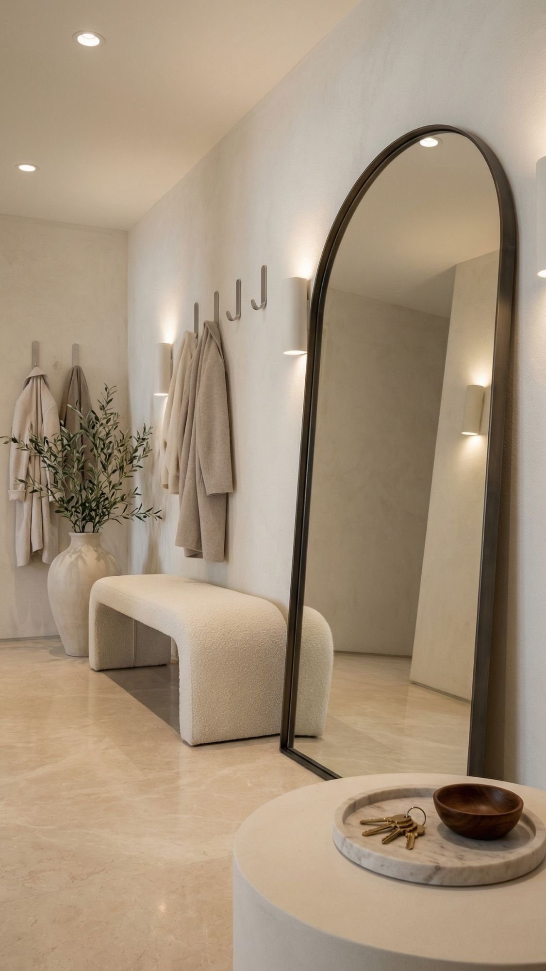
24) Make your entry feel “custom” with a no-drill drop zone (because chaos should not greet you at the door)
A no-drill entry drop zone makes a rental feel instantly more polished and functional. It creates that “this home has systems” energy, even if the space is tiny. Ever walked in and immediately lost your keys, bag, and patience? This solves that.
Use a slim bench or stool, add a tray for keys, and lean a tall mirror against the wall for a high-end look. Then use damage-free hooks for lightweight essentials like a small bag, a dog leash, or hats. Keep the styling minimal and consistent so it looks like a designer entry moment instead of a pile of survival gear.

- Glass
- Full-Length Mirror:71″ x 26″ full-size mirror, enough for you to see your entire figure in a single glance and bring you…
- Safety Glass: Our full length mirror is made of HD-definition glass, explosion-proof materials, The glass is reinforced …
Luxury entry formula that always works:
- Leaned arched mirror for height and light
- Slim bench or sculptural stool for function
- Stone or marble tray for keys and small items
- Damage-free hooks for lightweight grab-and-go items
- One elevated detail: a candle, a vase, or a small lamp
Make it look expensive:
- Stick to one metal finish (brass or black usually wins)
- Keep the tray and decor edited, not cluttered
- Add a soft runner rug to anchor the space
- Use a basket under the bench for hidden storage

- 【Warm & Rustic Entry Table】Want to add charm and character to your space? This rustic sofa console table combines a rich…
- 【Extra Thick Top Surface】Crafted with a 4cm thick particleboard, the tabletop of the entry console table offers a durabl…
- 【O-Shaped Frame with 2 Shelves】This rustic console table features a sturdy O-shaped metal frame with 2 built-in storage …
No drill, no drama, still looks expensive
Renters can absolutely make a space feel custom without risking the deposit. The best upgrades stay simple and high-impact: a statement wall, better lighting, window upgrades, and smart styling moves that make everything feel intentional. Ever notice how luxury homes rarely rely on one “big thing”? They stack small upgrades until the whole space looks polished.
Here’s the easiest way to pull it all together:
- Pick one visual hero (wallpaper, molding, or backsplash)
- Add two lighting upgrades (plug-in sconces + under-cabinet lighting works every time)
- Finish with one softness layer (curtains or rug layering)
- Keep the palette cohesive so the room feels designed, not chaotic
When move-out day arrives, slow removal and a little patience save the day. No last-minute wall patching, no panic-cleaning adhesive residue, no awkward “please don’t charge me” emails. Just a great-looking home that never needed a drill in the first place.