“As an Amazon Associate, I earn from qualifying purchases. If you click a link and make a purchase, I may receive a small commission at no extra cost to you. This helps keep my design guides free and honest—thank you for the support!”
Quiet luxury doesn’t mean “spend like a celebrity.” It means choose fewer things, choose better things, and stop letting random clutter run the room. You want that calm, expensive-looking space that feels intentional… not like a clearance aisle exploded in your living room. Ever notice how some homes look “high-end” even when they barely have anything in them? That’s not magic—that’s restraint, texture, and smart upgrades. This list keeps it realistic, budget-friendly, and very “you’ve got taste” without trying too hard. Let’s get into it.
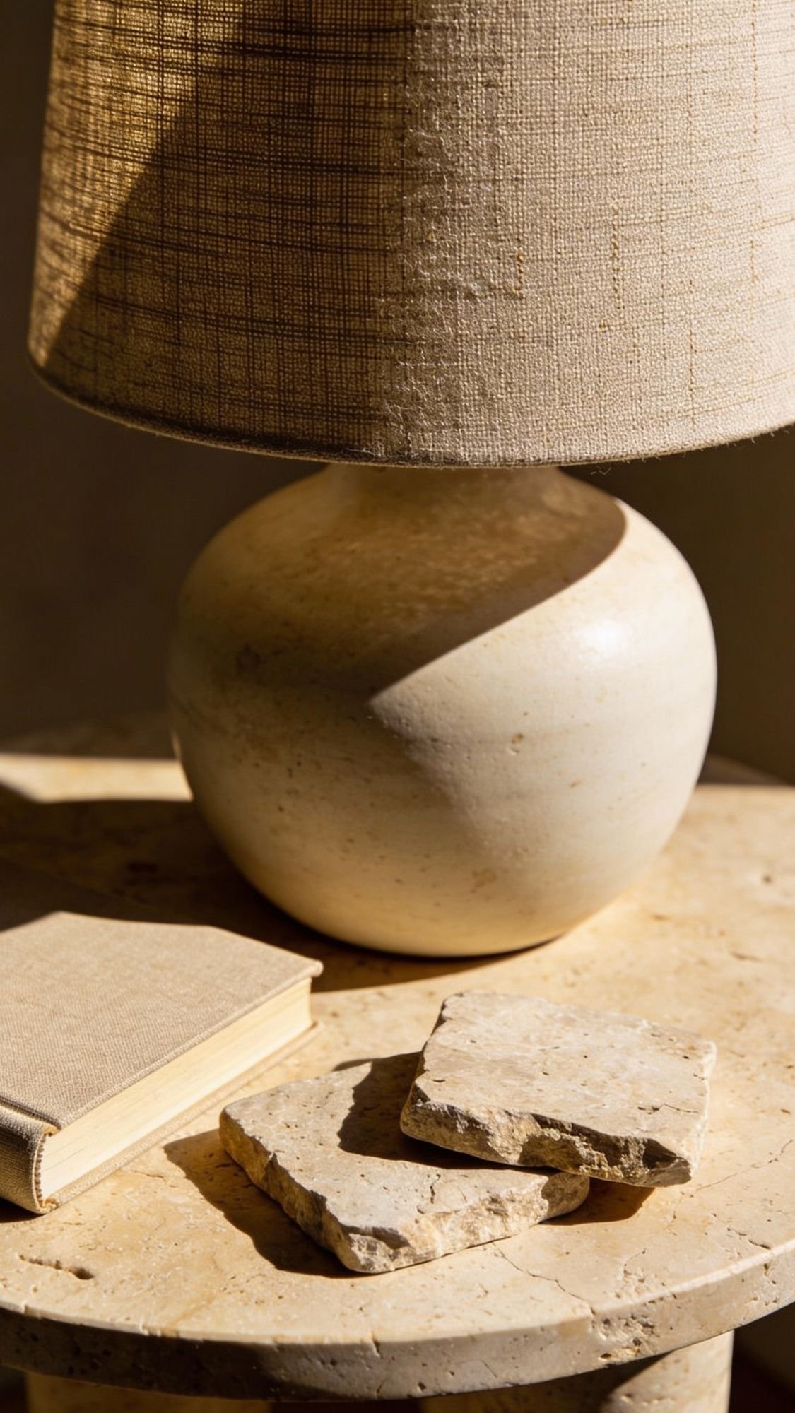
1) Build a “Rich Neutral” Palette (Without Going Full Beige Monotone)
Quiet luxury starts with color that feels calm and expensive, and rich neutrals deliver every time. Warm mushroom, creamy ivory, soft taupe, gentle greige—these shades create that “designer did this” look without screaming for attention. The trick comes from adding depth, not stacking fifty shades of oatmeal and hoping for the best. When you repeat the same undertone across your space, the room instantly looks more pulled together. Want the easiest “high-end look for less” move? Choose a neutral base, then add one deeper anchor color like walnut, cocoa, or charcoal. That contrast makes everything look intentional instead of accidental.

- Linen and Cotton
- 【Natural Linen Fabric】 Made of grade ramie linen and cotton. Natural linen fabric makes it soft, comfortable, and breath…
- 【Design with Flange Edges】 Boho pillow covers have flange at the edges. All fabric edges are sewn well to prevent frayin…
How to nail it on a realistic budget
- Pick 2–3 base neutrals: creamy white + warm greige + soft taupe works in almost any home.
- Add 1 anchor tone: deep brown, dark wood, or matte black brings that quiet-luxury weight.
- Repeat the palette 3 times: use it in pillows, art, and one accent piece so it looks planned.
- Match undertones: keep everything warm or keep everything cool—mixing undertones turns “calm” into “confusing.”
Quick “expensive” swaps (no renovation required)
- Replace bright-white accessories with cream or ivory (it looks softer and more elevated).
- Swap a cheap-looking black for soft matte black (it looks calmer and richer).
- Add one dark wood element (tray, frame, bowl, or stool) to ground the space.
- [Modern Vibe] The round tabletop, rustic walnut finish, and angled legs merge on this small side table, adding a clean, …
- [2-Tier Storage] The tabletop is spacious to place an elegant flower vase, a cup of coffee, or a stack of books, and the…
- [Built with Strength] Made with quality particleboard and thick legs, this nightstand table boasts a stable, sturdy stru…
Don’t do this (unless chaos feels like a hobby)
Skip the flat, all-one-tone beige look. It can read bland fast, and it makes rooms feel unfinished instead of luxe. Add depth with one anchor color and at least one textured element, and the room instantly looks more “quiet luxury home decor” and less “temporary rental vibes.”
2) Upgrade One “Touch Point” to a Natural Material
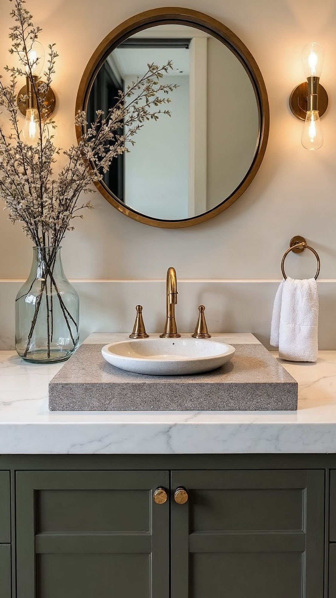
Quiet luxury lives in the little things people literally touch every day. A space can look simple and still feel high-end when the “everyday” items look intentional instead of cheap. Swapping one touch point to wood, stone, ceramic, or glass makes an instant difference because those materials feel heavier, calmer, and more expensive. The best part? This upgrade doesn’t require a remodel or a dramatic budget spiral. It just requires picking one spot and leveling it up on purpose. Ever noticed how a bathroom feels fancy when the soap dispenser looks like it belongs in a boutique hotel? Same idea.
The easiest touch points to upgrade (pick ONE zone)
Kitchen
- Soap dispenser (glass or ceramic instead of plastic)
- Hand towel holder (wood or matte metal)
- Counter tray (stone or wood)
- Cutting board left out on purpose (wood always reads elevated)
Bathroom
- Soap + lotion set (glass/ceramic)
- Vanity tray (stone or faux travertine)
- Waste bin (lined, textured, or woven instead of shiny plastic)
- Matching towel set in white, cream, or warm gray
How to make it look expensive (without doing the most)
- Limit the item count: one tray + two items beats seven random bottles.
- Use a tray every time: trays create “this is styled” energy with zero effort.
- Match finishes: warm metals with warm neutrals, cool metals with cool neutrals.

- Lead-Free Glass Elegance: Light weight and compact hand soap dispenser glass is made of lead-free glass. Plastic pump sc…
- Versatile Vintage Dispenser: The vintage style amber bottles dispenser is designed to dispense from low to high viscous …
- Reusable & Dishwasher Safe: Large Capacity of 1 pint (16 Ounces) allows sufficient liquid in the bottle to avoid frequen…
Quick comparison that actually matters
- Plastic + loud labels → reads “basic and busy”
- Glass/ceramic + muted tones → reads “calm and considered”
- Random mix of colors → reads “clutter”
- One palette repeated → reads “quiet luxury”
Don’t do this
Don’t upgrade five things across the house at once and wonder why nothing looks finished. Pick one surface—kitchen counter or bathroom vanity—and make it look intentional. That single “done” moment will make the whole home feel more elevated.
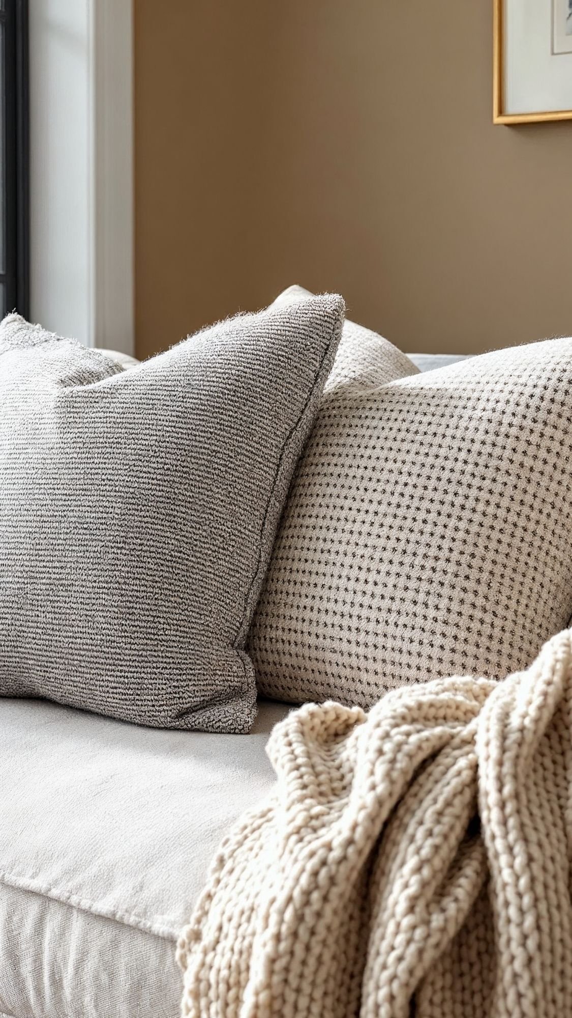
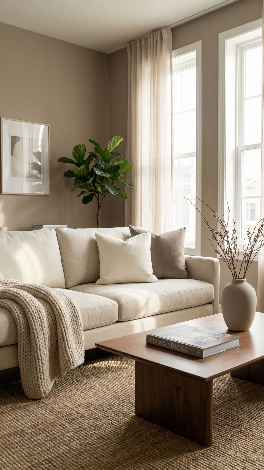
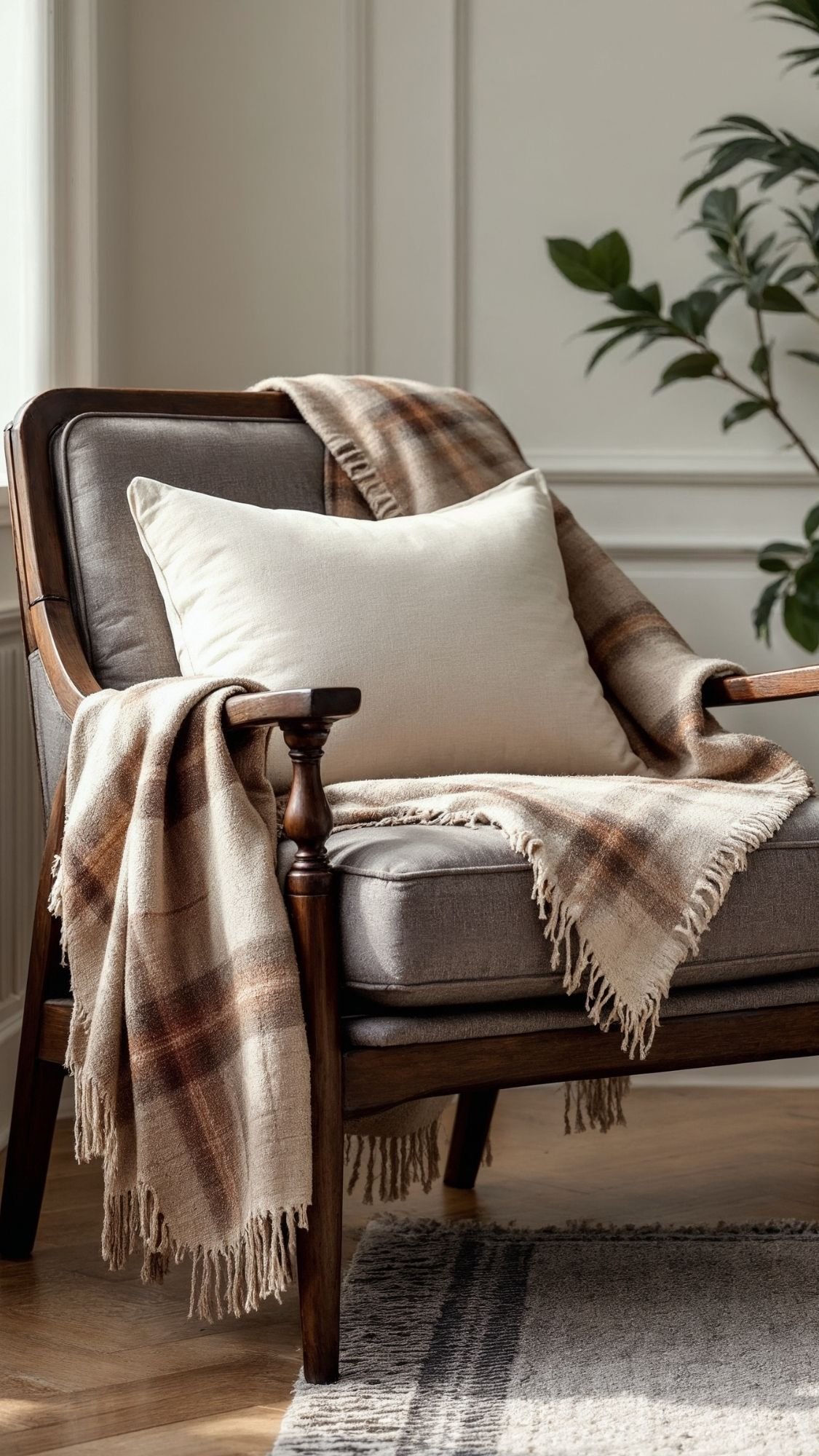
3) Texture-Maxxing (But Keep the Color Calm)
Quiet luxury doesn’t rely on loud color to feel expensive—it relies on texture. Texture adds depth, movement, and that “this room feels finished” vibe without turning your space into a visual circus. When everything stays in the same calm color family, the textures do the heavy lifting. That’s why a cream-on-cream room can still look insanely elevated when the fabrics vary. Think linen, knit, boucle-ish weaves, wool, velvet (used sparingly), and even subtle leather. Ever wonder why designer rooms look cozy but still clean? They layer textures like they mean it.
The “3-Texture Rule” (easy and foolproof)
Pick one area—sofa, bed, or reading chair—and layer three different textures:
- Base texture: linen-look pillow, cotton duvet, smooth upholstery
- Mid texture: nubby boucle pillow, woven lumbar, soft wool
- Statement texture: chunky knit throw, faux mohair blanket, quilted coverlet
That mix looks rich because it creates contrast without chaos.

- Holey Chunky Knit Blanket: Our chunky throw blanket is 100% hand knit with cute holes, the special holey feature and cla…
- No Shedding, No Stiffness, No Prickly: Our soft thick blankets and throws are knitted with premium chenille yarn to prev…
- Six Sizes to Meet Different Needs: From the small size of 40 x 40 inches to the giant size of 80 x 90 inches, we offer 6…
Where texture works the fastest
- Sofa: two pillows + one throw = instant upgrade
- Bed: quilt/coverlet + duvet + textured lumbar
- Dining: textured runner + simple ceramic centerpiece
- Entry: woven basket + linen shade lamp + matte vase
Quick comparison that makes this click
- Flat fabric + flat color → reads “fine, but basic”
- Layered textures in similar tones → reads “designer, calm, expensive”
Don’t do this
Don’t pile on every fuzzy item you own and call it cozy. Too many plush textures can look messy fast. Keep the palette calm, then let one statement texture shine while the other two support it.
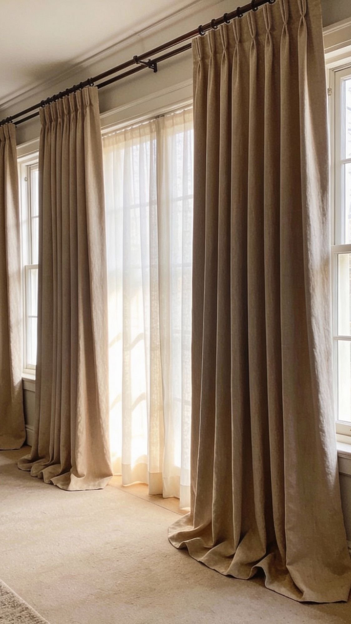
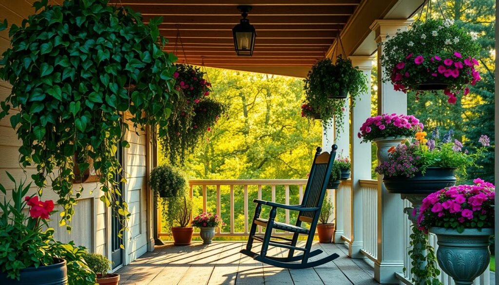
4) Fake Custom Drapes With the “High + Wide” Trick
Nothing screams “builder basic” faster than curtains that look like they gave up halfway down the wall. Quiet luxury loves height, softness, and clean lines, and drapes deliver all three—especially when you hang them the right way. The “high + wide” trick makes any window look larger and any room look more expensive. And no, this doesn’t require custom drapery or a designer on speed dial. You just need the rod placement to do the heavy lifting. Ever notice how hotel rooms feel instantly polished? Tall drapes play a big role.
The “High + Wide” placement rules
- Hang the rod high: place it 2–4 inches below the ceiling (or right under crown molding).
- Go wide: extend the rod 8–12 inches past the window frame on each side.
- Let panels kiss the floor: aim for a light “kiss” or a tiny puddle (nothing dramatic).
That placement creates the illusion of taller ceilings and bigger windows—aka quiet luxury magic.

- Heavy-Duty & Sag-Proof Construction:IFELS modern curtain rods for windows are built with reinforced, thick-gauge metal t…
- Easy, Secure Wall-Mount Installation:Designed for a permanent and professional look, the black curtain rod install secur…
- Adjustable for a Perfect Fit Every Time:Adjustable curtain rod design effortlessly adjusts from 32 inches to 120 inches …
Budget-friendly curtain choices that still look expensive
- Linen-look panels: you get softness and texture without linen pricing.
- Pinch-pleat look: instant tailored vibe (even if it’s not custom).
- Sheer + drape combo: sheers add glow; outer panels add structure.
Hardware that upgrades the whole look
- Use matte black, brushed brass, or soft nickel rods.
- Add clip rings for easy “designer drape” folds with minimal effort.
Don’t do this
Skip skinny panels that don’t reach the floor or rods mounted right above the window frame. That look reads rushed. Quiet luxury doesn’t rush—quiet luxury plans.
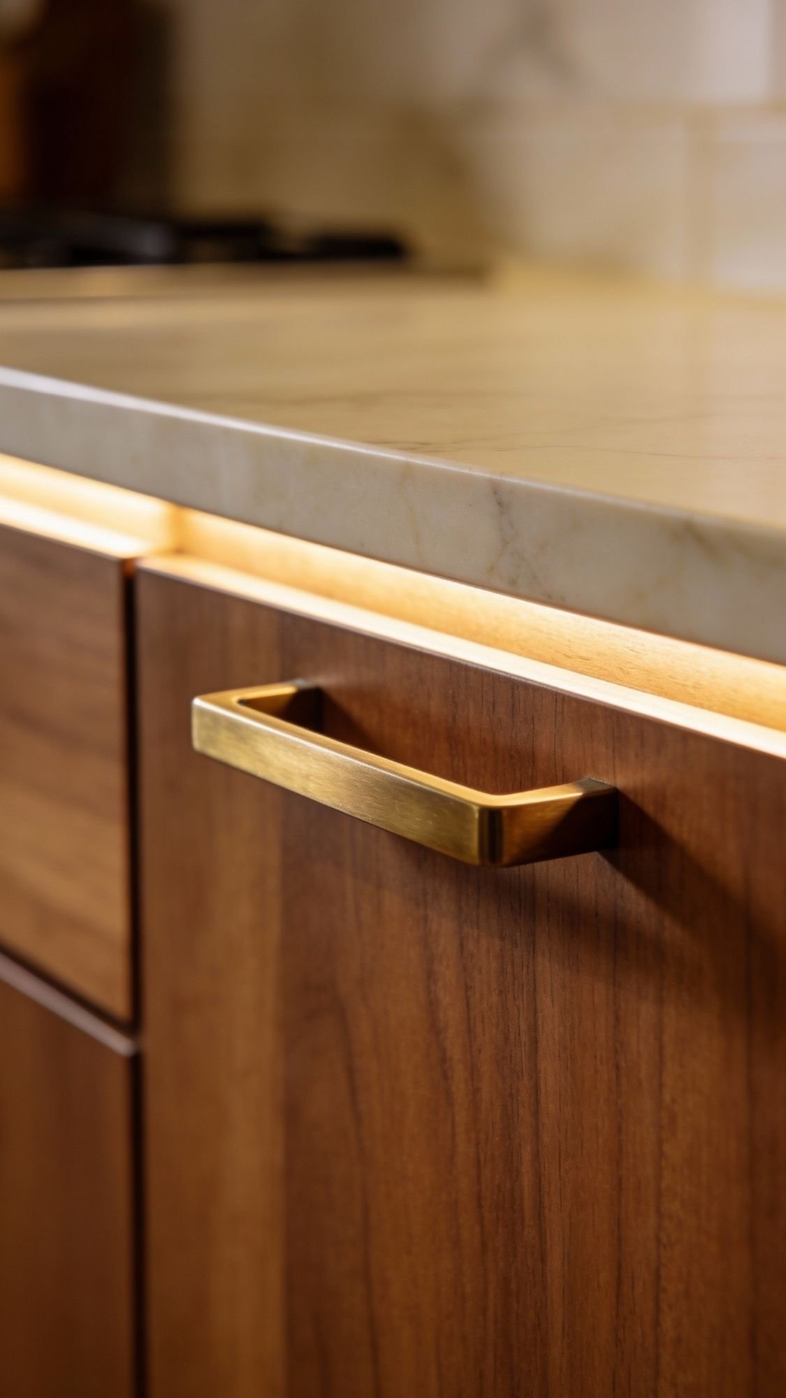
5) Swap to “Quiet” Hardware (Kitchen + Bath Glow-Up)
Hardware works like jewelry for your home. When it looks cheap, the whole room looks cheaper. When it looks intentional, the space suddenly feels finished—even if you didn’t change anything else. Quiet luxury leans toward soft, understated finishes that don’t yell for attention. Think brushed brass, satin nickel, warm bronze, or matte black with a muted finish. This upgrade hits especially hard in kitchens and bathrooms because you see those handles constantly. Ever grabbed a flimsy knob and instantly felt annoyed? Yeah… your brain clocks that.
Why this feels high-end fast
- Hardware sits at eye level and hand level, so it signals quality immediately.
- Matching finishes create a “custom” look without custom costs.
- Subtle sheen looks richer than super shiny, mirror-like metal.
Best finishes for a quiet luxury look
- Brushed brass: warm and elevated without looking flashy
- Oil-rubbed bronze / warm bronze: moody and timeless
- Satin nickel: clean, classic, and easy to match
- Matte black: sharp and modern when it stays soft, not glossy
How to choose the right finish (so it doesn’t look random)
- If the room feels warm (wood, beige, cream), choose brass or warm bronze.
- If the room feels cool (gray, crisp white, chrome), choose nickel or matte black.
- Keep it simple: one dominant metal per room keeps everything calm and cohesive.
Quick install tips that save headaches
- Measure existing hole spacing before buying (yes, it matters).
- Start with the most visible area first:
- kitchen base cabinets
- bathroom vanity
- linen closet or pantry (this one surprises people)

- 100-Day Evaluation: We believe you’ll find value in your Ravinte handles. Use them for a full year, and if they don’t me…
- If you’re replacing your handle, measure and ensure the center to center hole spacing of the current handle is 3 Inches …
- STURDY & STRONG: 30 bar pulls made of stainless steel finished with classic Brushed Brass coordinates well with other ap…
Don’t do this
Don’t mix three different metals in the same small room unless there’s a clear plan. Quiet luxury looks intentional, not like a sample pack showed up and everyone panicked.
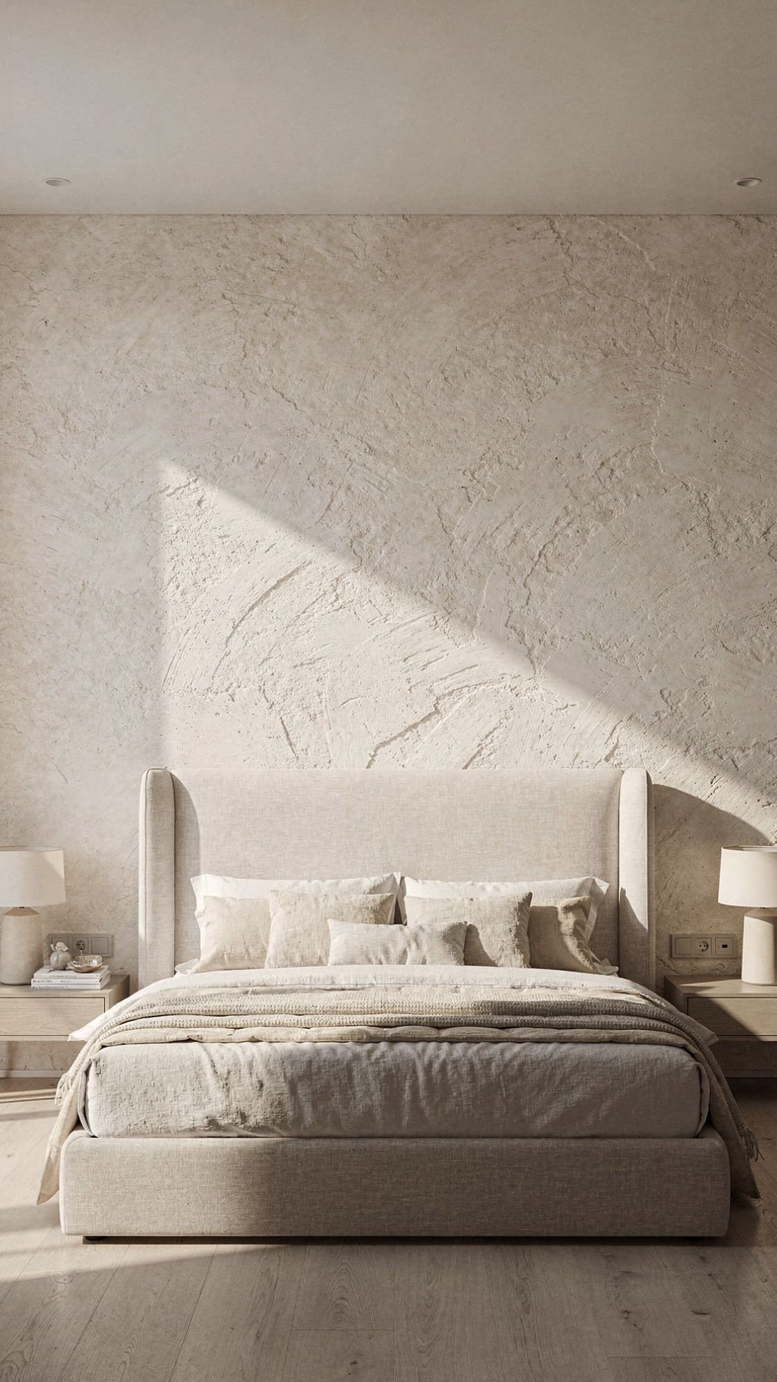
6) Try a Limewash-Look Wall Finish (Texture Without the “Look at Me” Drama)
Quiet luxury loves walls that look soft, dimensional, and slightly imperfect in a classy way. Limewash and mineral-style finishes deliver that vibe because they create cloudy tonal movement instead of a flat, solid color. This finish makes a room feel custom, even when everything else stays simple. It also plays really well with warm neutrals, wood tones, and calm styling. Want a space to look “designer” without buying more stuff? A textured wall finish pulls that off fast. Ever notice how upscale spaces feel layered even when they barely have decor?
Where this works best (so it looks intentional, not chaotic)
- Behind the bed as an accent wall
- In a dining nook to add softness
- On a fireplace wall to create a focal point
- In an entryway for instant “welcome to the nice house” energy
Budget-friendly ways to get the look
- Limewash-look paint technique: use a special finish paint (or a paint designed to mimic limewash) and apply it with wide brush strokes.
- Mineral/texture paint: create subtle movement that reads upscale without intense labor.
- Textured wallpaper (renter-friendly): choose a plaster-look or linen-texture option that adds depth without permanent commitment.

- Romabio Masonry Textured is a beautiful, permanently flat, subtly textured finish that is naturally toxin-free, and envi…
- Ideal for brick, stone, stucco, and cementitious siding, Masonry Textured is a breathable coating that calcifies to the …
- 2 coats, no additional primer for unpainted, absorbent masonry. Backed by a 20-year warranty when applied as directed.
Quick how-to (keep it simple)
- Test first: paint a sample board and check it in morning + night lighting.
- Choose one tone: soft warm white, mushroom, or muted taupe looks calm and expensive.
- Work in sections: apply in loose, consistent strokes so it looks intentional.
- Stop at one wall: one feature wall looks elevated; every wall looks like a project took over your life.
Don’t do this
Don’t pick a high-contrast color and expect “quiet” luxury. That turns into “statement wall” energy, and that’s a different party.
7) Bring In a Vintage-Style Rug (Patina = Instant “Collected”)
If a room looks a little too new and a little too plain, a vintage-style rug fixes that in one move. Quiet luxury loves pieces that feel collected over time, and a rug with patina delivers that story without needing an actual estate sale hobby. These rugs add depth, soften hard floors, and instantly make furniture feel grounded instead of floating around like it can’t commit. A good rug also hides a lot of “real life” (crumbs, pet hair, general existing) better than a flat, brand-new solid rug. Want the easiest way to make a space look more expensive without buying a bunch of decor? Start under your feet. Ever wonder why designer rooms feel finished even when they stay minimal?
What to look for (so it reads quiet luxury, not loud vintage chaos)
- Muted, washed tones: faded terracotta, dusty blue, warm sand, soft olive
- Distressed patterns: looks collected and forgiving (aka practical)
- Low-to-medium pile: feels more tailored and “expensive” than shag in most spaces
- Warm neutrals + one subtle accent color: keeps the palette calm and elevated
Sizing rules that make the room look instantly higher-end
- Living room: place at least the front legs of the sofa and chairs on the rug
- Bedroom: choose a rug that extends at least 18–24 inches beyond the bed sides
- Dining: make sure chairs stay on the rug even when pulled out
Tiny rug + big furniture always looks awkward. A correctly sized rug makes a budget room look planned.

- Machine Washable & Easy Maintenance – Toss our machine washable area rugs in a standard washer for hassle-free cleaning….
- Stain & Water-Resistant – Designed for homes with kids and pets, this washable area rug has a non-toxic, water-resistant…
- Non-Slip & Secure – The latex-free rug pad grips hard surface floors to help keep your rug in place. Designed for high-t…
Quick comparison that keeps it real
- Small rug + floating furniture → looks unfinished
- Bigger rug + furniture grounded → looks tailored and expensive
- Perfectly new + flat solid color → can feel bland
- Vintage-style pattern + patina → feels layered and “quiet luxury”
Don’t do this
Don’t pick a super high-contrast, neon-heavy pattern and then call it quiet luxury. That rug will run the room like it pays rent.
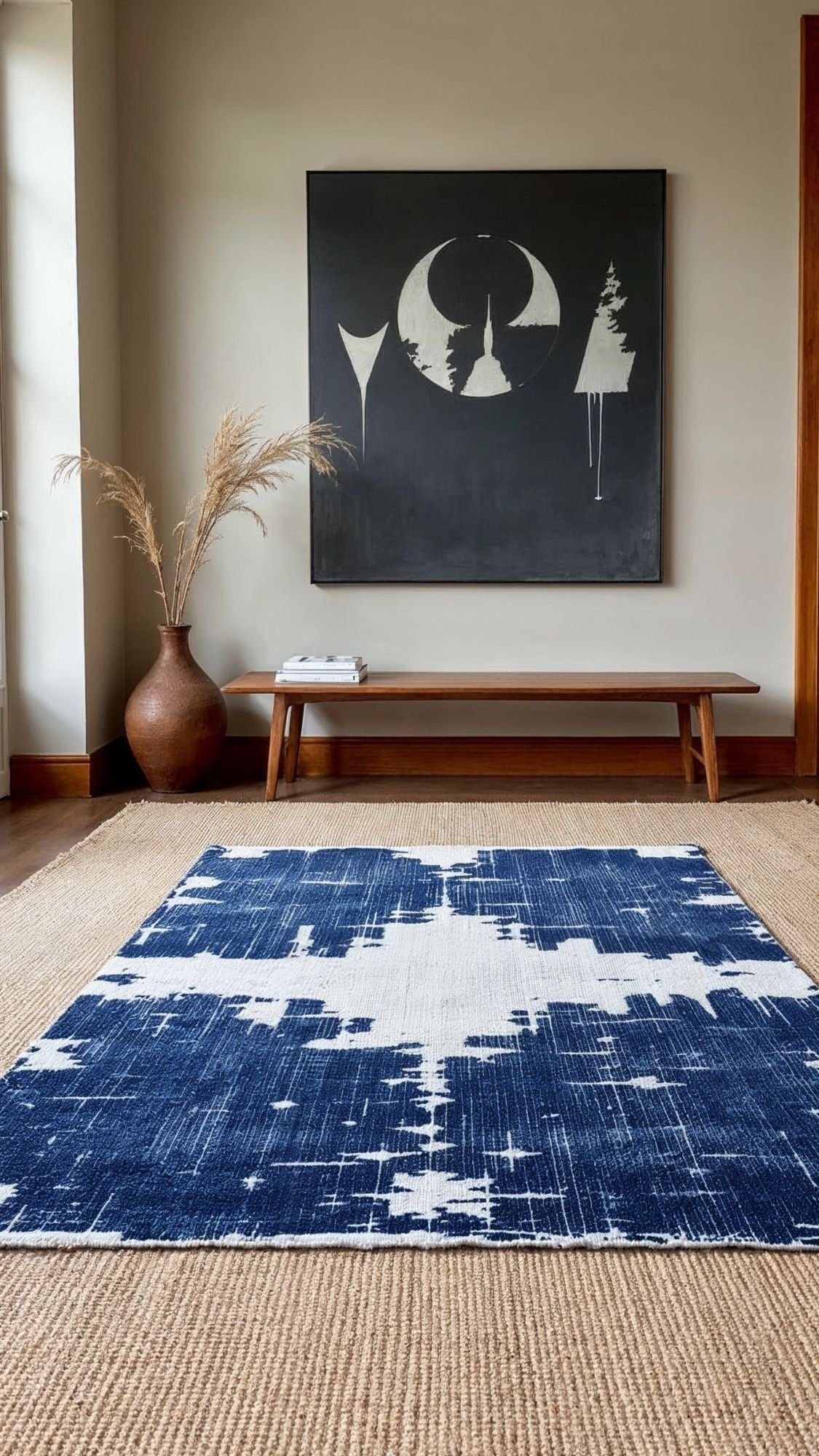
8) Layer Rugs Like a Stylist (Yes, It Works)
Layering rugs looks fancy because it creates depth and texture—plus it gives that “collected over time” vibe quiet luxury loves. It also solves a very real budget problem: large statement rugs cost real money, but a simple base rug doesn’t. So the move goes like this: big neutral base + smaller character rug on top, and suddenly the room looks styled instead of “I bought one rug and hoped for the best.” This trick works especially well when your base rug feels plain or when you want more warmth without changing your whole palette. Ever seen a room that feels cozy and curated but still calm? Rug layering usually sits behind the scenes making that happen.
The easiest layering combo (low effort, high payoff)
- Base rug: natural jute/sisal look, flatweave, or a simple solid neutral
- Top rug: smaller vintage-style patterned rug with muted tones
That combo feels textured, grounded, and expensive without looking busy.
Where rug layering looks the most intentional
- Living room: under coffee table area to anchor the seating
- Bedroom: at the foot of the bed for a boutique-hotel vibe
- Entryway: base runner + smaller patterned rug on top (so good)
- Home office: base rug for size + top rug for personality
Pro tips that keep it from looking messy
- Keep the bottom rug simple and larger.
- Center the top rug or align it with the coffee table/bed so it feels planned.
- Choose top rug colors that repeat somewhere else (pillows, art, throw).

- Recommended Rooms: Add warmth and texture to your living room, dining room, bedroom, kitchen, or hallway with this stunn…
- Enduring Natural Style: Combining the rustic appeal of a farmhouse rug with a modern twist, our jute area rugs go with a…
- Versatile Size: This area rug measures 8×10 feet, making this rug the ideal choice for various room sizes and layouts. T…
Don’t do this
Don’t layer two loud patterns together unless you enjoy visual chaos. Quiet luxury looks calm, not competitive.
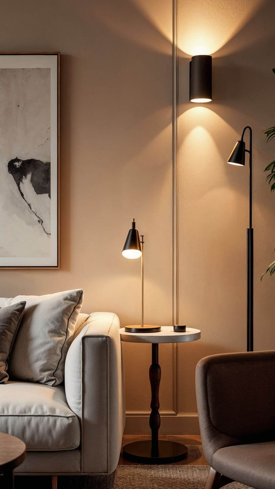
9) Layer Your Lighting (Because One Overhead Light Is Not the Vibe)
Quiet luxury never relies on a single overhead light. One ceiling fixture can’t create warmth, depth, or mood—it can only create shadows in weird places and make everyone look tired. Layered lighting makes a home feel expensive because it feels intentional and adjustable. It also makes your space feel cozy at night without turning it into a cave. The goal is simple: multiple soft light sources at different heights. Ever walked into a room and instantly felt calm, like the lighting understood the assignment? That’s layered lighting doing its job.
The quiet luxury lighting formula (easy starter version)
Aim for 3 light sources in the main living space:
- Table lamp (adds warmth at eye level)
- Floor lamp (fills corners and adds height)
- Ambient accent light (sconce, picture light, or even a small lamp on a shelf)
That combo makes the room feel balanced and “done,” even if your furniture stays basic.

- CONVENIENT – an easy way to create a big impact for a minmal cost and customize the light level in any room, for any occ…
- EASY TO INSTALL – plug the dimmer into the outlet and your lamp into the dimmer. 150W LED/CFL, 300W Incandescent/Halogen
- SENSIBLE – designed to dim LED bulbs. To find out which LED bulbs pair best, visit Leviton’s bulb compatibility tool on …
Bulb choices matter more than people admit
- Choose warm white bulbs for evenings (soft glow = calm luxury).
- Stick to one consistent bulb color across the room.
- Add a dimmer plug or smart bulb so you can control the mood.
Where to place lamps so the room looks styled
- Sofa corner: table lamp on an end table + floor lamp nearby
- Console table: small lamp + art or mirror above it
- Reading chair: floor lamp behind or beside it for a cozy zone
Don’t do this
Don’t use harsh blue-white bulbs and expect a cozy, expensive vibe. That lighting gives “office break room,” not “quiet luxury home.”
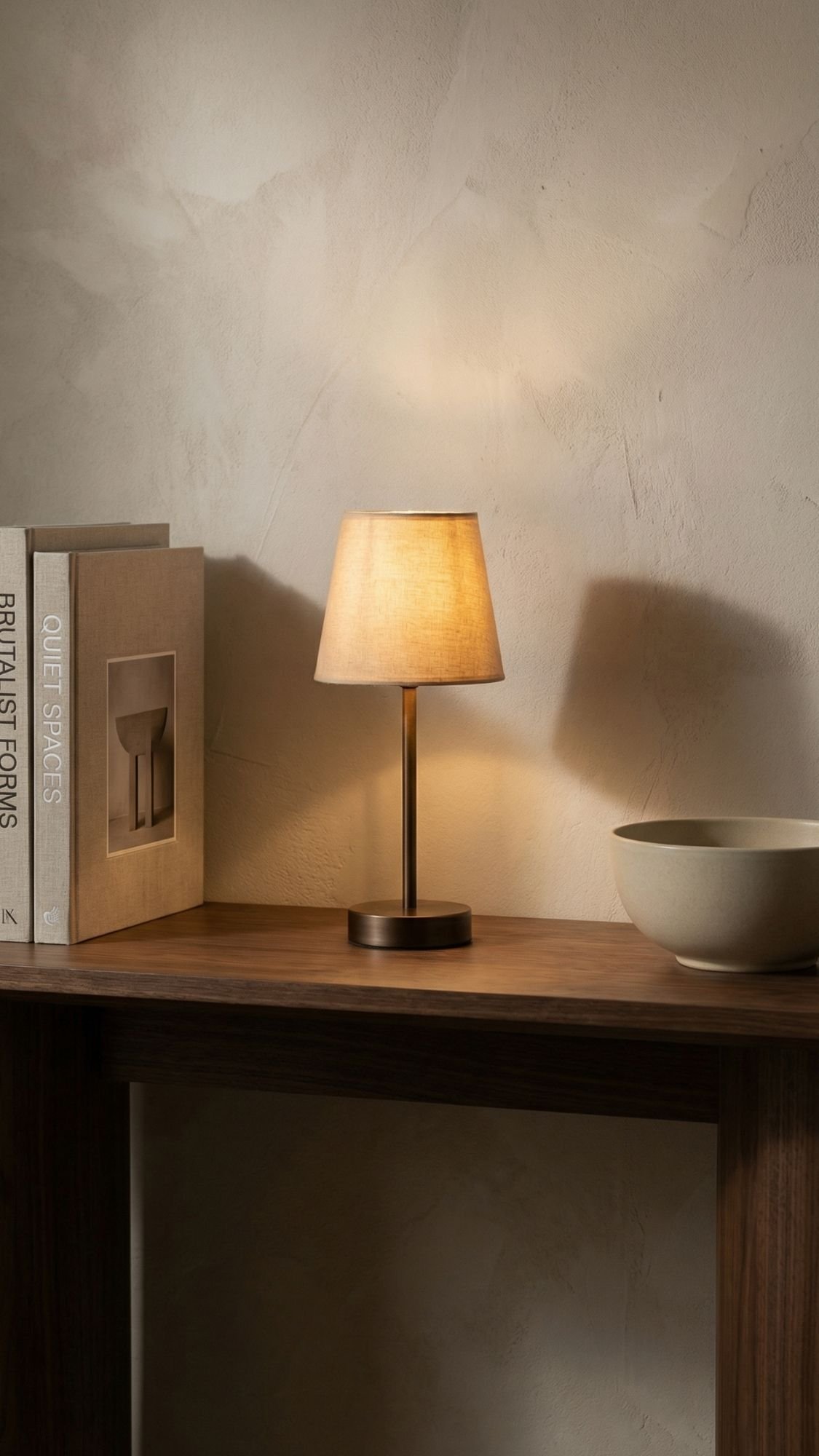
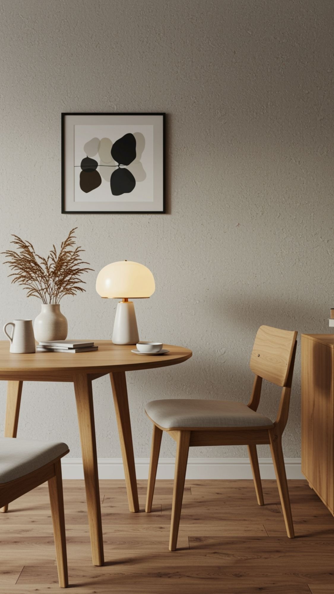
10) Add One Cordless Lamp (Tiny Upgrade, Big Designer Energy)
Cordless lamps feel like a small thing until you realize they instantly make your home feel styled. They create that soft glow designers love, and they work anywhere without cords ruining the look. Quiet luxury thrives on lighting that feels effortless, and a cordless lamp nails that “I thought of everything” vibe. It also upgrades spaces people forget to light, like shelves, buffets, or dining tables. One little lamp can make a room feel warmer, calmer, and more expensive in about five seconds. Ever notice how fancy restaurants always nail the lighting? Yeah… they don’t do overhead.
Where a cordless lamp looks the most expensive
- On a console table in the entryway (instant welcome moment)
- On a bookshelf to add depth and glow
- On a dining table for a cozy dinner mood
- On a nightstand when you want a softer bedside look
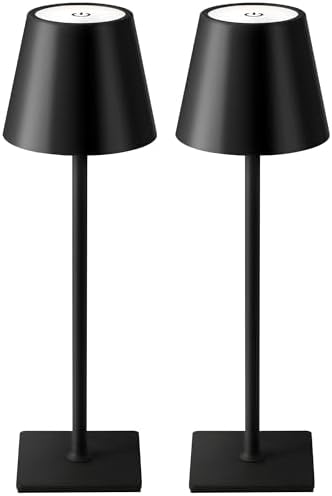
- Cordless Portable Design: Built-in 5000mAh rechargeable battery, you can use the light while charging. Can be used as an…
- Battery Powered LED Lamp: Charging time is 4-5 hours using USB Type-C, with a range of 8-40 hours depending on the brigh…
- 3 Color Stepless Dimmable: Color temperature 2700K-6000K, white light, warm white light and warm light. Stepless dimming…
What to look for (so it doesn’t look cheap)
- Matte finish (avoid shiny plastic energy)
- Warm light (soft, cozy glow)
- Simple silhouette (clean and timeless beats trendy here)
Styling tip that makes it feel intentional
Pair the lamp with one or two calm items:
- a small stack of books
- a ceramic bowl
- a single vase
That “lamp + two things” combo looks curated without trying too hard.
Don’t do this
Don’t blast the cordless lamp at full brightness like it’s a spotlight. Quiet luxury lighting stays soft and warm. Think glow, not glare.
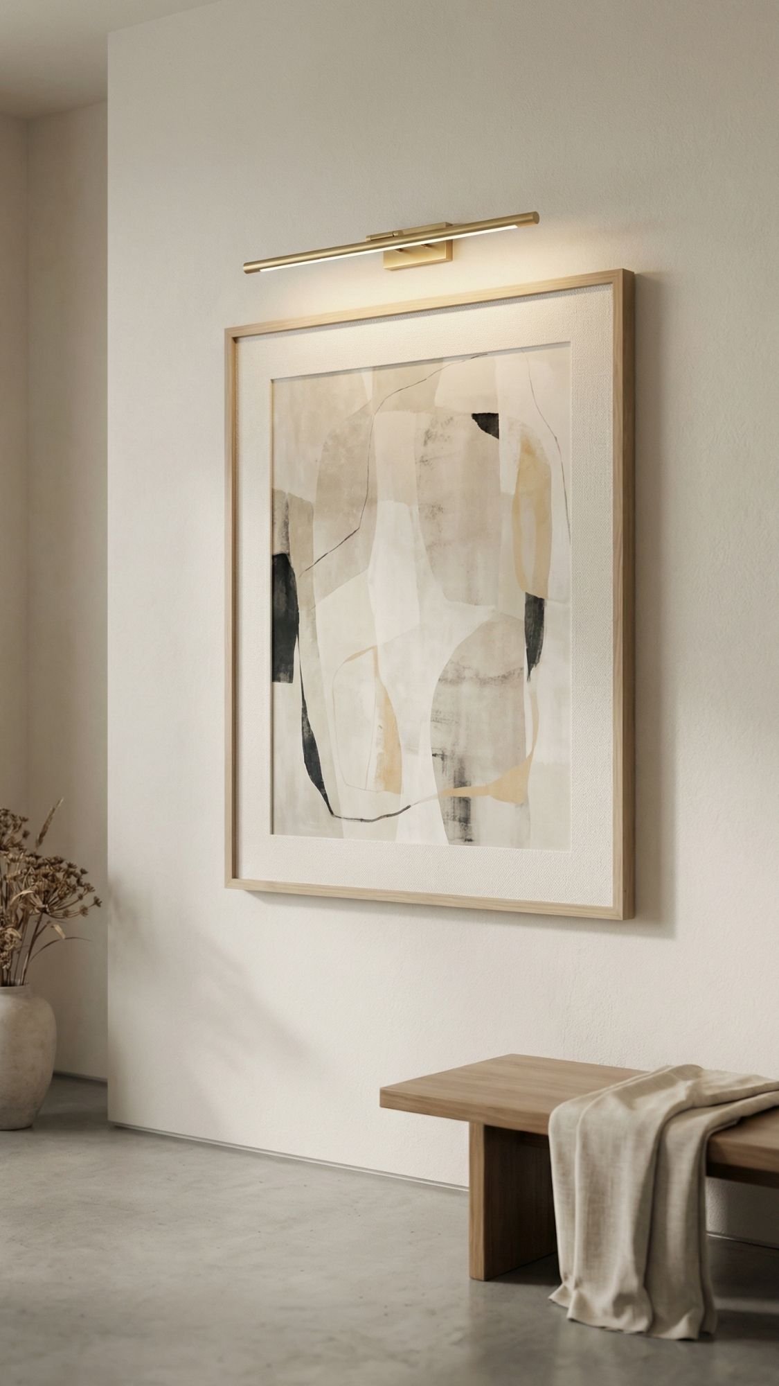
11) Use Picture Lights to Make Art Look Expensive
Picture lights give instant gallery energy, and quiet luxury loves anything that feels subtle but intentional. Art looks “okay” when it hangs on a wall. Art looks expensive when it gets lit like it belongs in a curated space. A picture light adds warmth, creates depth, and makes the wall feel designed instead of decorated. This works especially well when the rest of your room stays simple because the light becomes a soft focal point. Ever notice how the same piece of art looks ten times better in a museum? Lighting does that.
Why picture lights feel so high-end
- They create a soft focal point without adding clutter.
- They make art feel purposeful, not like a last-minute purchase.
- They add that layered lighting effect quiet luxury loves.
The easiest ways to do it on a budget
- Battery picture lights: quick install, no wiring, renter-friendly
- Plug-in picture lights: slightly more permanent feel, still easy
- Rechargeable options: clean look, no constant battery swaps
How to place it so it looks like a designer did it
- Center the light above the frame (simple, but crucial).
- Keep the art at eye level (roughly center of frame around 57–60 inches from the floor).
- Use warm light so the wall feels soft and elevated.
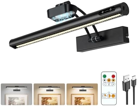
- Adjustable Angle Cordless Picture Light: Triple-axis flexibility (30° vertical head rotation + 270° vertical swing arm +…
- Remote & Touch Control, 3-Color Temp Adjustable: This 16-inch wireless picture light offers 3 preset color temps (3000K …
- Super Easy Charge & Install: Magnetic cordless picture light features detachable LED bar + base. Tool-free slide-off cha…
Don’t do this
Don’t choose a super cool-toned light or point it at the art like a flashlight. You want a gentle glow that washes the frame, not a harsh beam that creates glare.
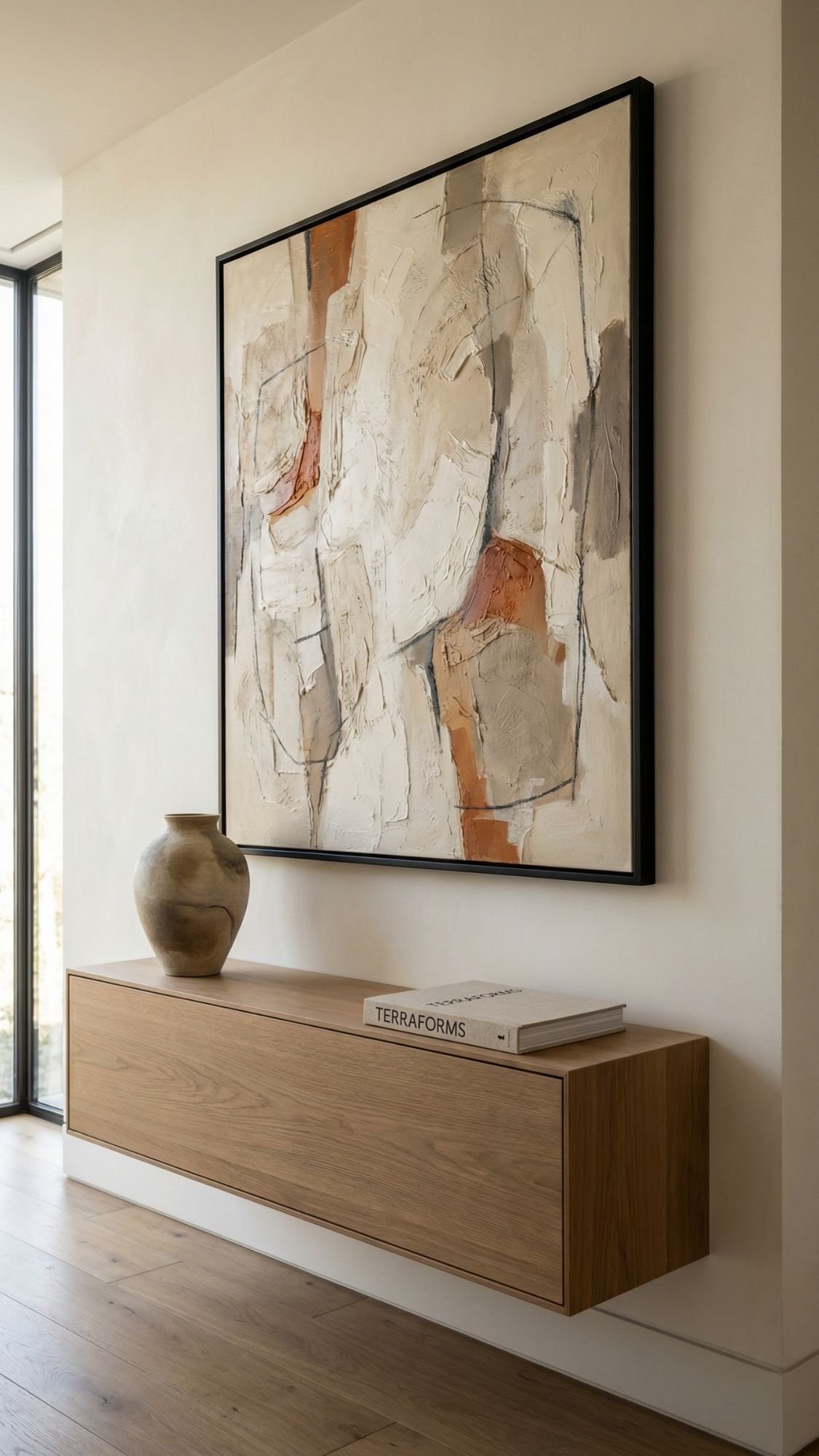
12) Go Oversized With One Art Piece (Instead of Lots of Little Ones)
A single oversized art piece makes a room look intentional, calm, and expensive—aka the whole quiet luxury goal. Small art can work, but a bunch of tiny frames often makes the wall look busy and a little… uncertain. One large piece creates a clean focal point and instantly makes the space feel more “designed” than “decorated.” This trick also helps budgets because one statement piece beats buying ten separate items that still don’t look cohesive. Large-scale art also balances big furniture, so the room stops feeling top-heavy. Ever notice how upscale spaces usually commit to one strong moment instead of sprinkling stuff everywhere?
How to choose the right oversized piece (so it looks luxe, not loud)
- Stick to restrained color: warm neutrals, soft blacks, muted earth tones, gentle contrast
- Choose visual calm: abstract textures, minimal landscapes, tonal photography, simple line work
- Aim for scale that makes sense: art should feel “proportional,” not like it got lost on the wall

- 【Modern Style】 Immerse your living space in contemporary elegance with our 24×36 aluminum picture frame. Clean lines and…
- 【Practical Material】Crafted with precision from durable aluminum, our photo frame guarantees not just style but also res…
- 【HD Tempered Glass】Indulge in an unparalleled viewing experience with our high-definition tempered glass. The clarity it…
Budget-friendly ways to get the oversized look
- Large print + oversized frame: clean, crisp, and easy to swap later
- Canvas print: lightweight and affordable in big sizes
- DIY: frame a large textile: linen-look fabric, neutral woven panels, or a vintage-inspired scarf
Don’t do this
Don’t hang a tiny piece over a large sofa and call it a day. That move makes the wall look unfinished, and quiet luxury doesn’t do unfinished.
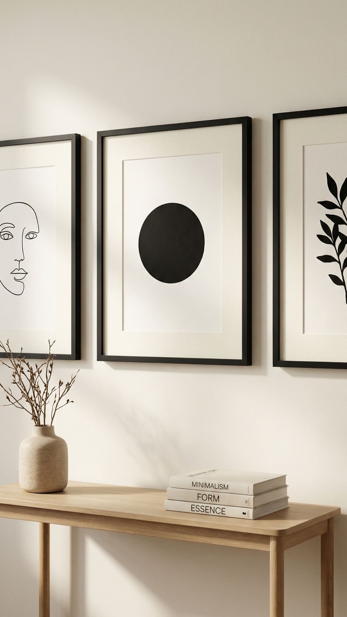
13) Upgrade Frames + Add Mats (Instant “Museum” Effect)
Frames and mats can make basic prints look expensive, and that’s why quiet luxury people obsess over them. A mat adds breathing room, makes the art feel more important, and instantly gives that “gallery wall” polish. Even cheap prints look more elevated when the frame looks sturdy and the mat looks intentional. This is one of those upgrades people don’t notice right away… but they feel it. Ever looked at a wall and thought, “Why does this look so grown?” Good framing does that.
The quiet luxury framing rules (simple, not fussy)
- Use mats whenever possible: white, cream, or soft warm tones look timeless.
- Stick to 1–2 frame finishes: matte black + warm wood is a classic combo.
- Choose thin or medium profiles: chunky shiny frames can look dated fast.
Budget ways to get the “custom” look
- Buy affordable ready-made frames, then add a custom-cut mat from a craft store.
- Print art in standard sizes so you don’t pay extra for weird dimensions.
- Use consistent spacing between frames if you build a gallery wall (it looks planned).

- Pack of 25 pre-cut mixed color 11×14 photo mats matte with white core, 4-ply thick (1/16in – 1.4mm). The backing is whit…
- Acid free 11×14 pre-cut picture mat board kit for 8×10-inch photos. Add additional decoration for your pictures or print…
- Photo Mat Opening Size: 7.5″ x 9.5″ with 45° white core bevel cut.
Quick comparison that makes it obvious
- No mat + thin flimsy frame → looks casual
- Mat + solid frame → looks curated and expensive
Don’t do this
Don’t mix five different frame styles on one wall unless you’re aiming for eclectic chaos. Quiet luxury prefers calm, cohesive, and intentional.
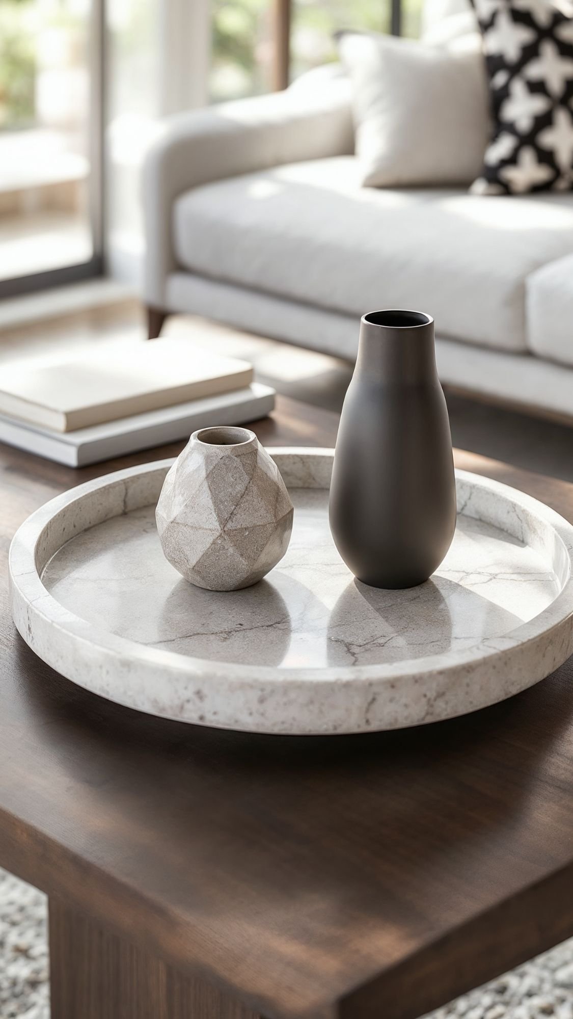
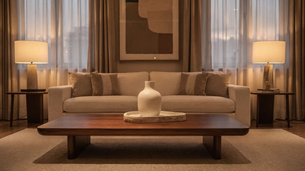
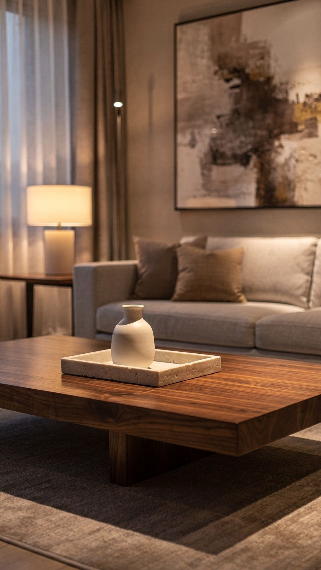
14) Style a Coffee Table Like a Magazine (3 Objects + One Tray)
A coffee table can make a whole living room look expensive—or make it look like a holding zone for remotes, receipts, and mystery items. Quiet luxury coffee tables look calm, curated, and intentional, and the formula stays shockingly simple: one tray + three styled elements. This approach keeps things functional while still giving that “designer home” vibe. It also helps you stop over-styling, because restraint always reads more elevated. Ever wonder why styled rooms feel peaceful? They don’t let every object audition for attention.
The “Tray + 3” formula (works every time)
- Tray: stone, wood, or matte metal (this creates structure)
- Book stack: 1–2 neutral hardcovers (adds height and polish)
- Sculptural object: ceramic bowl, knot sculpture, or carved piece (adds shape)
- One natural element: a single stem, small vase, or candle (adds softness)

- 【Elevate Your Space】This decorative books a stunning addition to any interior space. These faux books not only serve as …
- 【Books Blank Pages】Unlike other products, Our decorative books contain 4 books that can be more flexible in combining ho…
- 【Colors That lnspire】 With neutral yet distinctive hues, these books effortlessly complement various interior styles. Fr…
Easy styling rules that keep it looking luxe
- Vary the height: tall + medium + low looks intentional.
- Keep the palette tonal: neutrals with one subtle accent feel calm and expensive.
- Leave space: empty space reads like confidence, not like “forgot to finish.”
Quick comparison that tells the truth
- Loose clutter scattered everywhere → looks stressful
- Contained styling on a tray → looks curated and high-end
Don’t do this
Don’t treat your coffee table like storage. If it needs to hold daily stuff, use a tray to contain it so the mess looks “organized” instead of “help.”
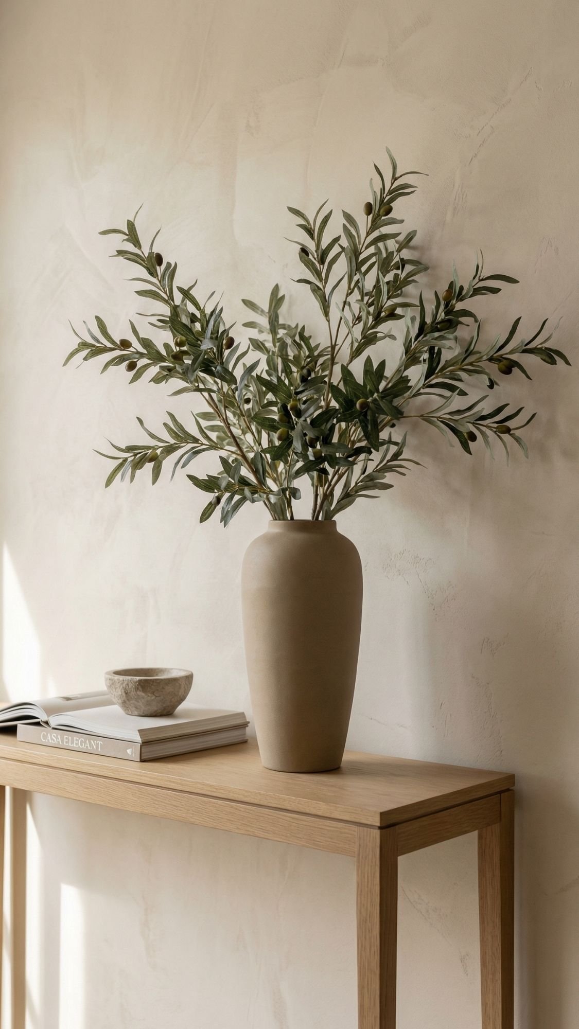
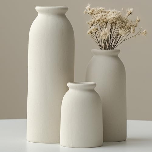
15) Use “Sculptural Greenery” (Not a Random Fake Plant Army)
Quiet luxury doesn’t sprinkle ten tiny plants around and hope it looks intentional. It chooses one or two pieces of greenery that feel sculptural, elevated, and calm. A single dramatic branch instantly adds life, height, and softness without cluttering every surface. This also helps the room feel “collected” instead of “decorated,” which is the whole point. The right greenery gives that relaxed, upscale vibe like someone pays attention… without looking like they’re trying too hard. Ever walked into a space and felt like it could breathe? That’s usually because the styling stays minimal.
The best greenery choices for quiet luxury
- Olive branches (classic, airy, expensive-looking)
- Eucalyptus (soft, modern, and easy to style)
- Magnolia stems (bold, elegant, and timeless)
- Tall dried pampas or grasses (only if the palette stays calm)
The vase matters just as much as the stems
Choose a vase that feels substantial:
- Matte ceramic (clean and timeless)
- Stoneware (adds texture and weight)
- Smoked/amber glass (adds warmth without shouting)

- 【Size】The size of these vases are: high one is 9.05″H x 3.35″D,Middle one is 6.89″H x 4.25″,Small one is 5.12″H x4.13″,P…
- 【High-grade color matching】The surface of the ceramic vase adopts low-saturation beige and gray background colors, and t…
- 【Minimalist style design】Abandon the complex shape and return to the simple and smooth line design, which can better ref…
The easy styling rule
- One tall vase + one sculptural stem arrangement = enough.
- Repeat the greenery once (maybe in a smaller vase somewhere else) and stop there.
Don’t do this
Don’t buy bright neon-green faux plants that look like plastic. If faux greenery looks fake, it drags the whole room down fast.
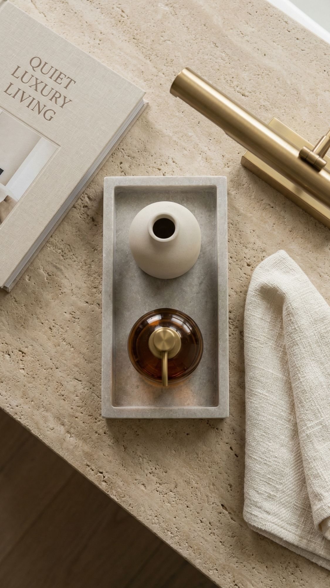
16) Add a Stone-Look Accent (Honed, Matte, Calm)
Stone reads expensive because it feels timeless and substantial. Quiet luxury leans into that “natural and grounded” look, but a full stone renovation belongs in a different tax bracket. The realistic-budget move comes from adding one stone-look accent that gives the same vibe without the same price. Think trays, side tables, coasters, bowls, or even a small surface covered with a stone-look finish. When you choose matte, honed textures, the room instantly feels more elevated. Ever notice how glossy fake marble always looks a little suspicious? Matte finishes fix that.
The easiest stone-look accents to add (pick one)
- Honed stone tray on a coffee table or bathroom vanity
- Travertine-look side table (small but high impact)
- Stone coasters (tiny upgrade that reads luxe)
- Stone-look bowl for entry keys or shelf styling
What makes it look “quiet luxury” instead of “fake marble vibes”
- Choose matte or honed finishes over glossy.
- Stick to subtle veining or porous textures (travertine-style reads calm).
- Keep the palette warm and natural: cream, sand, taupe, soft gray.

- About The Marbling: A heavy duty marble handicraft is made from raw marble stone, not cheap plastic or resin. The textur…
- 100% Solid Natural Marble: A heavy-duty piece of marble craftwork. Each marble stone tray is handmade, carefully cut, an…
- Practical And Stylish: Beautiful natural white marble, with pure texture and good luminosity, an elegant modern decorati…
Quick comparison that matters
- Glossy white marble print → looks mass-produced
- Matte stone-look texture → looks refined and elevated
Don’t do this
Don’t mix multiple loud stone patterns in one room. One stone moment looks intentional. Three different marbles looks like a showroom sample wall.
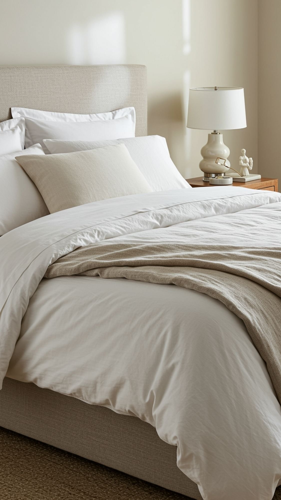
17) Choose Better Bedding (Hotel Energy Without Hotel Prices)
Nothing upgrades a bedroom faster than bedding that looks crisp, layered, and intentional. Quiet luxury bedrooms feel calm and expensive because they focus on texture, quality, and restraint, not loud prints and trendy chaos. You don’t need the most expensive sheets on earth—you need bedding that looks tailored and feels good. When the bed looks put together, the whole room feels more elevated, even if nothing else changes. Ever noticed how hotels make beds look like a lifestyle? They layer, they repeat tones, and they keep it simple.
The quiet luxury bedding formula (easy)
- Crisp base: cotton percale or a smooth cotton set for that clean hotel look
- Soft layer: a quilt or coverlet for texture (this makes it look expensive)
- Finishing layer: one throw folded at the foot for contrast and polish
- 100% Organic Cotton
- GOTS Certified 100% Organic Cotton Sheet Set – Classic Percale Sheets. Gentle on skin, this queen size sheets set is mad…
- Lightweight & Very Comfortable: Unlike shiny sateen sheets, our crisp percale weave has a matte finish and a cool, breat…
Colors that read expensive every time
- White + cream (clean, soft, timeless)
- Ivory + sand (warm and calming)
- Warm gray + cream (still neutral, just moodier)
Small details that make it feel high-end
- Piped edges on pillows or duvet covers
- Matching shams instead of random throw pillows
- One textured lumbar pillow (one—don’t start a pillow economy)
Don’t do this
Don’t mix five patterns on the bed and call it cozy. That looks busy fast. Quiet luxury beds look calm, layered, and easy on the eyes.
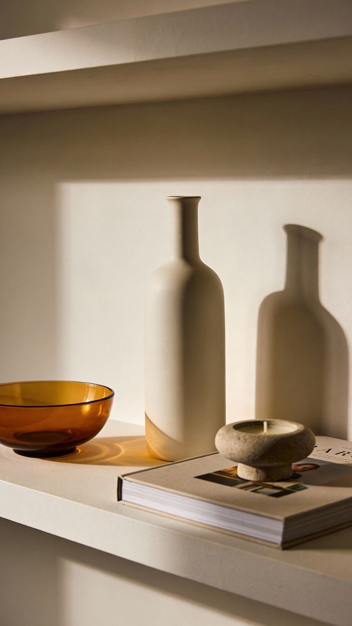
18) Swap Small Decor to Ceramic + Glass (Goodbye, Shiny Plastic)
Quiet luxury doesn’t rely on a bunch of “cute” decor. It relies on a few pieces that feel substantial and calm. Ceramic and glass win here because they look heavier, more refined, and more intentional than shiny plastic or thin metal. Even a basic shelf or console looks elevated when the decor feels tactile and slightly imperfect—like it came from a boutique, not a big-box aisle that screams “last minute.” This upgrade also works because it makes your home feel more grown without adding visual clutter. Ever picked something up and thought, “Oh, this feels nice”? That’s the whole point.
The easiest small swaps (high impact, low effort)
- Replace plastic vases with matte ceramic (instant upgrade)
- Swap bright, shiny bowls for stoneware or glass
- Use amber or smoked glass for warmth and depth
- Choose handmade-looking shapes (slightly uneven = elevated)
The simple “3-piece styling” setup
Pick one surface (shelf, console, coffee table side) and style it with:
- 1 tall piece: vase or sculptural bottle
- 1 medium piece: bowl or candle
- 1 low piece: book stack or small object
Keep everything in a tight color palette so it reads calm and curated.
Quick comparison that makes the difference obvious
- Lots of tiny trinkets → looks cluttered
- A few substantial pieces → looks collected and expensive
- Decorative Vase Set: Includes 3 small ceramic vases in different sizes, perfect for displaying pampas grass, fresh and d…
- Boho Farmhouse Style: Featuring a distressed, matte finish, these vases complement modern, boho, and farmhouse interior …
- Versatile Placement: Ideal for shelves, tables, bookshelves, entryways, or any space needing a touch of rustic charm.
Don’t do this
Don’t buy five tiny decor objects that don’t relate to each other. Quiet luxury wants fewer items with stronger presence, not a shelf full of “stuff.”
19) Add One “Classic” Pattern (Plaid, Stripe, Herringbone) in a Quiet Way
Quiet luxury loves timeless patterns because they feel established, not trendy. The key is using them like a whisper, not a megaphone. A subtle stripe, muted plaid, or herringbone texture adds sophistication without turning the room into a theme. Patterns also make neutrals feel richer because they create detail without needing bold color. One classic pattern can make a room feel “finished” in a way plain solids sometimes don’t. Ever notice how high-end spaces often look simple but still interesting? Patterns help quietly carry that.
The best quiet-luxury patterns (and where to use them)
- Stripes: pillows, throws, roman shades (clean and classic)
- Plaid: wool throw, cushion cover (cozy but still refined)
- Herringbone: rug texture, blanket, subtle wallpaper (quiet texture that reads expensive)

- SOFT & LIGHTWEIGHT: The plaid blanket feels as soft as wool thanks to the selected material; But the quality acrylic fab…
- CLASSIC DESIGN: A classic hues matching of dusty pumpkin orange gives the buffalo check blanket a chic and attractive lo…
- VERSITILE & PORTABLE: The lightweight throw blanket can serve as an outdoor shawl or scarf. You can also drape the blank…
The “one pattern” rule (so it stays calm)
- Use one classic pattern as the feature.
- Keep everything else solid and tonal.
- Repeat the pattern color once elsewhere (like a frame or vase) so it feels connected.
Quick scale guide (so it looks intentional)
- Small room? Choose a smaller or medium pattern scale.
- Large room? A medium scale reads best without disappearing.
- Super bold scale? Only works when the palette stays muted.
Don’t do this
Don’t mix multiple patterns unless you’ve got a plan. Quiet luxury isn’t a pattern party. One quiet pattern feels elevated; three patterns can feel busy fast.
20) Create a “Contemporary Classic” Moment With One Traditional Shape
Quiet luxury loves the mix of modern and classic because it feels timeless, not trendy. You don’t need to turn your home into a historical reenactment to get that elevated look. You just need one traditional element—a turned leg, a classic lamp silhouette, a carved-edge mirror—paired with cleaner modern pieces. That contrast makes the space feel curated and layered, like it evolved over time. Ever seen a room that feels current but still warm and “established”? This trick usually shows up somewhere in it.
Traditional shapes that instantly feel expensive (pick one)
- Turned-leg stool or side table (classic detail, small footprint)
- Arched or carved-edge mirror (adds softness and polish)
- Traditional lamp silhouette (especially with a linen shade)
- Frame with classic molding (makes art feel more refined)

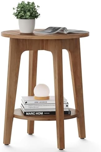
- Modern Room Decor: Add a touch of modernity to your home decor with this contemporary small round accent table, enhancin…
- Lightweight & Chic Design: This decorative side table boasts a lightweight, compact, and chic design, making it suitable…
- Small Space Solution: With its compact dimensions of 14″ x 14″ x 23″, this table is ideal for smaller spaces, offering f…
How to keep it “quiet luxury” (not formal and fussy)
- Pair the traditional piece with simple modern lines nearby.
- Keep the palette restrained: warm neutrals, soft blacks, wood tones.
- Choose matte or satin finishes over shiny.
Easy examples that work in real homes
- Modern sofa + traditional table lamp
- Minimal console + arched mirror
- Clean dining table + turned-leg side table
- Simple bed + classic framed art
Don’t do this
Don’t add five traditional pieces at once. One classic moment feels intentional. Too many can shift the room into formal territory, and that’s not always the goal.
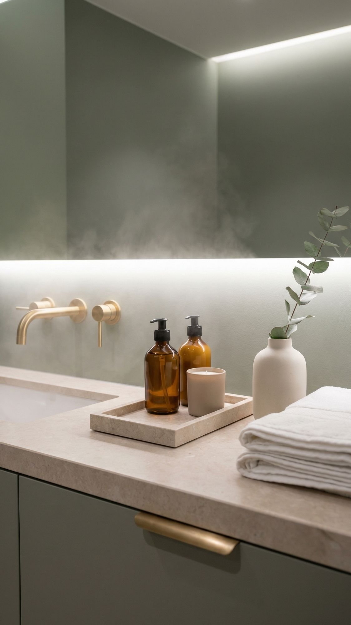
21) Go Spa-Calm in the Bathroom With Muted, Nature-Led Color
Bathrooms can look expensive fast when they feel calm, clean, and intentional. Quiet luxury bathrooms don’t rely on a million products on the counter—they rely on soft color, warm lighting, and natural textures. Muted nature tones like sage, olive, clay, and warm stone instantly make a bathroom feel more spa-like. This also helps when the bathroom feels plain or builder-basic because color adds mood without changing the layout. Ever walked into a bathroom and felt your shoulders drop? That’s the vibe.
The easiest “spa” color moves (budget-friendly)
- Paint one wall in muted sage or a warm gray-green.
- Add towels in white, cream, or soft oatmeal for that hotel look.
- Bring in natural texture: a woven basket, a stone tray, or a ceramic vessel.
Make it feel luxe with simple upgrades
- Warm metal accents: brushed brass or warm bronze reads elevated.
- Soft lighting: use warm bulbs and avoid harsh blue lighting.
- One clean countertop moment: tray + soap + one pretty item (done).
- Extreme Durable & Excellent Quality: This towel sets are made of cotton, woven to 650GSM, so it is ultra-soft and durabl…
- Absorbency & Quickly Dry: With zero-twist construction –a sophisticated spinning process, our bath towels could quickly…
- Multi-usage: You can use these towels for bath as beach bathroom decor, bathroom decor sets accessories, etc. in your ba…
The “calm counter” setup (fast and effective)
- Stone or wood tray
- Matching soap + lotion in glass
- One small candle or diffuser
- One folded hand towel
That’s it. The restraint makes it feel expensive.
Don’t do this
Don’t keep a rainbow of bottles on the vanity and expect spa vibes. If you want quiet luxury, hide the chaos and let the styling breathe.
Quiet Luxury Is Mostly About Editing (Not Overspending)
Quiet luxury looks expensive because it stays calm, cohesive, and intentional—not because it costs a fortune. When you focus on rich neutrals, natural textures, better lighting, and fewer-but-better styling moments, your home starts to feel elevated without trying too hard. The real secret comes from choosing upgrades that add depth: a vintage-style rug, drapes hung high and wide, a stone-look accent, or framed art that looks gallery-ready. Small changes stack up fast when they follow one clear direction. Ever notice how the nicest spaces never feel crowded? They leave room to breathe, and that’s the energy you’re aiming for.
Quick recap: the upgrades that give the most “high-end look for less”
- Pick a calm palette with one deeper anchor tone for contrast
- Add texture through textiles and wall finishes instead of loud decor
- Layer lighting so the room glows instead of glares
- Use scale (bigger rugs, larger art) so things feel intentional
- Edit your surfaces with trays and “less stuff” styling
The easiest next step (so you don’t overthink it)
Choose one room and commit to three upgrades from this list:
- one lighting upgrade
- one texture upgrade
- one “touch point” upgrade
That combo creates the quiet luxury vibe without a major spend. Your space will feel calmer, more curated, and honestly… more like you have your life together (even if you don’t, same).
FAQ: Quiet Luxury On A Realistic Budget
What does “quiet luxury” mean in home decor?
Quiet luxury means you create a space that feels calm, tailored, and timeless—not flashy or trend-chasing. You focus on texture, materials, and restraint, so the room looks expensive without screaming about it. You choose fewer pieces, but you choose them with intention. You also repeat a tight palette so the space looks cohesive instead of chaotic. Ever notice how some rooms feel “rich” even when they barely have anything in them? Quiet luxury pulls that off by prioritizing quality signals over quantity.
Quick signs you nailed it:
- Muted, layered color palette
- Natural-looking textures (linen, wood, ceramic, stone-look)
- Clean surfaces with styled “moments” (tray + a few pieces)
- Soft, layered lighting instead of one harsh overhead
What’s the fastest way to make a room look expensive?
Start with lighting and scale because those changes shift the whole vibe immediately. Add two lamps (table + floor) and use warm bulbs, then make sure your rug and art look proportional to your furniture. You can also “edit” the clutter by grouping items on a tray so the room looks curated. Want the cheat code? Upgrade one touch point (like hardware or a soap set) and let it anchor the space. Ever walked into a room and felt like it looked finished instantly? That room probably nailed lighting, scale, and clutter control.
Fast upgrades that work almost anywhere:
- Add a lamp to a dark corner
- Hang curtains high + wide
- Size up the rug so furniture sits on it
- Use one oversized art piece instead of many small frames
- Contain clutter with a tray or lidded basket
What colors look like quiet luxury?
Quiet luxury loves colors that feel soft, warm, and grounded. Warm neutrals like mushroom, ivory, taupe, and greige create that calm backdrop, then one deeper anchor tone adds weight. Chocolate brown and walnut tones feel especially “2026” and timeless at the same time, which honestly feels unfair in the best way. You can also bring in muted nature tones—sage, olive, clay—when you want a spa-calm vibe. Ever notice how bright, high-contrast colors can make a room feel busy even when it’s clean? Quiet luxury avoids that chaos and leans into depth instead.
Easy palette formula:
- 2–3 warm neutrals (ivory + greige + taupe)
- 1 anchor tone (walnut, cocoa, charcoal, soft black)
- 1 subtle accent (sage, dusty blue, muted terracotta)
What materials look high-end on a budget?
Materials sell the illusion faster than almost anything else. You can skip the pricey remodel and still get the vibe by choosing ceramic, glass, wood, and stone-look accents with matte finishes. Texture matters here too—linen-look curtains, a nubby pillow, a knit throw, or a vintage-style rug adds depth that reads expensive. Avoid shiny plastic and high-gloss faux marble because they usually look cheap under real lighting (FYI). Ever picked up a decor piece and instantly felt the difference because it had weight? That’s exactly the effect you want.
Budget materials that read luxe:
- Matte ceramic (vases, bowls, lamps)
- Amber/smoked glass (soap bottles, vases, candle holders)
- Wood (trays, frames, stools)
- Stone-look (travertine-style trays, honed finishes)
- Linen-look textiles (curtains, bedding, throws)
How do you make a rental look quiet luxury without major changes?
Rentals can absolutely give quiet luxury when you focus on reversible upgrades. Hang curtains high and wide, swap in better-looking lamps, and use rugs to add warmth and scale. Style surfaces with trays and keep the palette tight so the space feels cohesive. Use peel-and-stick options carefully—choose subtle texture over loud patterns. Ever walked into a rental that felt custom anyway? That person probably mastered lighting, textiles, and editing.
Rental-friendly quiet luxury moves:
- Plug-in sconces or picture lights
- Battery/cordless lamps
- Peel-and-stick textured wallpaper (one accent wall max)
- Hardware swaps (save originals and reinstall later)
- Large rug + layered textiles
What should you avoid if you want quiet luxury?
Quiet luxury doesn’t tolerate chaos (respectfully). Too many tiny decor pieces, too many patterns, and too many bright whites can make a home feel busy instead of elevated. Random metals and mismatched undertones also break the calm vibe fast. You’ll get better results when you commit to a plan and repeat it across the room. Ever seen a space with good stuff that still looks “off”? That usually comes from mixing too many styles without a clear direction.
Common quiet-luxury killers:
- Cluttered surfaces
- Harsh cool lighting
- Tiny rugs and tiny art
- Glossy plastic decor
- Too many competing patterns