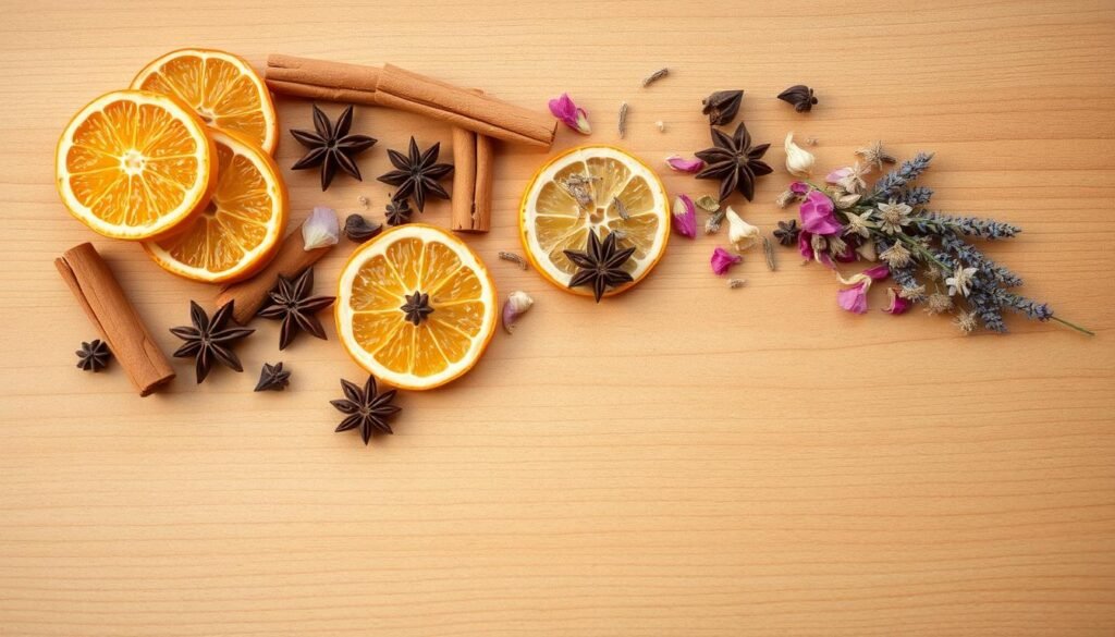
Blank walls don’t stand a chance once you discover how easy it is to craft eye-catching textured art—no prior experience required. Imagine turning basic materials into gallery-worthy pieces that reflect your personality, not a store-bought price tag. This isn’t about perfection; it’s about playful experimentation that fits your schedule and budget.
You’ll love how simple techniques create dramatic depth and movement. Layer colors like a pro using household tools, or blend unexpected textures for that “how’d they do that?” factor. The best part? Every stroke becomes a conversation starter that’s uniquely yours.
Home decorators nationwide are embracing this trend because it’s accessible and adaptable. Whether you prefer bold abstracts or subtle organic shapes, you control the vision. We’ll walk through each stage together—from selecting supplies to adding final touches—so you finish feeling proud (and maybe a little addicted).
Ready to transform empty spaces into curated showcases? Let’s turn “I’m not artistic” into “Look what I made!”
Introduction: Embracing DIY Painting Canvas Art
Elevate your interiors with unique pieces that capture your essence. Handmade wall designs do more than fill space—they become extensions of your story, blending creativity with intentional living. No two pieces are identical, just like the moments that inspire them.
The Impact of Handmade Art on Home Decor
Custom creations transform rooms into curated experiences. Imagine a guest pointing to your wall saying, “This feels so you“—that’s the power of personalized decor. Unlike generic prints, your work adapts to existing schemes, whether you’re accenting sage-green walls or complementing terracotta accents.
“The brush becomes a meditation tool—every stroke quiets the mind while building something beautiful.”
Studies show creative activities reduce stress by 75%. As you layer hues and textures, you’re not just designing art—you’re crafting confidence. Beginners thrive here because “mistakes” often become unexpected highlights.
| Aspect | Handmade Art | Store-Bought |
|---|---|---|
| Emotional Value | High (personal connection) | Low (mass-produced) |
| Color Matching | Exact (custom blends) | Approximate (limited options) |
| Uniqueness | 100% original | Common designs |
| Cost Over Time | Budget-friendly | Premium markup |
Notice how texture adds dimension? A crumpled paper press here, a palette knife swipe there—these techniques create depth that flat prints can’t replicate. Your space becomes a gallery of your evolution, one canvas at a time.
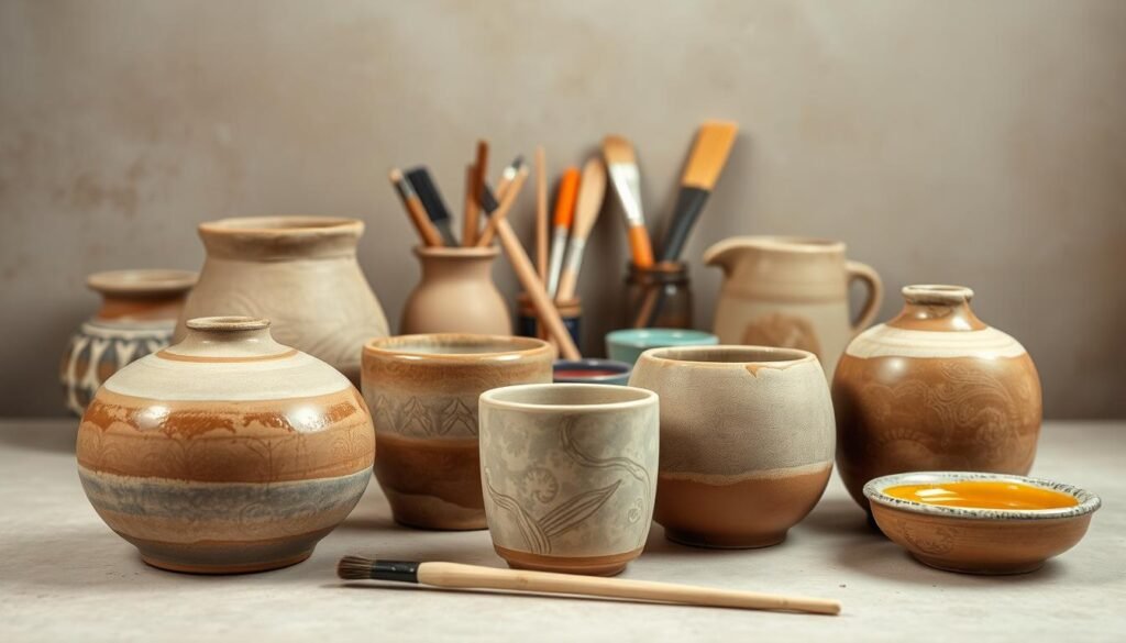
Materials and Tools for Your Canvas Project

Quality supplies don’t have to drain your wallet—smart sourcing makes all the difference. Let’s break down what you truly need versus what can wait until you’re ready to level up.
Essential Supplies
Start with these basics available at most craft stores:
- Framed surfaces: Reuse existing pieces or grab new ones
- Joint compound (lightweight) or plaster (for bold textures)
- Acrylic paint in 3-4 core colors
- Putty knives for sculpting ridges
- Matte sealer to protect finished work
Primer helps older surfaces absorb colors evenly, but fresh canvases often skip this step. Painter’s tape becomes your best friend for crisp edges.
Sourcing Affordable Canvases
Thrift stores hide goldmines under dated landscapes and floral prints. Last week’s find? Two framed pieces for $18—perfect for experimenting without pressure.
Facebook Marketplace sellers frequently offload unused art supplies. Look for sturdy frames and intact stretcher bars. Existing paint layers add character when you scrape through new textures.
Retail stores work for urgent needs, but secondhand scores let you practice freely. Remember: Imperfections become features in textured art.
Preparing Your Canvas: Priming and Base Coating
A masterpiece begins long before the first brushstroke—it starts with a well-prepared surface. Think of this stage as laying fresh soil for a garden: what you do here determines how vibrant your colors bloom later.
Ensuring a Smooth Surface
Primer acts like a neutral referee between old and new layers. Working over pre-loved surfaces? That vintage floral print might ghost through your modern design without this protective barrier. A quick spray version saves time—just rotate the frame to coat edges evenly.
No primer? Grab white acrylic instead. It’ll block stubborn pigments from playing peek-a-boo. Test an inconspicuous corner first: if colors stay true, you’ve got a green light. Thick textures or dark backgrounds usually demand full coverage.
The base layer isn’t just pretty—it’s practical. A uniform foundation helps subsequent coats stick better, especially when building dimensional effects. Matte finishes work best here, reducing slip-ups during detail work.
Smart shortcut: Skip priming entirely on unused, light-colored surfaces. Your future self will thank you during crunch time. Remember, preparation isn’t about perfection—it’s about creating possibilities.
Exploring Texture: Joint Compound and Plaster Techniques

Texture transforms flat surfaces into tactile masterpieces—no fancy tools required. Whether you crave subtle ridges or bold peaks, your choice between joint compound and plaster shapes the final result. Let’s decode these materials so you can pick your perfect match.
Material Showdown: Frosting vs. Stone
Joint compound spreads like buttercream—smooth, forgiving, and ideal for beginners. Made for drywall repairs, it’s budget-friendly and lets you rework designs for hours. Need to soften a ridge? Just swipe your putty knife again before it sets.
Plaster feels more like sculpting with wet sand. Its gritty consistency dries faster, locking in dramatic grooves that mimic high-end gallery pieces. Trade flexibility for permanence—once it hardens, those textures stay put.
| Feature | Joint Compound | Plaster |
|---|---|---|
| Consistency | Creamy (like frosting) | Grainy (like beach sand) |
| Drying Time | 2-4 hours | 20-40 minutes |
| Texture Depth | Medium (up to 1/4″) | Deep (up to 1/2″) |
| Best For | Subtle patterns | Bold statements |
Building Dimension Layer by Layer
Start thin—apply your base coat with a wide knife. Let it dry completely if using plaster. Add thicker dollops where you want focal points. Drag combs, sponges, or even credit cards through wet material to create organic lines.
Pro tip: Mix both materials! Use plaster for foundational textures and joint compound for final details. Seal between layers with matte medium to prevent cracking. Watch how light plays across your creation—that’s when the magic happens.
Applying Texture: Step-by-Step Process

Texture application transforms blank surfaces into dimensional art through intentional layering. Think of your first swipe as a conversation starter—it sets the rhythm for everything that follows. Forget rigid rules; this stage thrives on curiosity and tactile exploration.
Building Foundations Through Layering
Start with a base coat no thicker than 1/4 inch—like spreading peanut butter on toast. Wide putty knives glide effortlessly across large surfaces, while smaller painting knives offer control for detailed edges. Pro tip: Angle your tool at 45 degrees to minimize visible marks.
Timing separates rushed jobs from professional results. Let each layer firm up before adding the next—wait until it loses its wet shine. This prevents colors from bleeding and textures from collapsing. Working too fast? Place pieces near a fan (not directly!) to speed drying.
“Texture thrives in happy accidents,” notes mixed-media artist Lara Simmons. “Let the material guide your hands rather than forcing perfection.”
Notice how tool choices shape personality:
- Spatulas: Create flowing, ribbon-like ridges
- Combs: Add parallel grooves for geometric contrast
- Fingers: Press organic divots for raw, earthy vibes
Embrace uneven edges and asymmetrical patterns—they’re what make your work unmistakably human. That “flaw” you want to fix? It’s actually your signature.
Incorporating Color and Creative Expression

Colors whisper stories before you even pick up a brush. The right palette turns textures into emotional anchors, making walls feel alive. Let’s explore how to translate your personality into visual language that complements your space effortlessly.
Choosing Your Color Palette
Start by observing your room’s existing tones. Does afternoon sunlight warm your cream sofa? Maybe dusty blues or terracotta accents will sing. For bold contrast, pair deep charcoal textures with golden ochre highlights.
Pro tip: Mix pigments directly into joint compound or plaster. A dollop of brown paint in your base layer creates earthy depth. Grey-brown acrylic blended with white plaster adds subtle shadow play. These prep-stage tweaks save hours of surface painting later.
Mixing Hues for Visual Impact
Two similar shades create sophistication without chaos. Try layering sage green over mint-stippled textures. The variation reads as intentional, not random. Remember: Lighting changes everything. Test swatches at different times before committing.
| Technique | Effect | Best For |
|---|---|---|
| Wet Blending | Soft gradients | Sunset-inspired pieces |
| Dry Brushing | Textured highlights | Rustic or aged looks |
| Glazing | Luminous depth | Modern metallic accents |
Notice how water alters intensity? A spritz bottle lets you control opacity. Dab lighter tones over dried dark bases for ethereal veils of color. The magic happens when you let materials collaborate—plaster grabs pigments differently than smooth surfaces.
“Color isn’t just seen—it’s felt. Your choices should give visitors emotional whiplash (the good kind).”
Trust your instincts. That “wrong” shade might become your signature when layered intentionally. Now go make some happy accidents.
Techniques for Blending and Smoothing Your Art

Mastering the art of blending turns rigid lines into flowing stories—your secret weapon for professional finishes. Like a dance between control and spontaneity, smoothing techniques transform stark contrasts into harmonious transitions. The key lies in understanding your materials’ personalities and how they interact with moisture.
Material Behavior Decoded
Water acts differently across surfaces. Try this test: Dampen a small area of dried plaster. Notice how it becomes pliable again, letting you reshape textures? Now attempt the same with joint compound. Those reactivated particles will pull paint pigments downward, creating organic ombré effects perfect for sunset-inspired art.
| Material | Wet Brush Effect | Ideal Use |
|---|---|---|
| Plaster | Rehydrates for reshaping | Precise texture adjustments |
| Joint Compound | Creates color bleeds | Abstract backgrounds |
Timing determines your results. Blend plaster within 15 minutes of application for soft edges. With joint compound, wait until the surface firms up slightly—about 30 minutes—to avoid collapsing delicate ridges.
Brush selection matters more than you’d think. Synthetic bristles hold moisture longer for gradual blending. Natural-haired options release water quickly, perfect for targeted fixes. Pro tip: Keep two brushes handy—one damp, one nearly dry—for multitasking mastery.
“Water isn’t just a tool—it’s a collaborator. Let it suggest new directions when you feel stuck.”
Those “errors” you panic over? A spritzed brush can transform them into intentional details. Unexpected color bleeds become depth-building shadows. Over-blended areas gain ethereal softness. Remember: Perfection lives in the imperfections here.
Overcoming Common Challenges in DIY Canvas Projects
Every creative journey hits bumps—here’s how to turn frustrations into design features. Texture inconsistencies and cracks often stem from material behavior, not your skills. Let’s troubleshoot smart fixes that keep your vision intact.
Troubleshooting Cracks and Uneven Texture
Temperature swings make materials expand and contract. Thick layers worsen this dance. Mix flexible modeling paste into plaster (1:4 ratio) for bendable bases. If joint compound stays damp for days, scrape excess and let airflow work its magic.
Uneven drying creates patchy areas. Use a hairdryer on low heat 12 inches away to gently even surfaces. For stubborn cracks, fill gaps with lightweight spackle using a palette knife. Sand lightly once dry—it’ll vanish under fresh paint.
| Issue | Prevention Strategy | Quick Fix |
|---|---|---|
| Cracks | Thinner layers + flexible additives | Fill with tinted caulk |
| Uneven Drying | Room-temperature workspace | Targeted heat application |
| Material Limits | 1/2″ max per layer | Reinforce with cheesecloth |
“Imperfections become assets when you reframe them,” notes studio artist Mara Vickers. That hairline crack? Turn it into a lightning bolt with metallic accents. Gritty patches? Perfect for creating weathered stone effects.
Remember: Your project evolves with each adjustment. What feels like a setback today becomes tomorrow’s signature technique. Keep experimenting—you’re not fixing mistakes, you’re curating character.
Mixed Media and Innovative Art Elements
Break creative boundaries by marrying unexpected materials into cohesive visual stories. Mixed media lets your art transcend flat surfaces through tactile combinations—think lace pressed into plaster or sand blended with acrylics. This approach turns every idea into a multi-sensory experience that invites closer inspection.
Start simple: glue vintage buttons onto textured backgrounds or press metallic leaf into wet joint compound. Urban explorer and collage artist Jenna Lowe suggests,
“Let materials talk to each other—a rusted washer becomes profound when paired with delicate watercolor strokes.”
Three ways to layer effectively:
- Weight distribution: Heavy objects (keys, stones) need strong adhesives
- Surface compatibility: Test materials on scrap canvas first
- Depth sequencing: Add delicate elements last to prevent crushing
Household items unlock new possibilities. Try these transformations:
| Everyday Object | Artistic Effect |
|---|---|
| Window screen | Geometric imprint patterns |
| Bubble wrap | Organic honeycomb textures |
| Aluminum foil | Crinkled metallic underlayers |
Balance emerges through intentional contrasts. Pair rough burlap with smooth resin pours. Offset bold spray-paint drips with soft pastel smudges. Your project becomes a dialogue between elements—chaotic until you find the rhythm.
Remember: Innovation thrives when you treat mistakes as collaborators. That coffee stain? Perfect for aging paper elements. The cracked glaze? Ideal for creating weathered stone illusions. Your art gains character with every happy accident.
Mastering diy painting canvas Techniques
Transform basic materials into gallery-worthy art through methodical layering. Success lies not in natural talent but in understanding how each action builds toward your vision. You’ll discover that structured approaches turn uncertainty into creative fuel.
Blueprint for Repeatable Results
Start with a primed surface—this foundation ensures colors pop uniformly. Apply joint compound like spreading frosting, using angled strokes to minimize tool marks. Let each layer firm up before adding texture swirls or geometric patterns.
Timing matters most. Rushing leads to smudged details, while patience lets textures set properly. Seal finished pieces with matte medium to protect delicate ridges. “Consistency breeds creativity,” advises mixed-media artist Elena Torres. “When steps become second nature, you’re free to experiment boldly.”
Systematic practice rewires your creative process. What felt awkward during your first attempt becomes fluid by the third. Keep a technique journal—note which tools create feathery lines versus bold impressions. This personalized reference grows with every project.
Structured methods dissolve creative blocks. Instead of staring at blank surfaces, you’ll think: “First I’ll prime, then layer compound, then…” This roadmap lets intuition flourish within proven boundaries. Before long, you’ll adapt techniques instinctively—mixing materials or altering drying times like a seasoned artist.
Quick Drying, Curing, and Layering Tips
Time management separates rushed projects from professional-grade results. Understanding your materials’ drying personalities helps you work smarter—not harder—while maintaining creative momentum.
Optimizing Drying Times
Joint compound behaves like a sleepy friend—it needs 24-48 hours to fully wake up (dry). Plaster? More like an over-caffeinated colleague, hardening in under an hour. Control their pace with these strategies:
| Material | Ideal Conditions | Speed Boost |
|---|---|---|
| Joint Compound | 65-75°F, 40% humidity | Box fan 6 feet away |
| Plaster | 70-80°F, low humidity | Mix small batches |
High humidity adds hours to drying. If your hair frizzes, your art dries slower. Dehumidifiers or silica packets help. Always test layers with a fingernail—no dent means go time.
Managing Multiple Layers
Build depth without chaos by sequencing coats strategically. Thin base layers cure fastest. Wait until surfaces feel cool to the touch before adding textures. Working on three pieces at once? Label each with sticky notes tracking application times.
“Patience isn’t waiting—it’s knowing when to switch canvases,” says studio artist Clara Ruiz.
Quick-dry hacks:
- Use heat guns cautiously (6” distance)
- Add cornstarch to plaster mixes
- Rotate pieces near open windows
Two golden rules: Never stack wet canvases, and always seal between coats. Your future self will thank you when colors stay vibrant for years.
Enhancing Your Artwork with Finishing Touches
Your textured masterpiece deserves a lasting spotlight—and that final 10% effort makes all the difference. Let’s ensure your work stays vibrant through seasons of admiration and sunlight.
Sealing and Protecting Your Creation
Choose your shield wisely: matte sealers preserve raw, earthy textures, while polyurethane adds subtle sheen. Water-based options dry clear in minutes—perfect for impatient artists. Oil-based alternatives offer museum-level protection for heirloom pieces.
Apply thin coats with a soft brush, moving in one direction to avoid streaks. Let the first layer cure overnight—this prevents cloudy patches. Second coats fill microscopic gaps, creating an invisible forcefield against dust and UV rays.
Pro tip: Test sealers on scrap canvas first. Some formulas alter color tones slightly. Your art should age like fine wine—developing character without losing its essence. Now step back and admire: what began as an experiment now stands ready to inspire.