Ever feel like your creative spark needs a little fuel? Transforming blank surfaces into vibrant expressions might be just what you need. Whether you’re looking to unwind after a long day or add personality to your space, brushwork becomes therapy when paired with colorful possibilities.
You don’t need formal training to enjoy this artistic journey. Many beginners find acrylic techniques surprisingly approachable – mix colors like a pro with just a few basic supplies. The best part? Those “happy accidents” often become your most cherished details.
We’ll help you navigate common hurdles, like overcoming the pressure to create perfection. Comparison steals joy, remember? Your floral patterns or abstract swirls deserve celebration exactly as they are.
From modern geometric designs to nature-inspired landscapes, discover styles that match your energy. Start with simple projects to build confidence, then gradually explore complex textures. Your living room wall – or Instagram feed – will thank you.
Ready to turn “someday” into today? Grab those brushes and let’s make magic happen. After all, every masterpiece begins with a single stroke.
Introduction to Canvas Painting Ideas
Unlock your artistic potential by discovering concepts that spark joy and align with your unique vision. The right project transforms blank surfaces into stories – whether you’re crafting decor for your studio or expressing emotions through color. Your journey matters more than perfection, especially when working with versatile materials that forgive experimentation.
Start by asking: What excites you? Morning coffee mugs might inspire still-life textures, while sunset walks could fuel gradient blends. Many creators find therapeutic value in translating personal experiences into visual narratives – your brush becomes a storyteller.
| Project Type | Skill Level | Time Investment |
|---|---|---|
| Abstract Patterns | Beginner | 1-2 Hours |
| Floral Designs | Intermediate | 3-4 Hours |
| Landscape Scenes | Advanced | 5+ Hours |
Adapt techniques to your schedule and abilities. A busy entrepreneur might layer acrylics during lunch breaks, while a weekend artist explores oil blending. Progress, not mastery, builds confidence. Those “imperfect” strokes? They’re proof of growth.
Remember: Your work serves your goals. Create pieces that calm your mind, celebrate milestones, or refresh your workspace. When inspiration feels elusive, revisit nature walks, favorite quotes, or childhood memories – they’re goldmines waiting for interpretation.
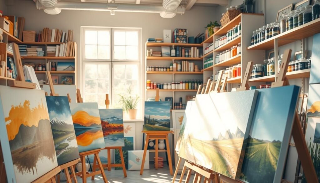
Essential Materials and Tools for Creative Painting

Equipping your studio doesn’t require complexity—just smart choices that fuel expression. Start with core items that handle 90% of projects, then expand as your style evolves. Quality matters more than quantity when building your toolkit.
Must-Have Supplies
Begin with a primed cotton surface – it’s forgiving for new techniques. Acrylics dry fast and clean easily, perfect for testing color combinations. Three brush shapes cover most needs: flat (washes), round (details), and filbert (blending).
Keep a plastic dish nearby for mixing hues – old ceramic plates work too. Sketch lightly with graphite before committing to pigments. Pro tip: designate separate cloths for wiping brushes and hands to avoid cross-staining.
Optional Tools and Varnishes
Once comfortable, explore gel mediums for impasto textures or glazing liquids for translucent layers. Protective coatings shield finished pieces from UV damage and dust. Consider these add-ons:
- Palette knives for sculptural strokes
- Misting bottles to slow drying time
- Retarder mediums for smoother gradients
Store supplies in labeled containers – repurposed jars organize brushes beautifully. Rotate stock to keep pigments fresh, and always recap tubes tightly. Your tools become creative partners when treated with care.
Getting Started with Basic Techniques

New to brushes and pigments? Let’s simplify those first strokes. Foundational skills act like training wheels – they steady your creative journey while leaving room for playful exploration. Start with the horizon line rule: always build your artwork from back to front. This avoids muddy skies peeking through foreground trees later.
Step-by-Step Beginner Methods
Begin with diluted washes to map your composition. Let each layer dry completely before adding details – patience prevents color bleeding. Mix primary hues on a spare surface first; even pros test combinations before committing.
Hold your tool like a pencil for fine lines, but grip near the ferrule for broad strokes. Rotate the canvas frequently to spot balance issues early. “That odd-shaped cloud? It’s a happy accident waiting to become a bird silhouette,” says veteran art instructor Mara Lin.
Simple Brush and Color Mixing Tips
Keep a cheat sheet for tonal values: add white to lighten, but use yellow sparingly to brighten without chalkiness. Your favorite hues? They’re your compass here. Adapt tutorials by swapping cerulean for teal if it sparks more joy.
Try this pro trick: clean brushes with vegetable oil before water – it breaks down acrylics faster. For gradual blends, work wet-on-wet with a spritzer bottle nearby. Remember: thick applications can always be scraped back with a palette knife. Progress beats perfection every time.
Developing Advanced Painting Techniques
Ready to elevate your artwork beyond the basics? Mastering strategic layer work unlocks professional-grade results – think luminous skies that glow and petals with velvety depth. This approach transforms flat surfaces into living compositions through intentional buildup.
Layering and Opaque Effects
Thin, translucent applications create magic. Build opacity gradually using 3-4 diluted coats rather than one thick stroke – you’ll avoid chalky textures while achieving rich saturation. “Underpaintings act like secret ingredients,” explains gallery artist Tessa Moreno. “A burnt sienna base makes subsequent greens vibrate differently than white would.”
Adding Depth with Multiple Layers
Plan your stack like a architectural blueprint. Background elements dry first, followed by midground details, then sharp foreground accents. Cool tones recede while warm ones advance – use this to simulate three-dimensional space. Stuck with muddy blends? Let layers cure fully before adjusting. A clean brush dipped in water often fixes bleeding edges.
Glazing techniques modify existing hues without covering previous work. Try tinting entire sections by brushing transparent color over dry layers. For texture, alternate between palette knife scrapes and soft dry-brush strokes. Your final piece will whisper, “Look closer” through its intricate strata.
Exploring the Power of Color and Texture

Colors whisper stories before your brush even touches the surface. Strategic combinations can evoke calm mornings or fiery passion – your choices shape how viewers feel about your work. Let’s transform pigment selection from guesswork to intentional storytelling.
Creating Vibrant and Harmonious Palettes
Start with a mood anchor. Planning a serene forest scene? Build around earthy greens and soft blues. Need energy? Pair crimson with mustard yellow. Three-color schemes work best for cohesion – try one dominant hue, one secondary, and an accent.
Complementary pairs (like violet and gold) create electric contrast. Analogous tones (think coral to peach) offer subtle harmony. Test combinations on scrap paper first – lighting affects perception. Pro tip: add a touch of gray to soften bright hues without dulling them.
Temperature shifts build depth. Cool recedes, warm advances. Paint distant mountains in icy blues while making foreground flowers glow with ochre. Texture amplifies this effect – thick impasto strokes grab attention, while smooth washes suggest distance.
“Limit your pigments to force creativity,” advises artist Helen Frankenthaler’s studio notes. Challenge yourself with just three tubes for your next project. You’ll discover surprising versatility – and avoid muddy mixes. Your palette becomes a strategic partner, not just a mixing surface.
Top canvas painting ideas for All Levels

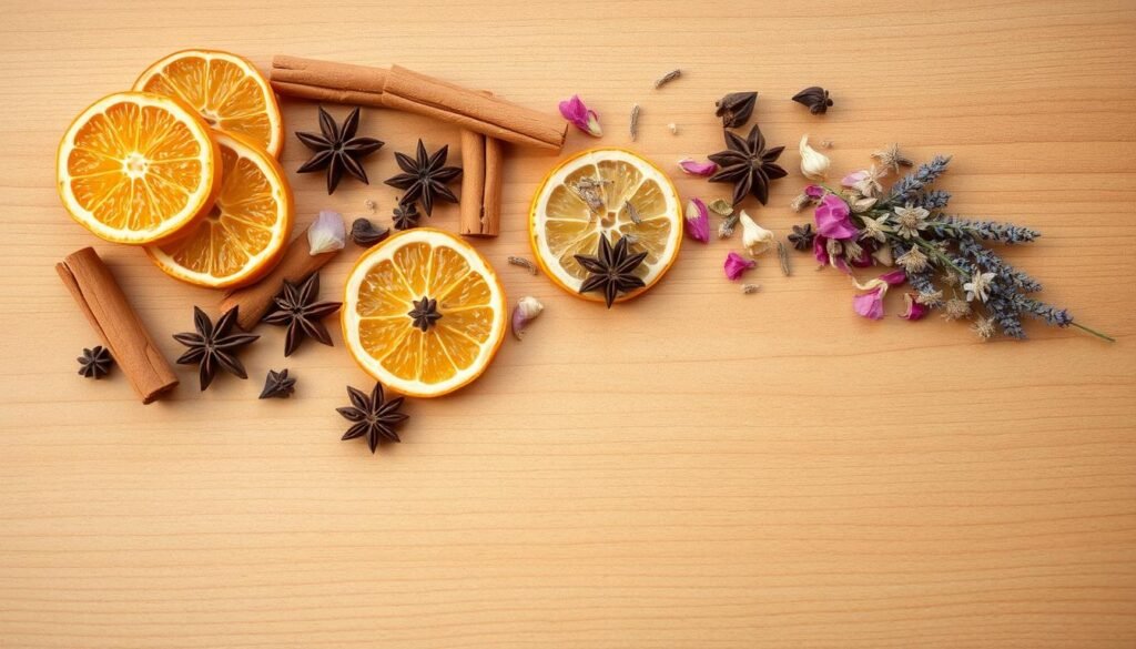
Your creative journey deserves projects that grow with you. Start with approachable subjects like citrus slices or feather textures if you’re building foundational skills. As confidence grows, graduate to misty mountain ranges or dynamic geometric patterns. The magic happens when challenge meets capability – pushing boundaries without frustration.
- Negative space compositions with bold focal points
- Metallic accents on moody backgrounds
- Biomorphic shapes blending nature and abstraction
Making Techniques Uniquely Yours
Your morning latte ritual could inspire a textured still life. Swap traditional sunflowers for protea blooms if tropical vibes resonate more. “Steal like an artist” doesn’t mean copying – it’s about absorbing influences and filtering them through your perspective.
| Skill Level | Project Example | Style Twist |
|---|---|---|
| Beginner | Single-tree silhouette | Add unexpected neon highlights |
| Intermediate | Ocean waves | Incorporate collage elements |
| Advanced | Urban cityscape | Use chiaroscuro lighting effects |
Notice which subjects make your heart race – that’s your North Star. Combine elements from different concepts: pair desert landscapes with celestial patterns, or merge animal portraits with floral motifs. Your signature emerges through these personal blends.
Remember: Authenticity trumps trends. That quirky rubber duck series you’ve been sketching? It might become your most beloved work. Your brush should dance to your rhythm, not someone else’s metronome.
Featured Idea: Pink Sky and Moon Inspirations

Imagine transforming blank spaces into dreamy twilight scenes that glow with quiet magic. This beginner-friendly concept lets you blend soft pinks and purples into a celestial dance – perfect for creating calming bedroom art or Instagram-worthy backgrounds.
Start by mixing equal parts magenta and white, then add a whisper of violet for depth. Apply horizontal strokes using a damp flat brush – the uneven blend creates natural-looking gradients. Let the first layer dry completely before adding wispy clouds with titanium white and a touch of Naples Yellow for warmth.
Struggling with crisp moon edges? Swap brushes for a White Gelly Roll Pen – its opaque ink glides smoothly over dried layers. “This trick saves hours of frustration,” notes a popular whimsical celestial art tutorial. Outline your lunar shape first, then fill it using gentle circular motions.
Want to personalize your masterpiece? Try these variations:
- Swap pink for peach to capture dawn’s first light
- Add silver glitter accents to star clusters
- Layer multiple moons in different phases
The beauty lies in scalability – this design works equally well on mini 6×6″ surfaces or statement wall art. Focus on maintaining soft edges and gradual color transitions regardless of size. Your finished piece becomes proof that simple techniques yield breathtaking results.
Featured Idea: Sunset and Seascape Masterpieces
There’s magic in watching daylight surrender to twilight hues – now imagine bottling that energy on your surface. This technique-rich concept teaches you to balance fiery skies with restless waters, creating compositions that feel alive. Your secret weapon? Strategic layering and brush care.
Blending Techniques for Realistic Sunsets
Start with a damp flat tool and three sunset shades – peach, coral, and indigo. Work quickly while pigments stay wet, blending upward strokes from horizon to sky. “Always keep two brushes rotating,” advises marine artist Lila Chen. “One for warm tones, another for cools – it prevents milky muddiness.”
Build intensity through translucent layers rather than thick applications. Let each wash dry completely before adding cloud details or deepening colors. Pastel evenings need whisper-soft gradients, while golden hour demands bold contrasts. Test mixtures on scrap paper first – lighting changes everything.
Capturing the Movement of Water
Reflections require mirroring sky colors while adding depth. Use horizontal zig-zag strokes with a fan brush for choppy waves, or smooth glazes for calm seas. Cooler blues near the horizon create atmospheric perspective – that “endless ocean” illusion.
Balance is key. Offset fiery oranges with teal undertones in water. Add final sparkles using a dry brush technique: barely dip bristle tips in titanium white, then lightly drag across wave crests. Your finished piece won’t just depict a sunset – it’ll hum with coastal energy.
Themed Artworks: From Animals to Landscapes
Your brush can travel from enchanted forests to quirky kitchen counters – themed creations turn ordinary surfaces into storytelling platforms. Whether you’re sketching a curious bear cub or translating summer blooms onto canvas, these concepts blend technical growth with personal expression.
Whimsy Meets Technique
Unexpected subjects become showstoppers when treated seriously. Paint a rubber duck wearing sunglasses using bold impasto strokes – the contrast between silly content and refined execution creates intrigue. Fruit studies work similarly: render peaches with velvety textures against abstract backgrounds.
Nature’s Timeless Appeal
Seasonal shifts offer endless inspiration. Winter forests thrive in cool blues with pops of cardinal red, while spring meadows beg for loose brushwork. “Always start landscapes with thumbnail sketches,” suggests plein air painter Clara Reyes. “It helps balance elements before committing to pigments.”
Try these approaches for dynamic results:
- Simplify animal features using geometric shapes
- Layer translucent glazes for glowing horizons
- Use palette knives to sculpt floral textures
Discover how animal-inspired artwork can evolve from basic outlines to intricate portraits. Your themed series becomes a skill-building diary – each piece documents growing confidence with color relationships and compositional flow.
Embracing Abstract and DIY Approaches
What if your next masterpiece didn’t need to look like anything at all? Abstract art throws open studio doors to spontaneous expression – no technical expertise required. Your intuition becomes the ultimate guide, blending colors and shapes into visual poetry that’s uniquely yours.
Experimenting with Patterns and Shapes
Start by tearing up the rulebook. Drag a credit card through wet pigments to create jagged lines. Layer circular stamps made from wine corks over geometric tape resist designs. “The best abstract work often begins with play,” notes mixed-media artist Jodie King. Keep baby wipes nearby – they’re perfect for softening harsh edges.
DIY approaches thrive on household hacks. Try these stress-free techniques:
- Drip watered-down hues using a plastic squeeze bottle
- Press bubble wrap into wet surfaces for organic textures
- Sketch loose charcoal lines before adding bold acrylic swipes
Notice how overlapping triangles create rhythm? Or how uneven circles suggest movement? Abstract compositions speak through balance rather than realism. Rotate your work mid-process – unexpected perspectives spark fresh solutions.
This isn’t about hiding “mistakes” but celebrating them. That rogue drip? It’s now a focal point. Your layered patterns become a meditation in motion, proving art thrives where control meets surrender.
Designing Unique Patterns and Visual Effects
Ever wondered how simple lines transform into mesmerizing art? Start by sketching loose, wavy paths that intersect like rivers meeting at twilight. These flowing boundaries become your secret framework for intricate designs – guiding color choices while leaving room for happy accidents.
You’ll master patterns that command attention through clever line work. Crisscrossing strokes create natural compartments – perfect for testing contrasting hues or gradual ombré effects. Alternate between geometric precision and organic curves to keep eyes dancing across your composition.
Balance is your superpower here. Pair structured grids with freeform swirls using different brush sizes. Try this pro move: outline sharp angles with a rigger brush, then soften edges with a damp fingertip. Your design gains rhythm when opposites collaborate – like jazz musicians improvising together.
Remember – patterns thrive on repetition with variation. Recreate similar shapes in different scales, or flip orientations for subtle intrigue. Those “mistakes”? They’re just unexpected collaborators in your creative conversation.